Mozzington
Overview
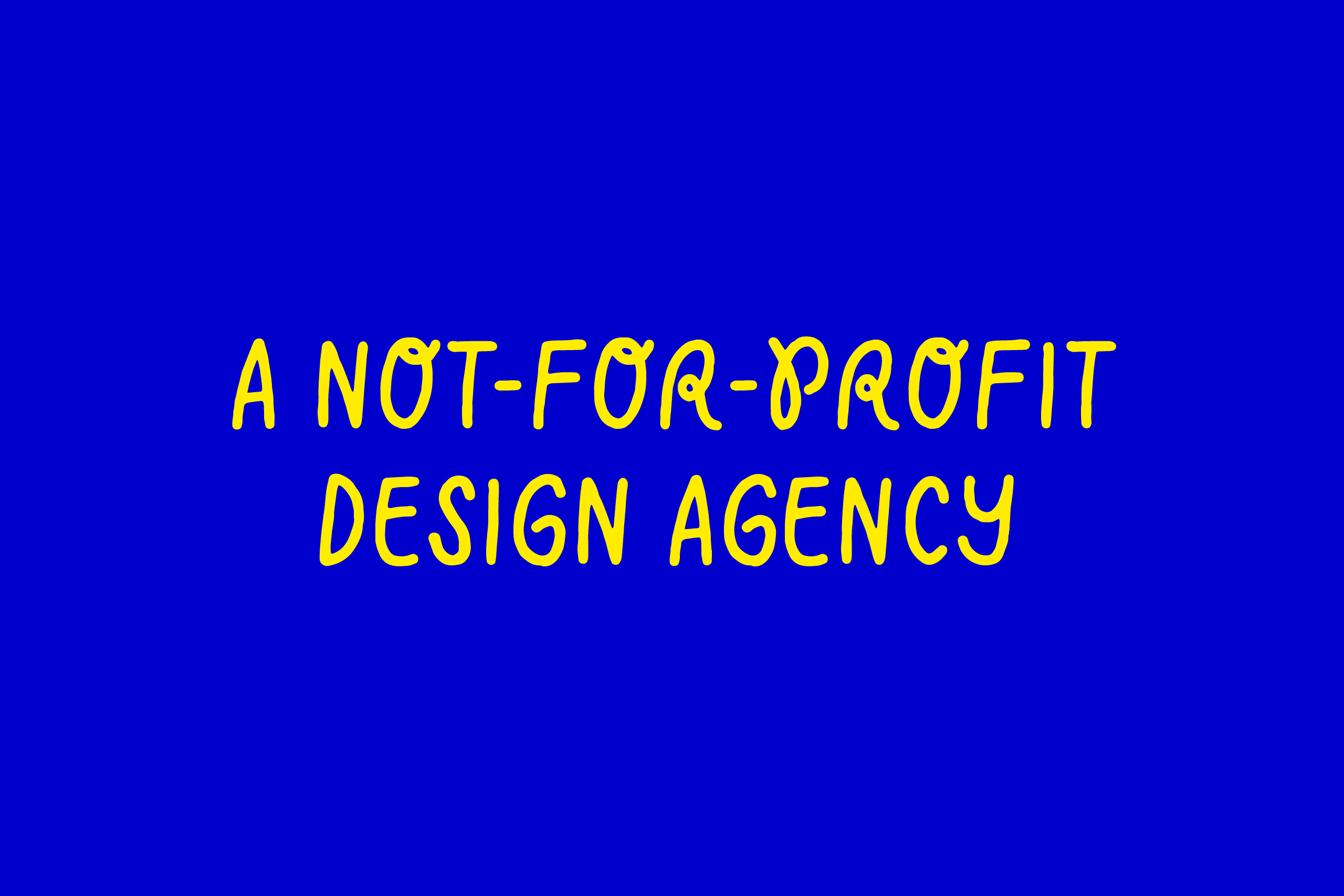
Identity and custom typeface design for Mozzington, a not-for-profit design agency.
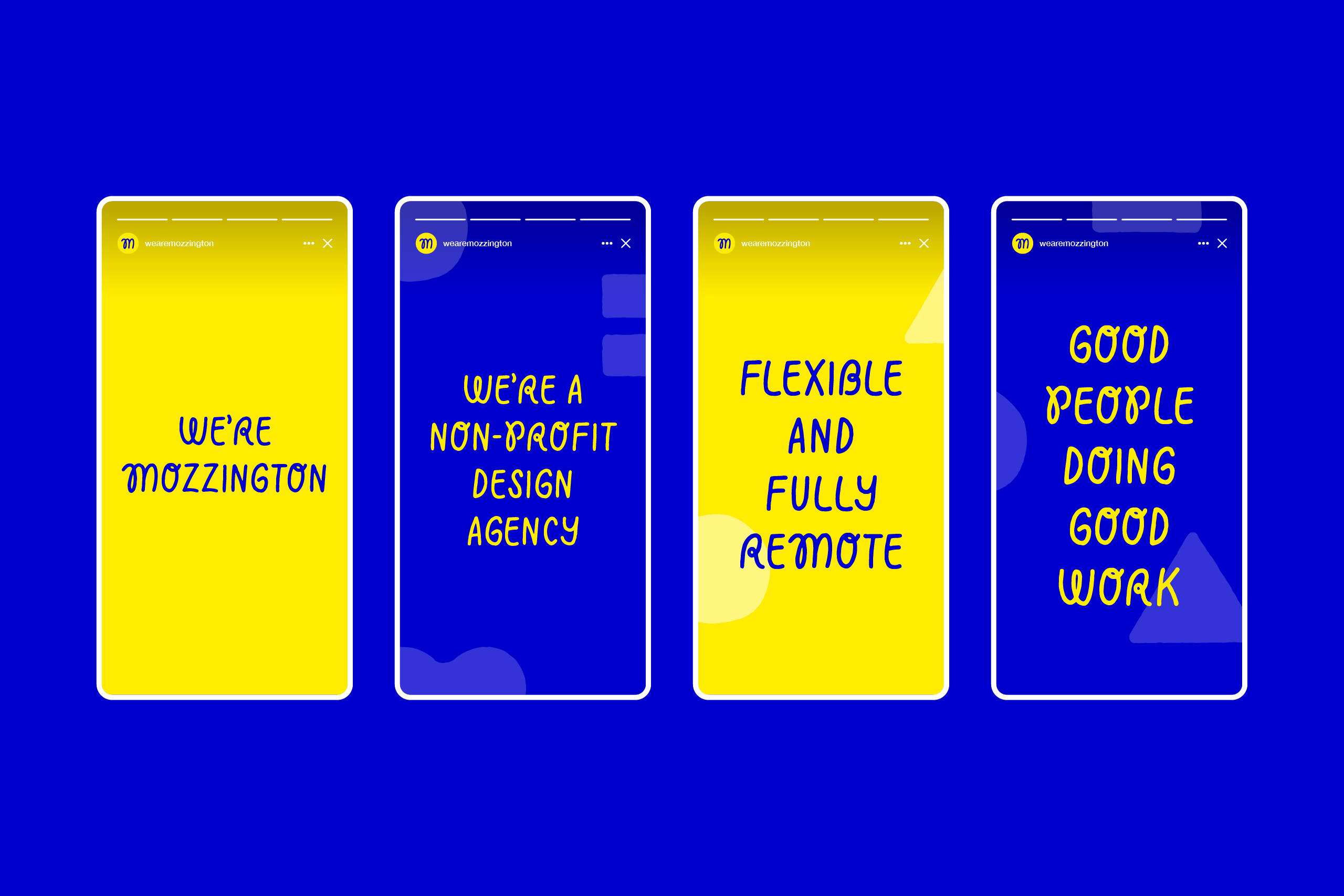
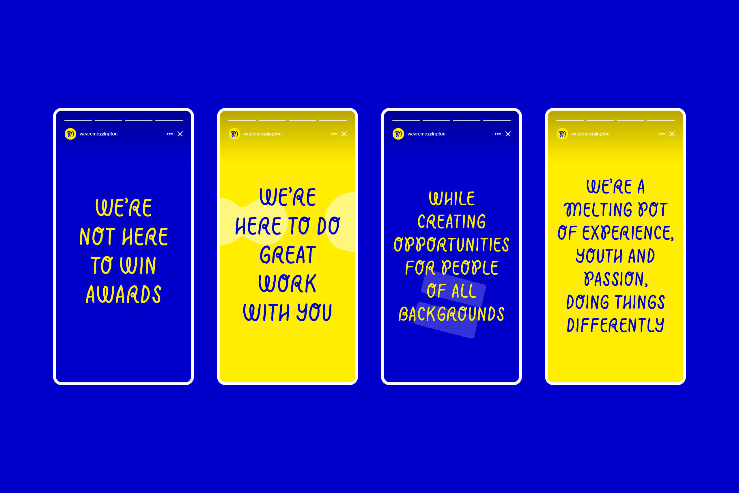
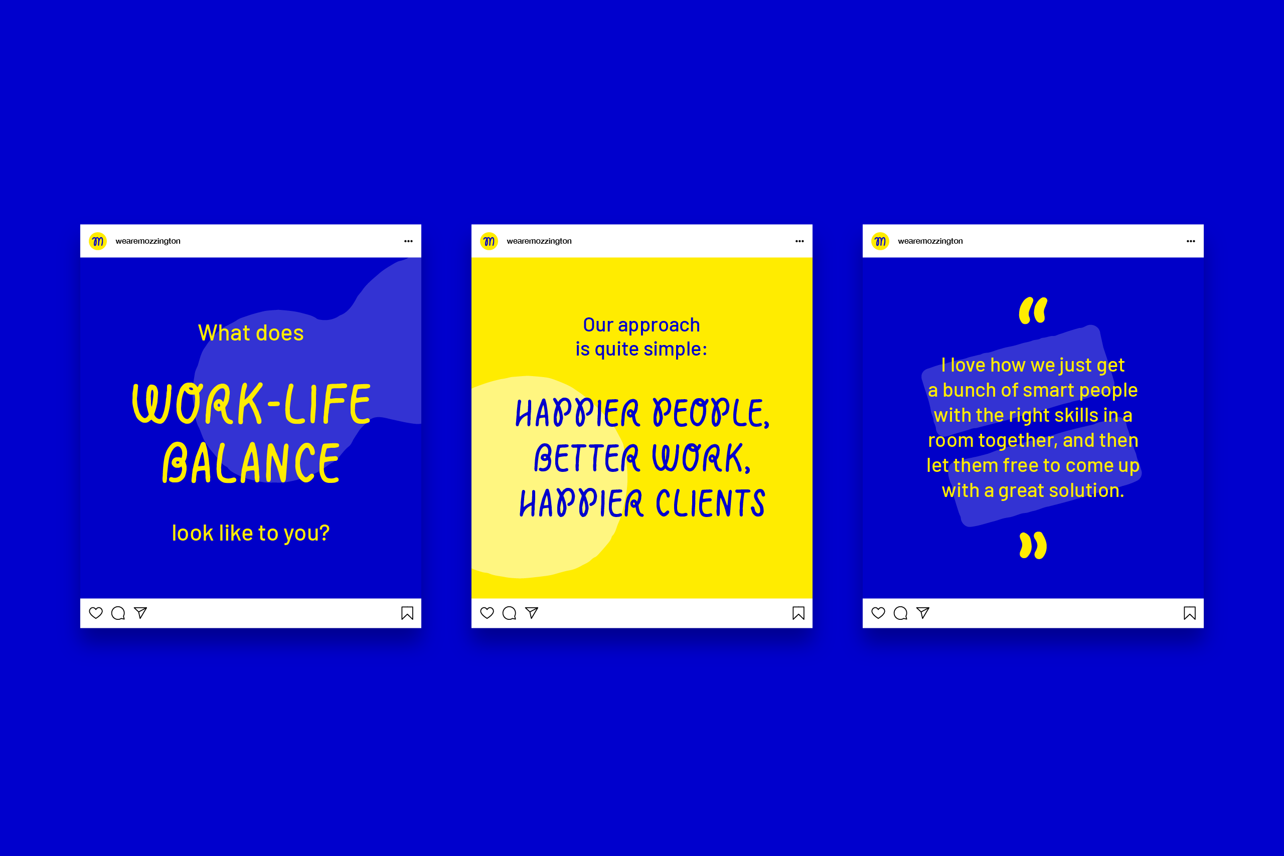
Mozzington is quite different from most agencies. All the projects they work on create opportunities for the people in their community. They offer mentorship and training to every young person that comes through their – metaphorical – doors (they work remotely). Plus all the money they make goes into ensuring their team continues to perform at their best.
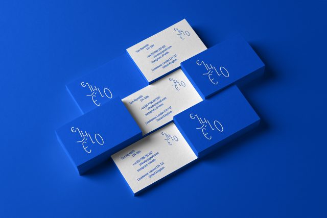
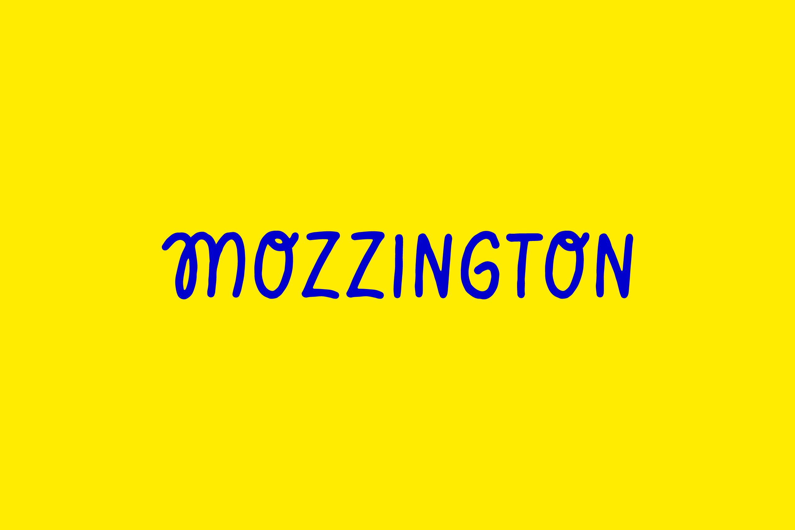
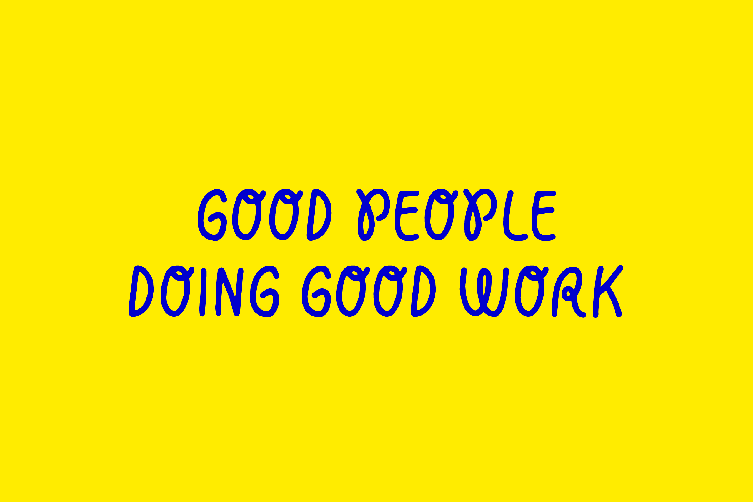
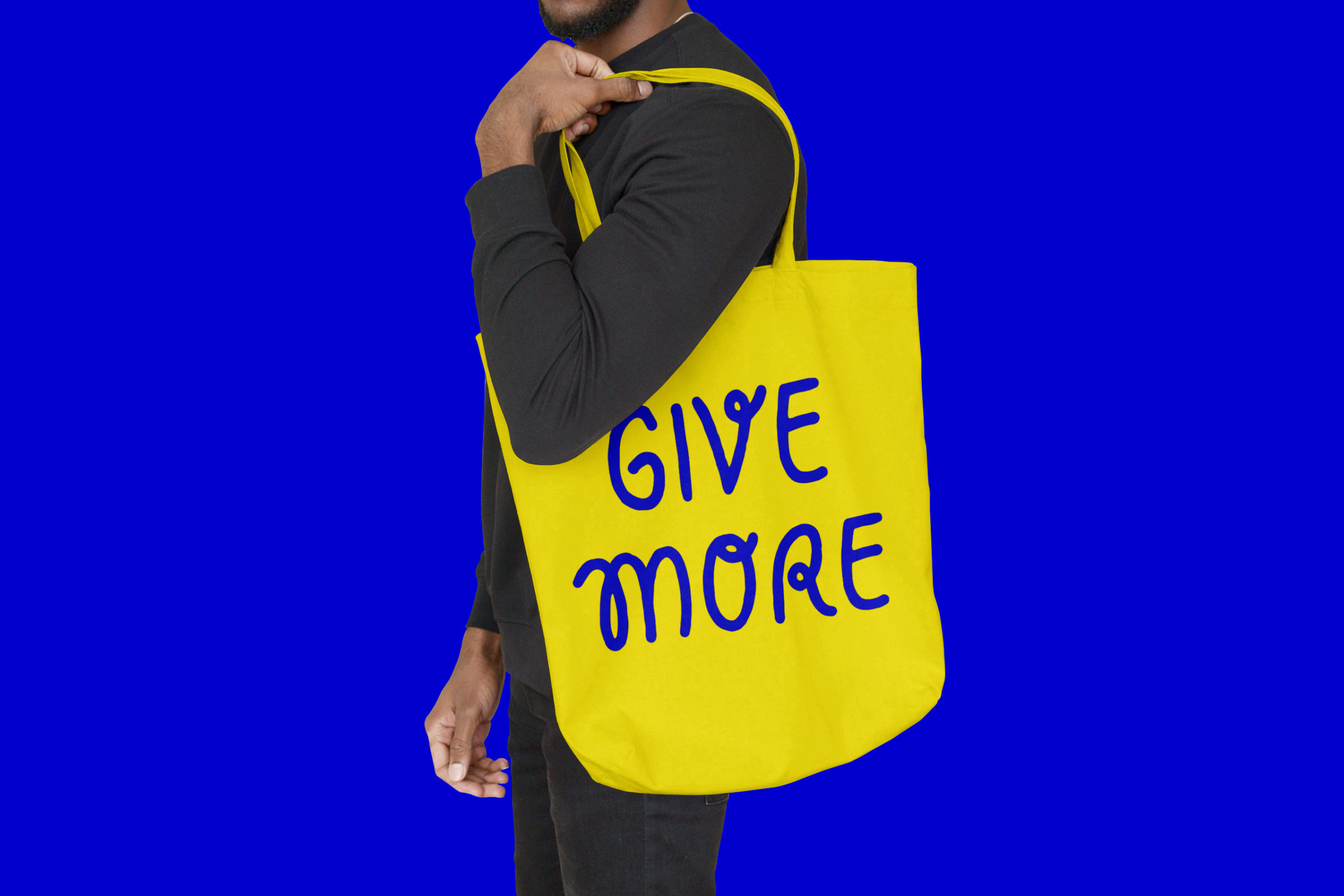
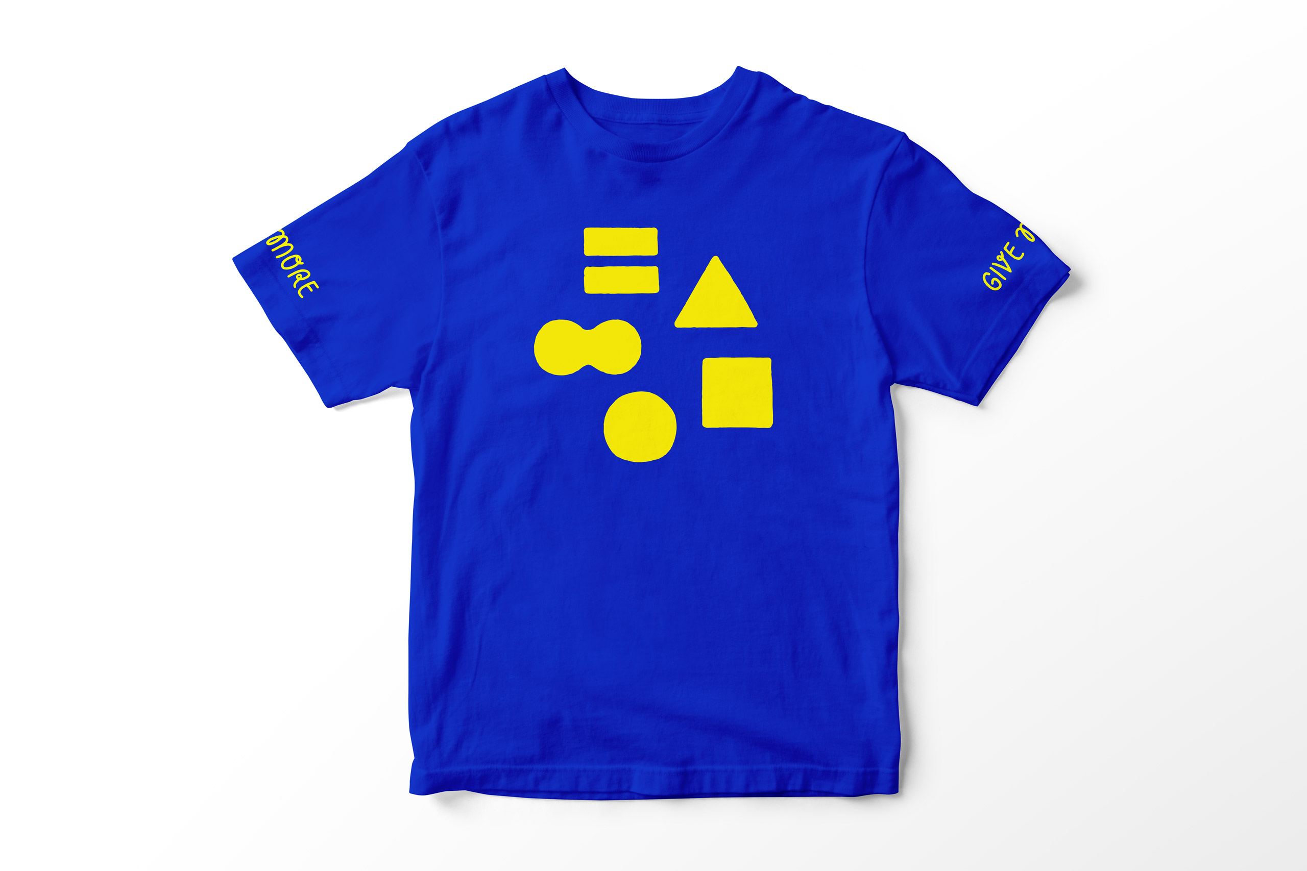
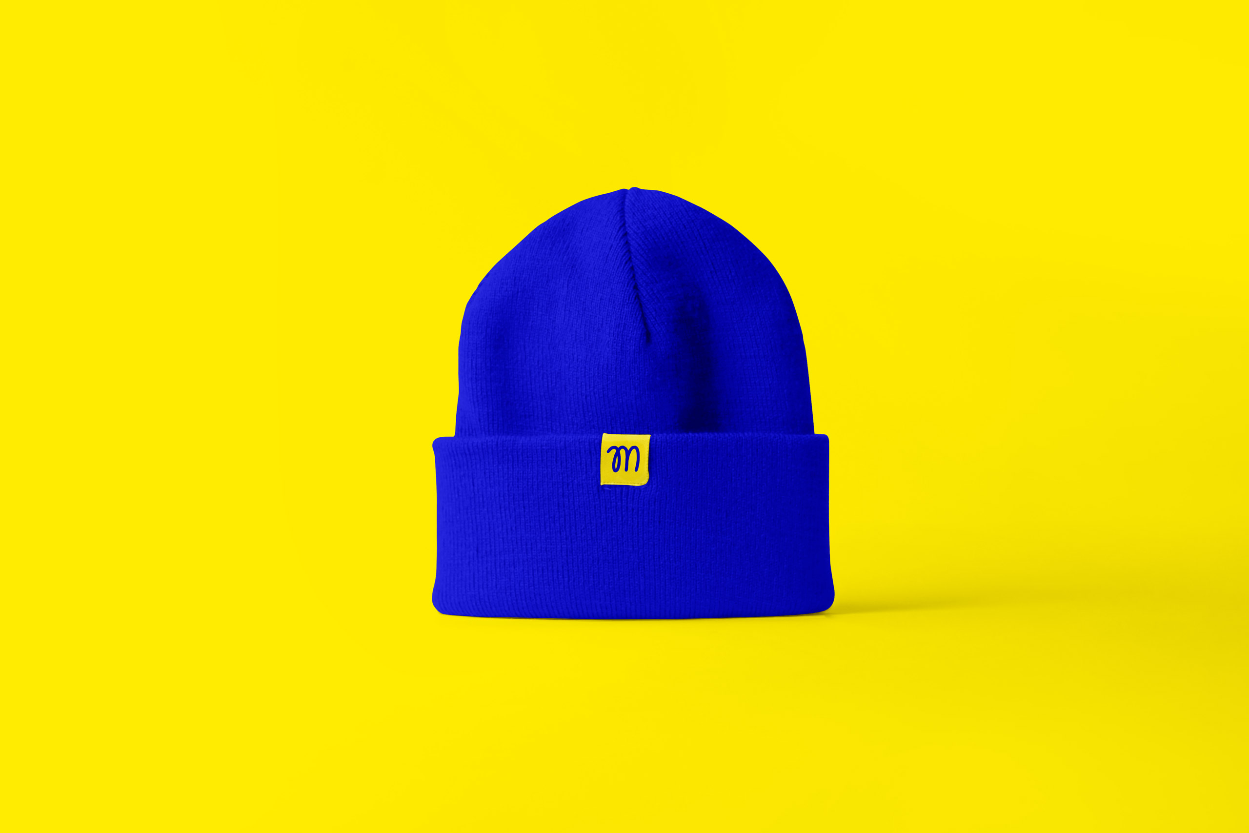
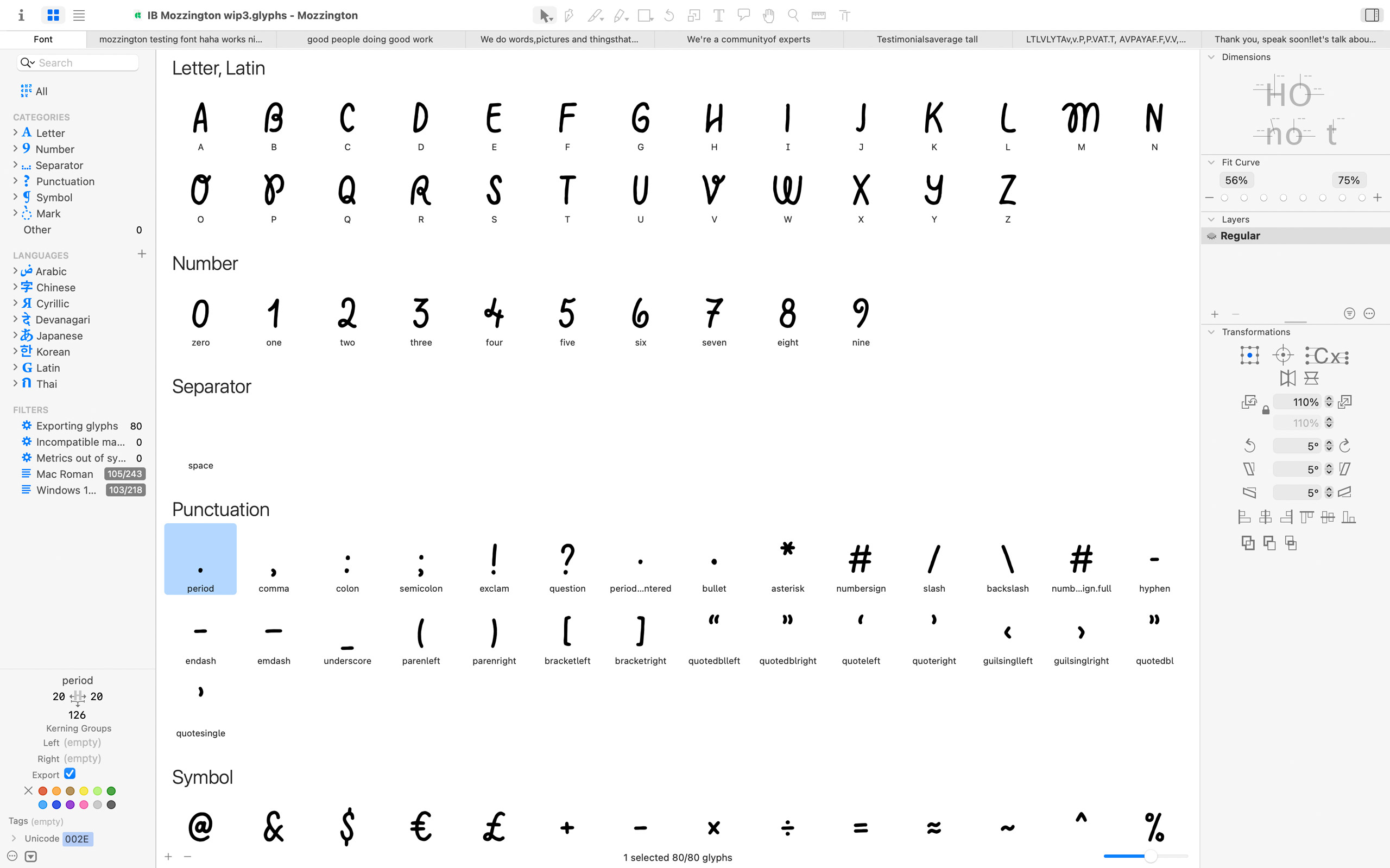
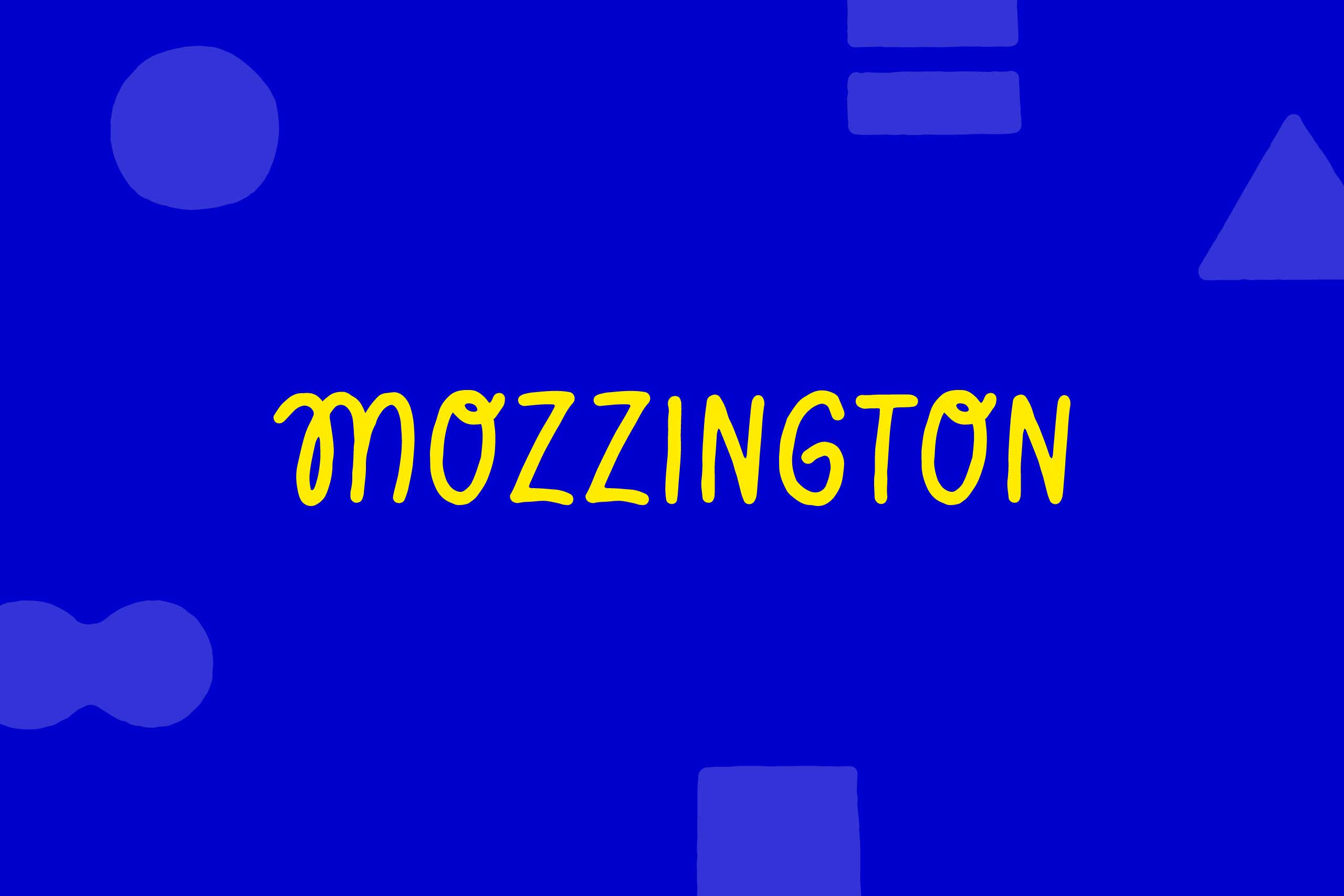
The Mozzington identity is mainly typographic, relying on a hand-made custom font that expresses what they care about and what makes them different.
Find out more in the Process section below.
Process
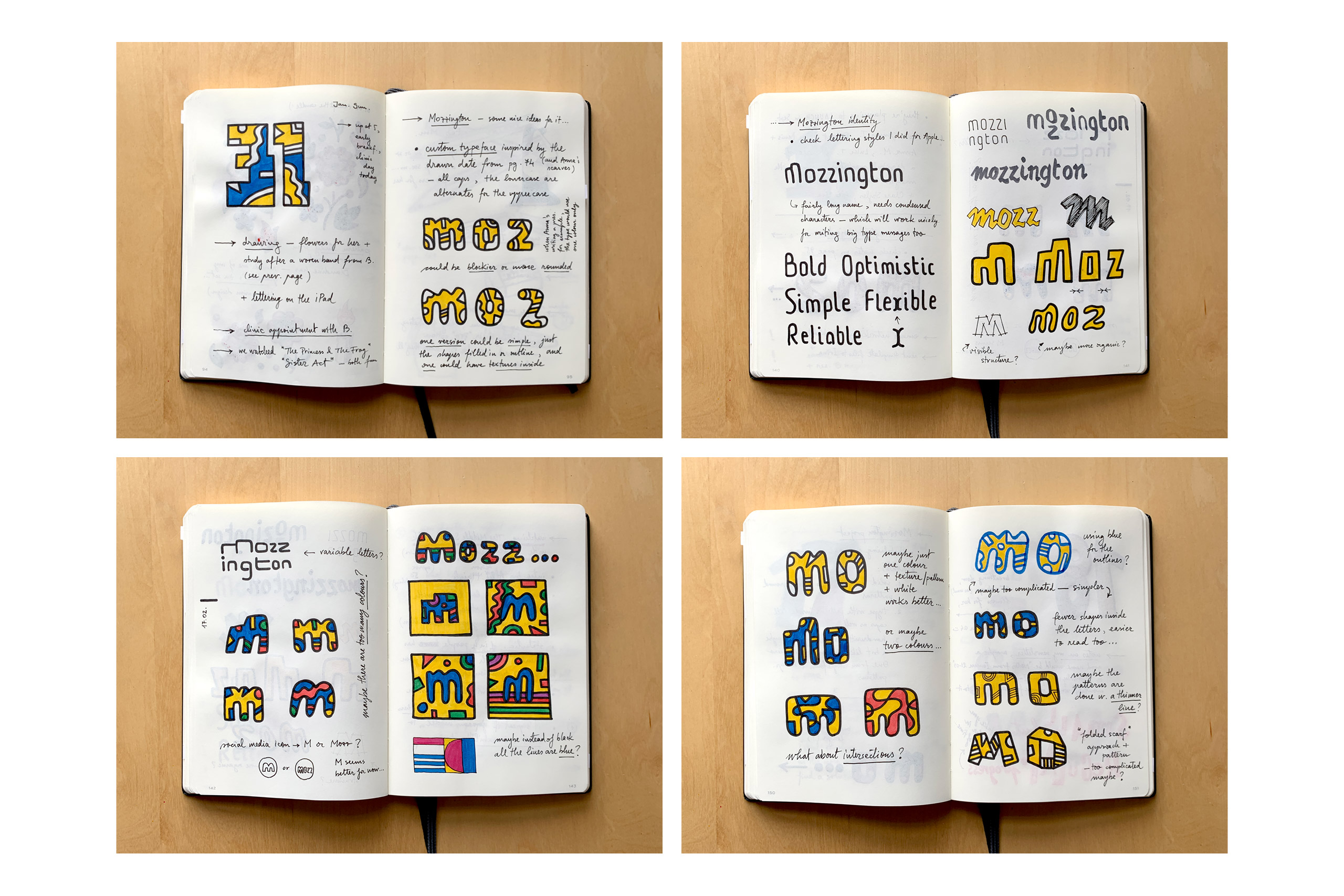
Anna Morrison and I had worked together on two global rebranding projects, and we got along really well. So I was very excited when she asked me if I could help with the identity for her new agency.
During one of those previous projects, Anna would often come to my desk and check out my sketchbook drawings, especially the hand-drawn dates. In her words, “seeing your sketchbooks each day was truly a pleasure. Like opening up a box of chocolates, so many treats inside”.
So her brief was to do something “optimistic, bold, simple and easily understood”, similar to my personal work that she enjoyed.
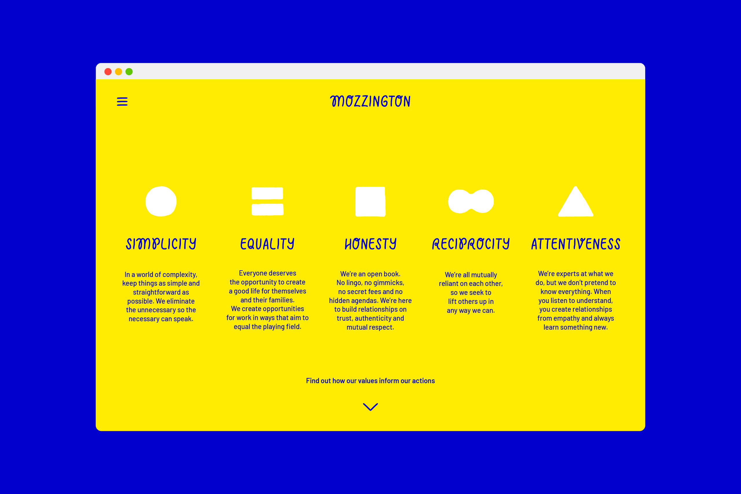
I’ve always admired Anna’s honest, clear and practical approach. This made me think of a custom typeface that would express her personality. The Mozzington name is also quite unique, being based on Anna’s school days nickname.
We explored two different routes, one that was quite detailed and playful, and one that was simpler and quirky. The blue and yellow colour palette was based on one of Anna’s favourite artists, Yves Klein, and her sense of style.
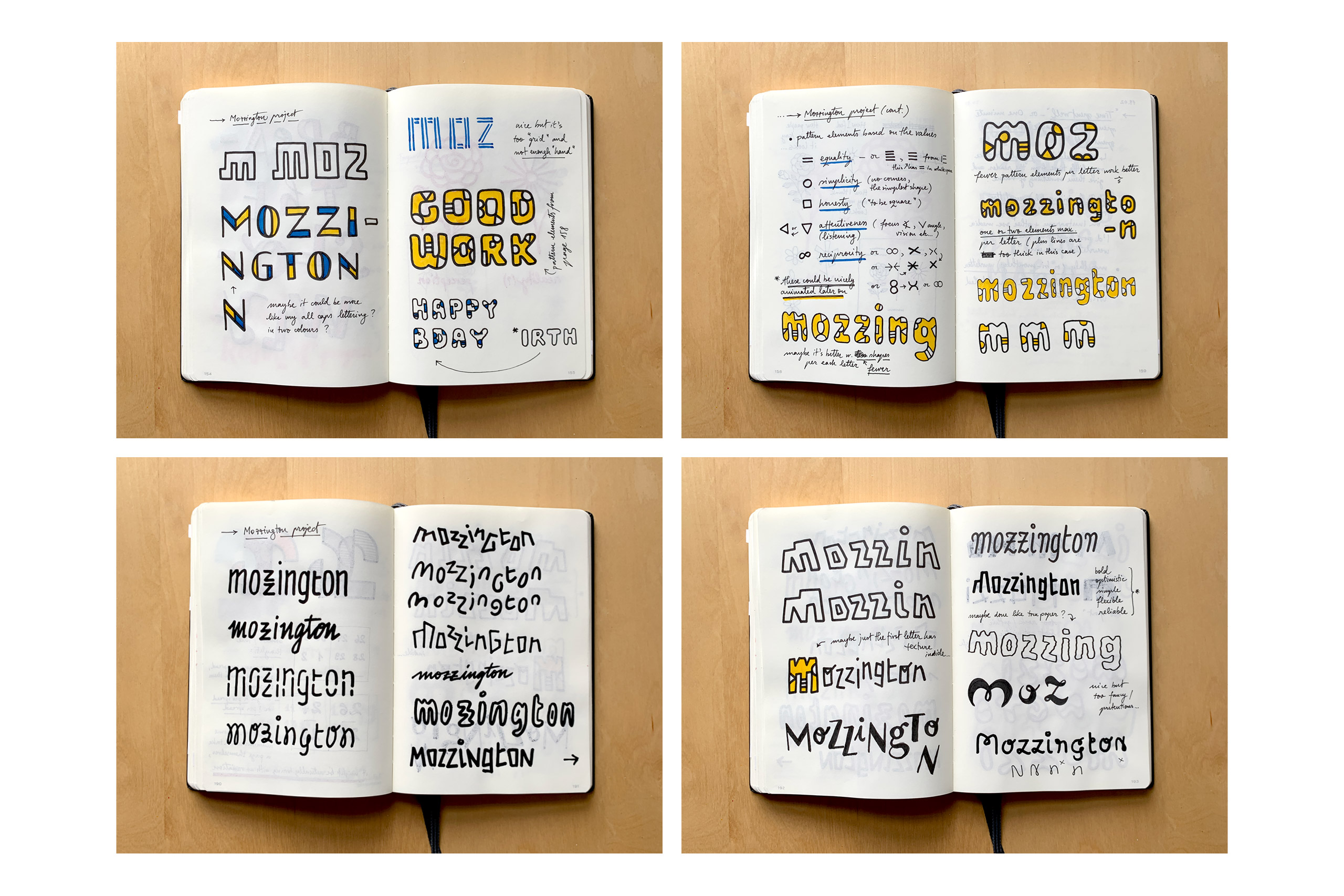
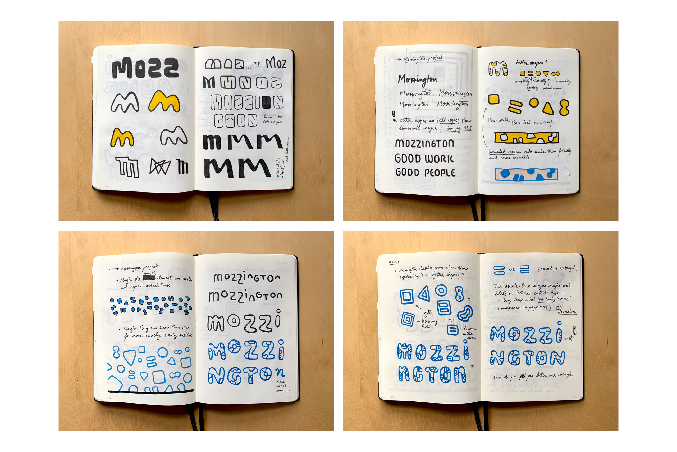
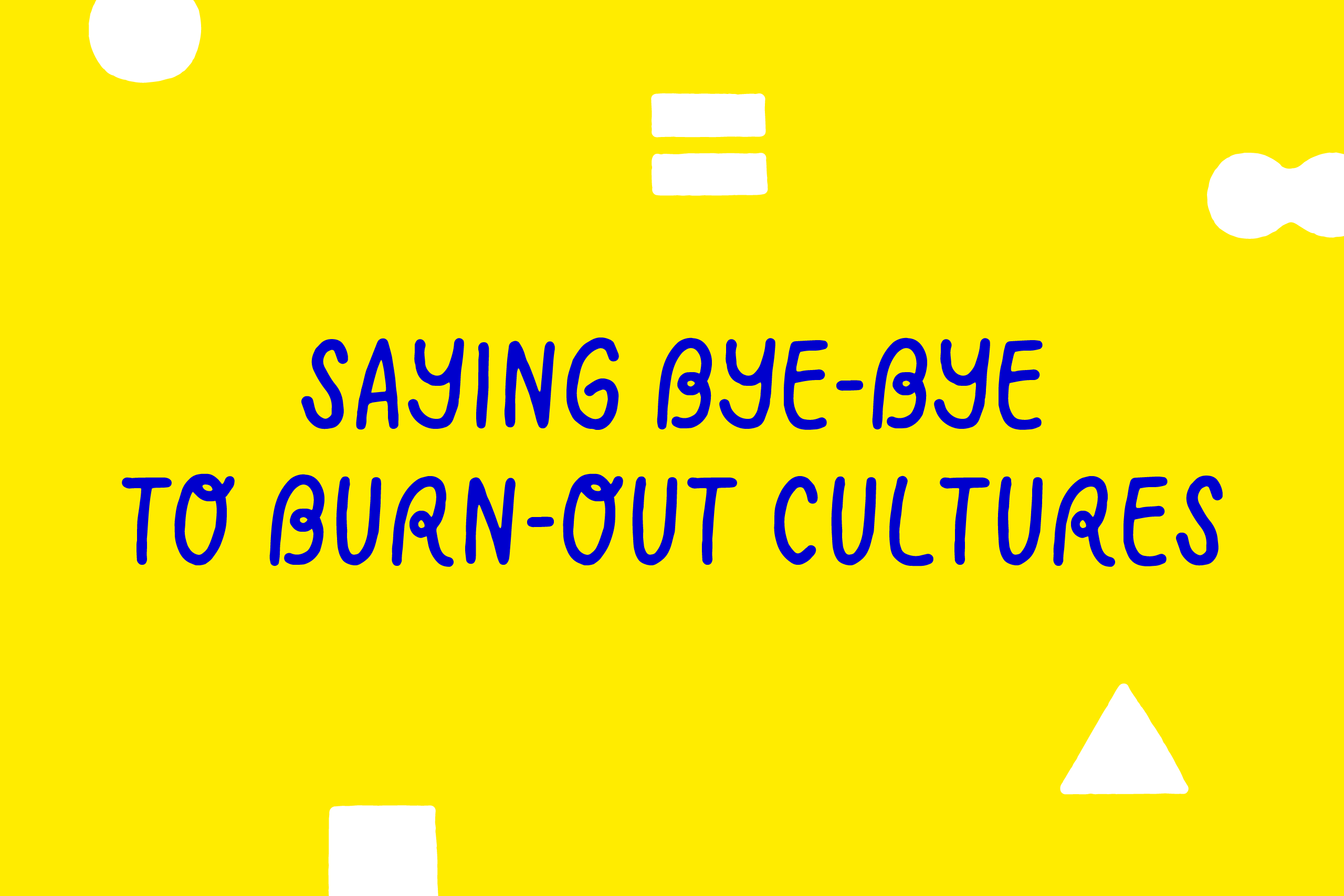
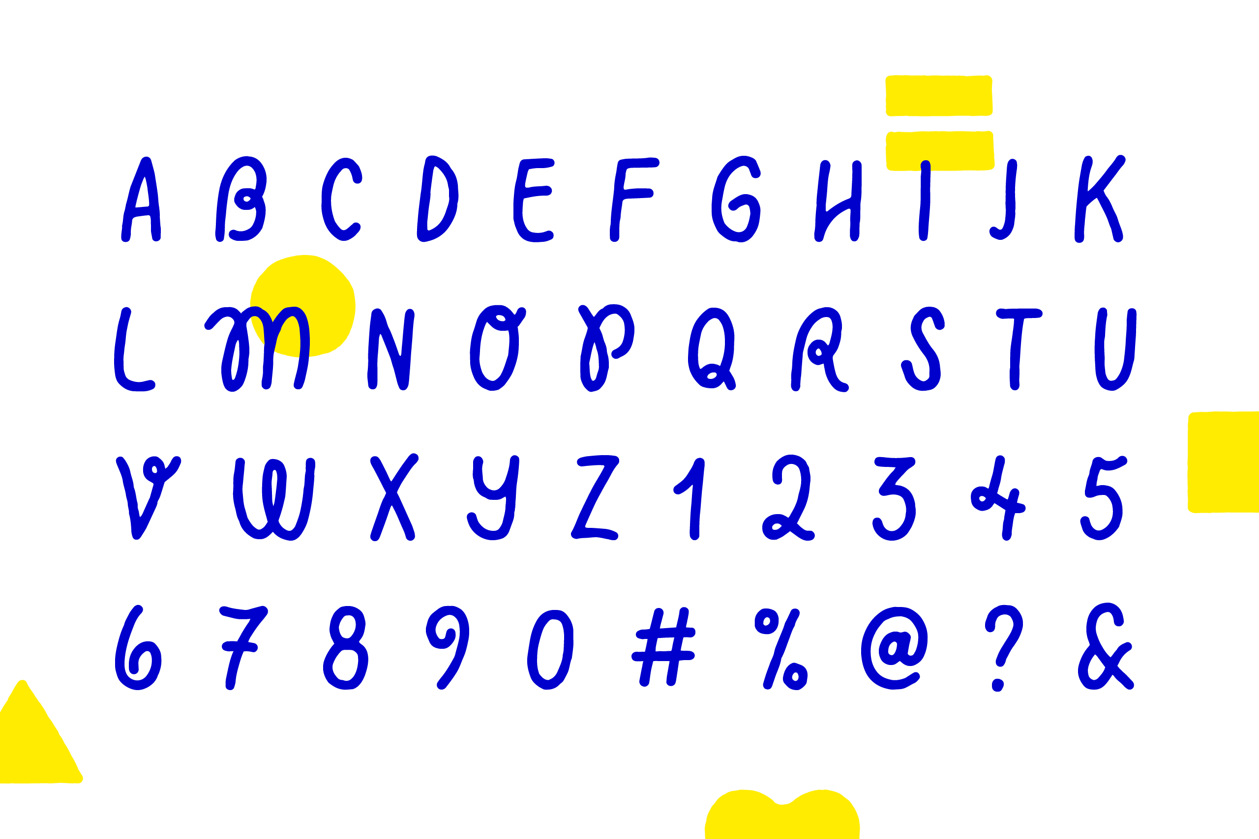
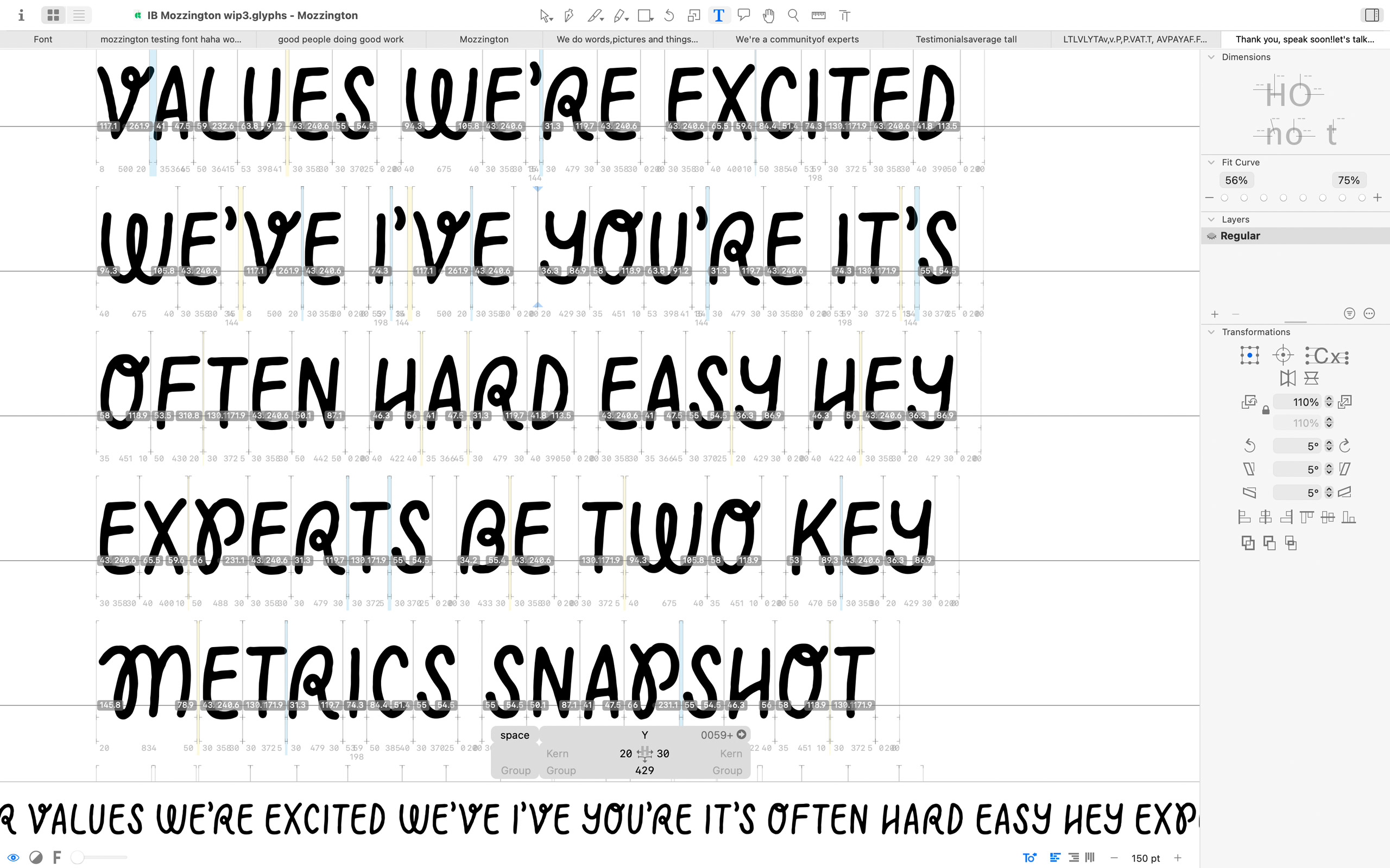
Once we agreed on the preferred route, I drew by hand the whole alphabet plus several additional characters, and then digitised them. We did a few rounds of testing and fine-tuning the custom typeface. The goal was to keep the playful, hand-made feel, while making sure it would work well in a wide range of situations. I also created a group of simple shapes that symbolize the Mozzington values and support the custom typeface.
The client, on working together
“Iancu is a designer that listens, that holds dear what you try to explain in your brief. Asks the right questions, teases out what inspired your ideas in the first place and makes them beautiful. I’ve had the pleasure of working with Iancu in an agency; and for the identity of my own agency and every time he understands, explores and delivers. And his sketchbooks are a joy to behold. Everyone should work with a Iancu at some point. Fact.” — Anna Morrison
Credits
Working directly with Anna Morrison, the founder of Mozzington. You can find out more about them on the Mozzington website.