3W Label
Overview
Identity design for 3W Label, a sustainable fashion brand created for women who care about our planet’s finite resources. The name reflects the rationale behind the brand’s promise. It transforms the three R’s, Reuse, Redesign, and Return, into 3 W’s: Waste to resource, Wearables, and Women empowerment.
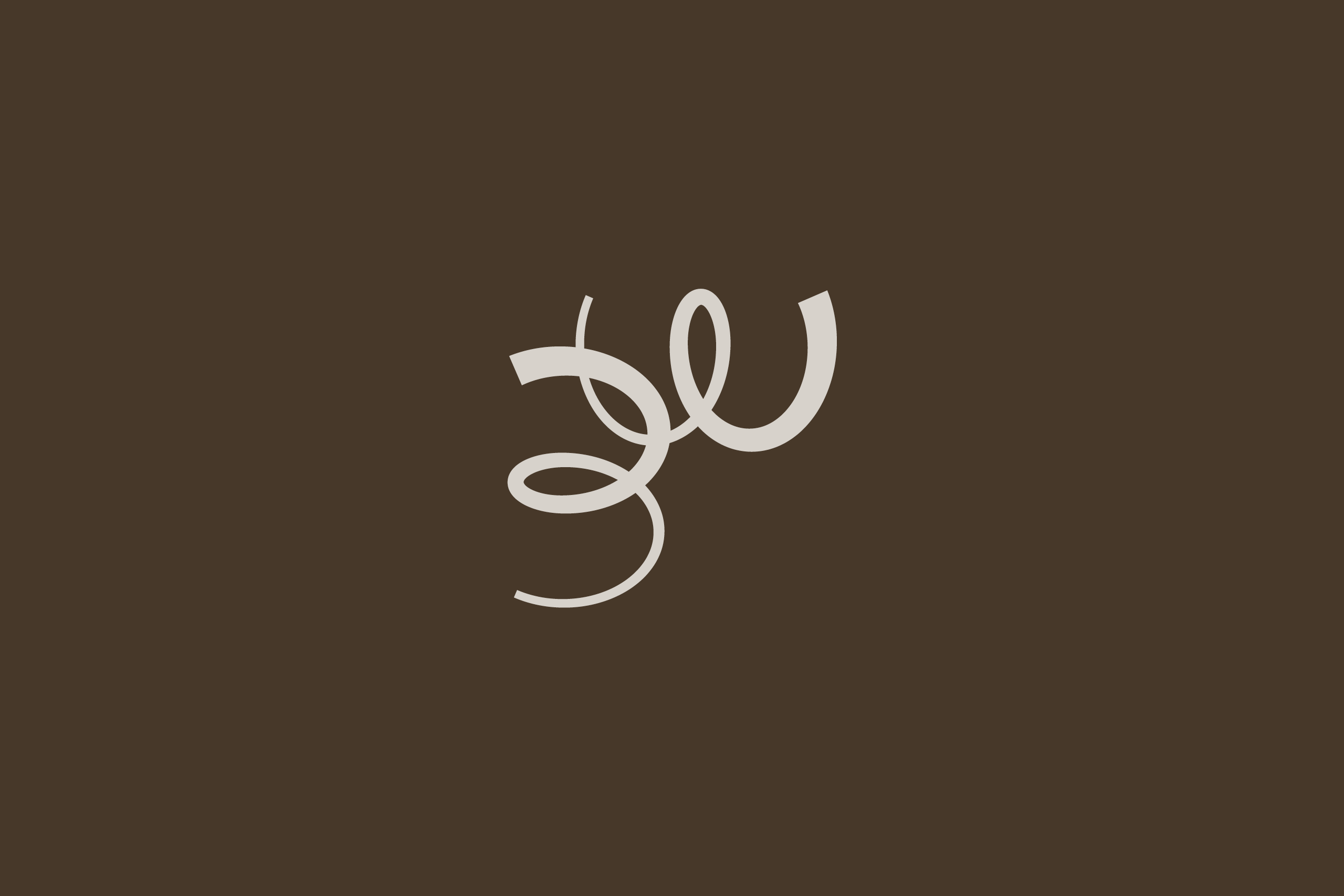
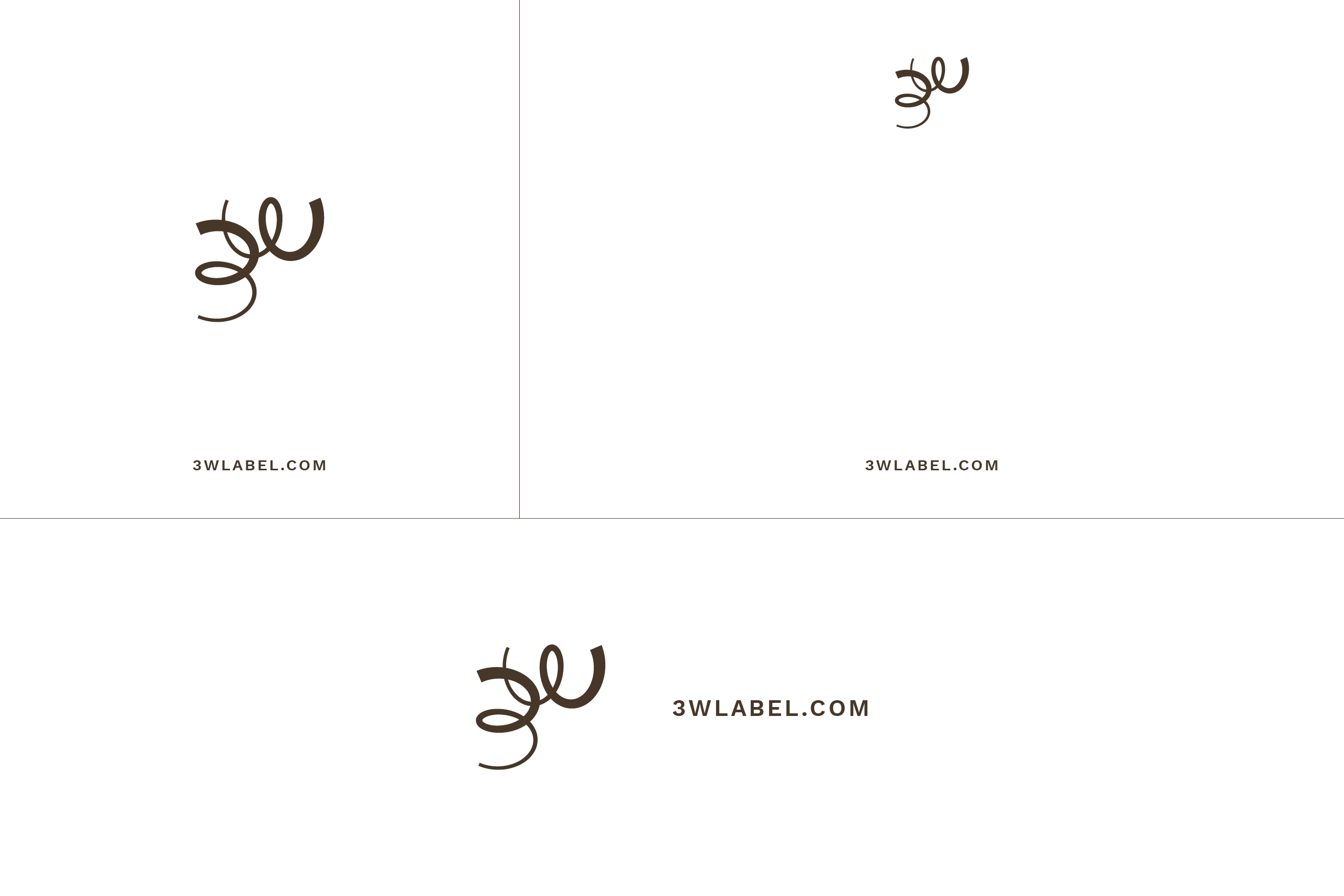
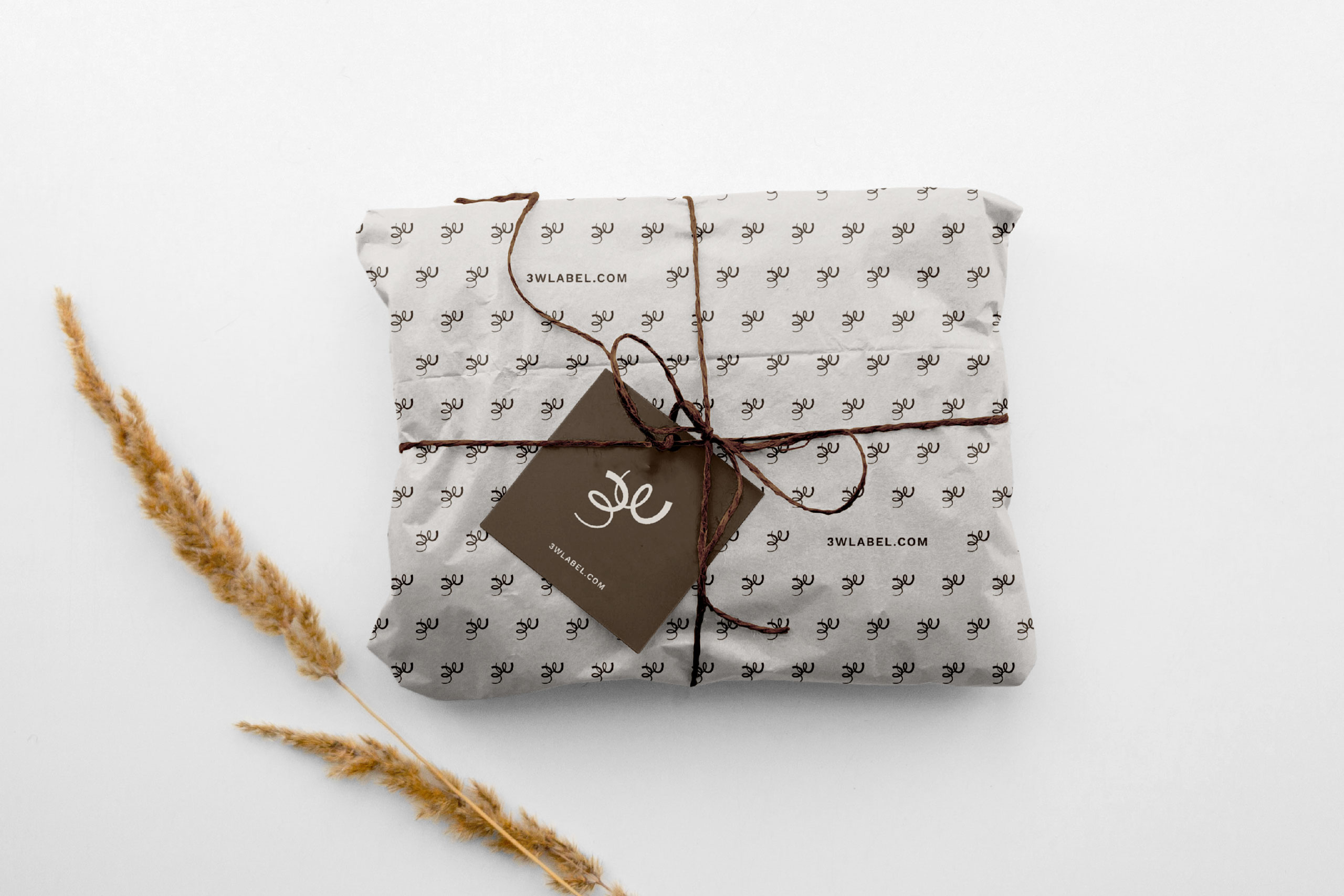
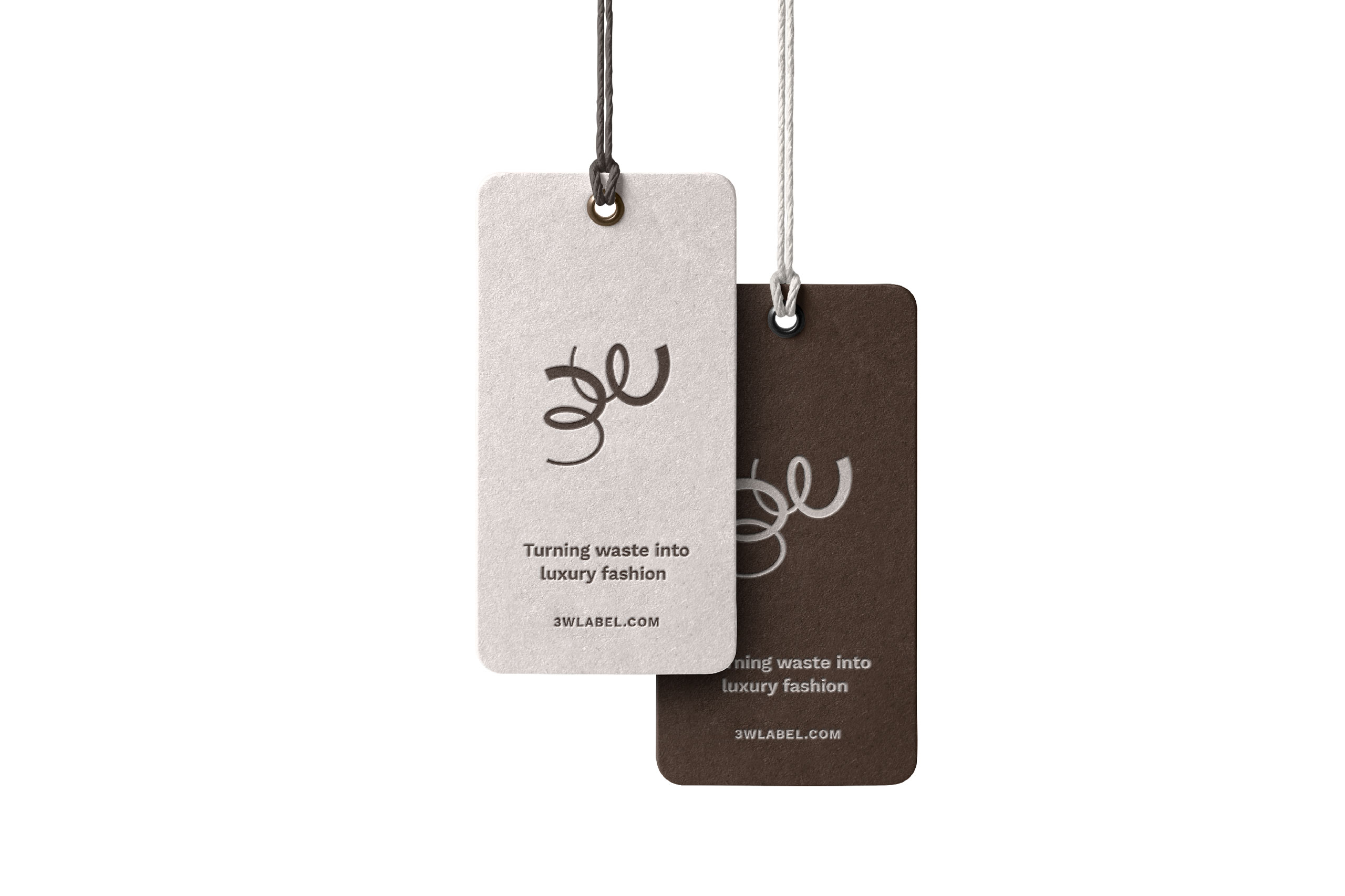
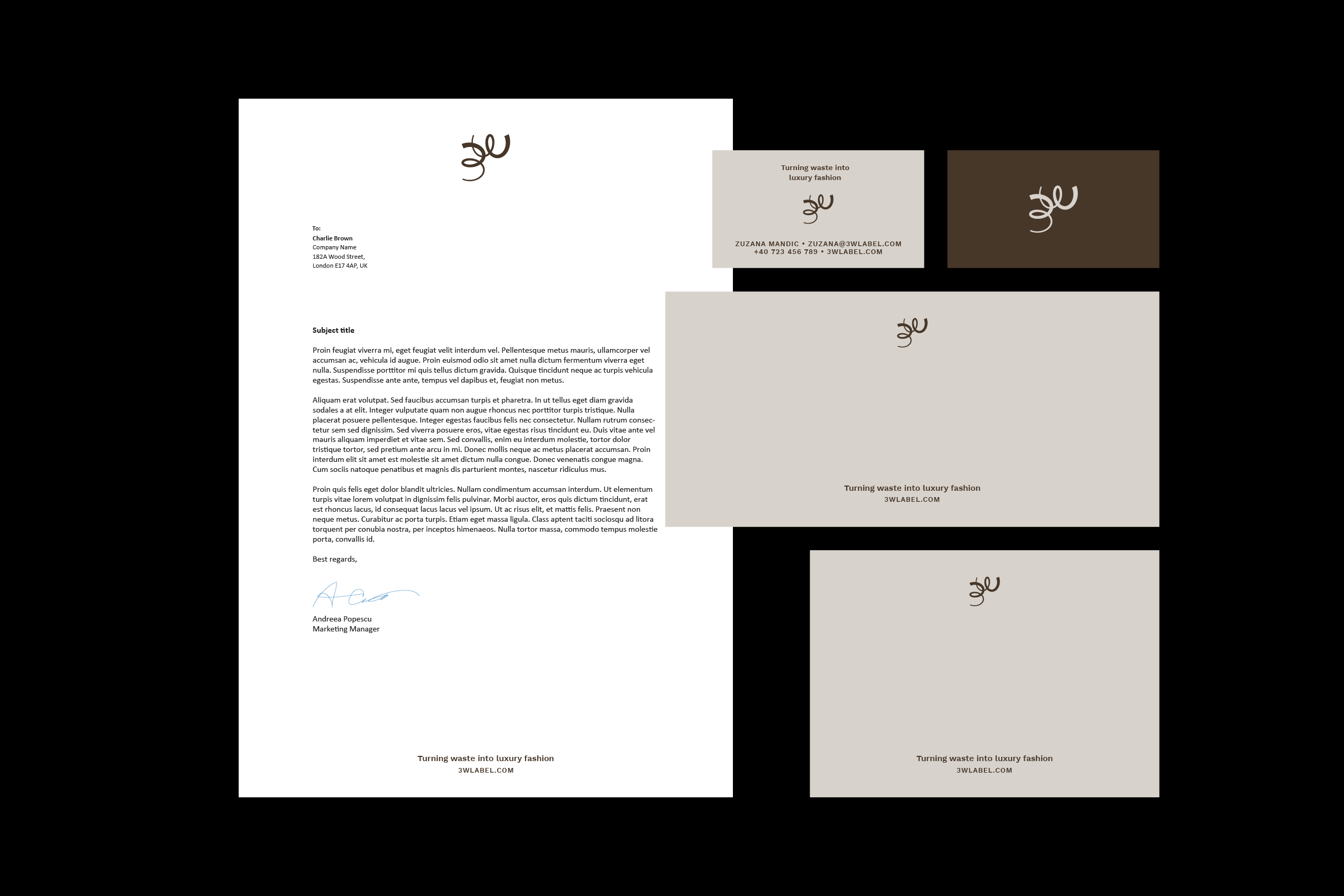
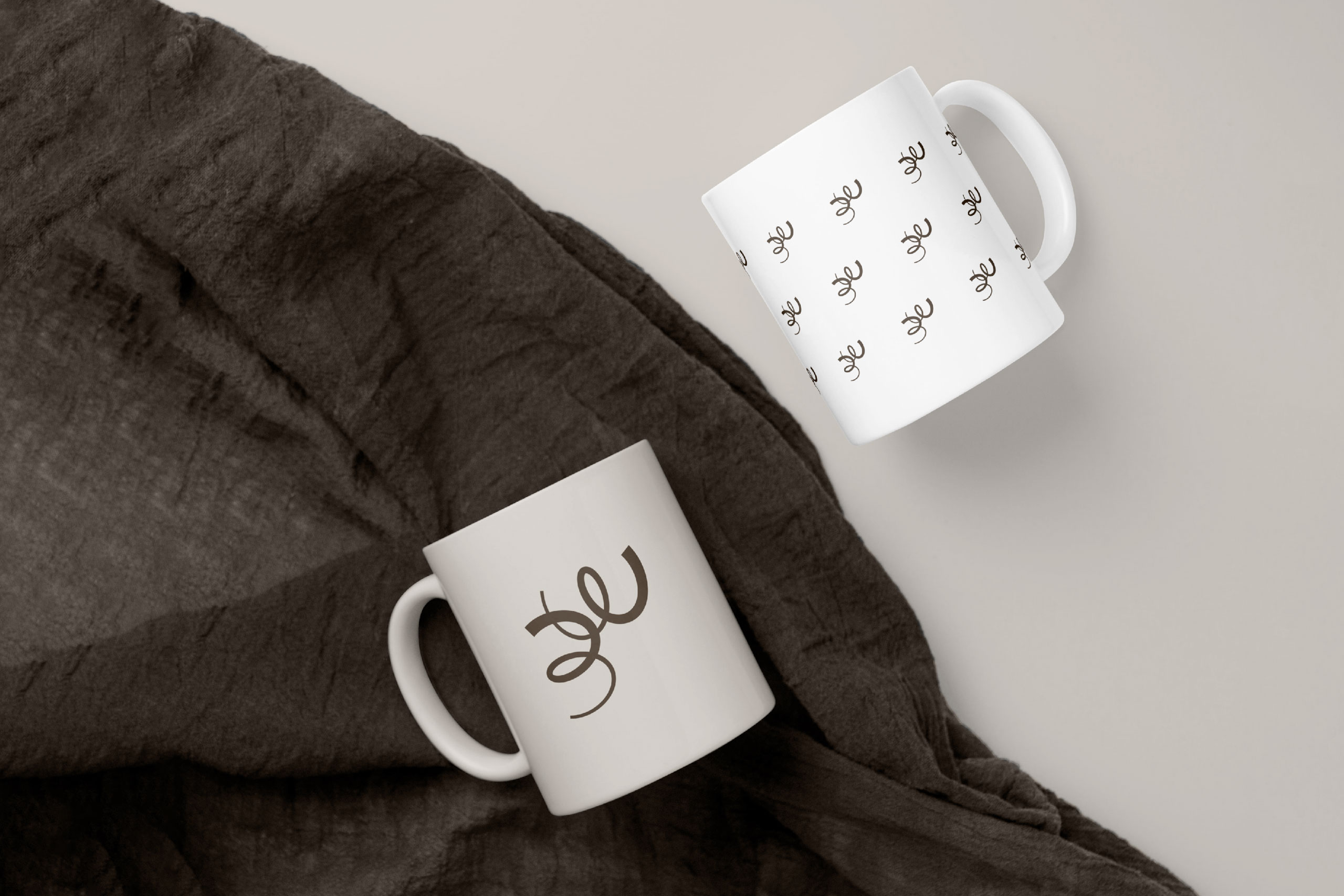
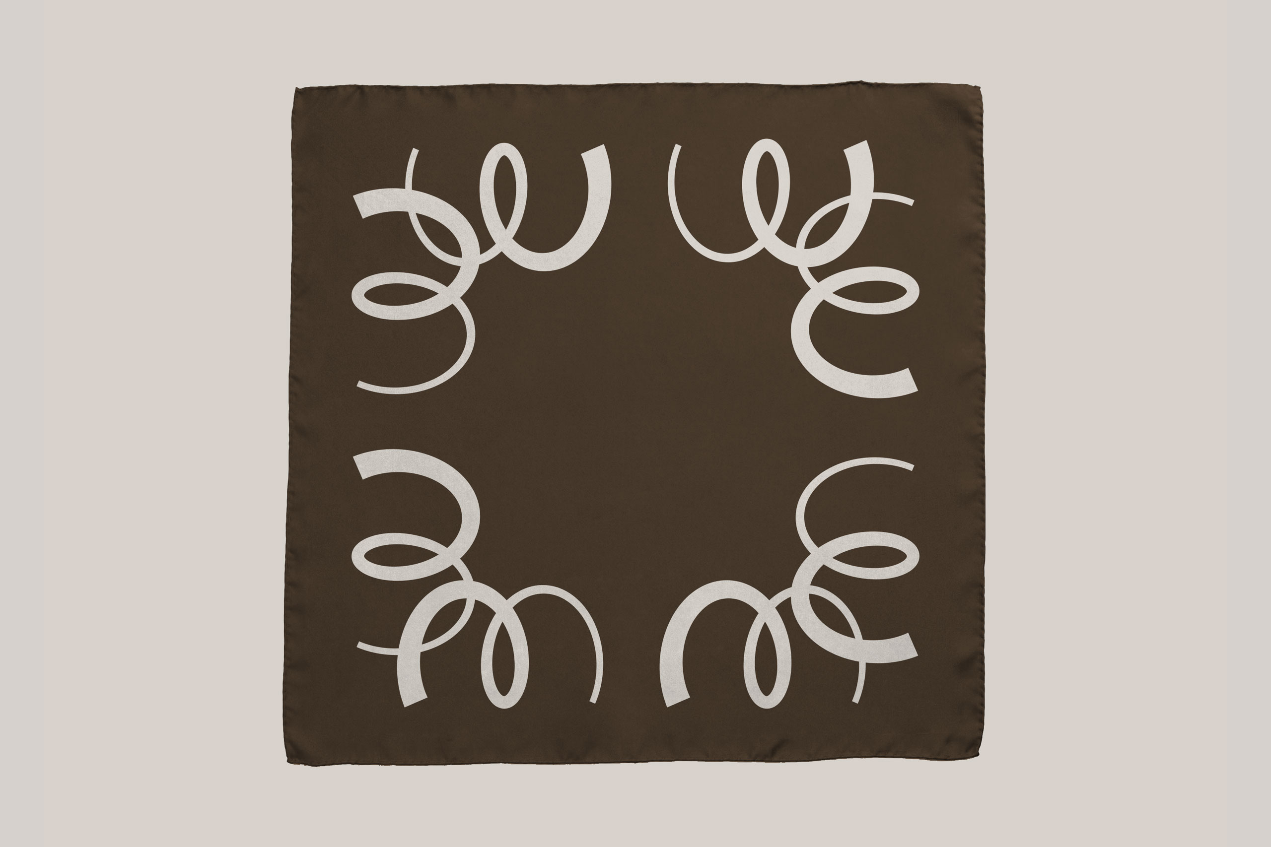
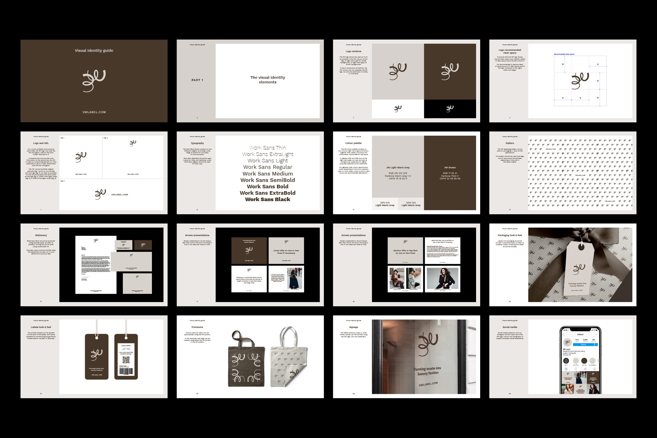
The logo uses the same shape for both the 3 and the W characters, highlighting the sustainable approach of the brand. Thin-to-thick lines suggest the transformation of waste fabric into garments. Smooth curves reference the quality of the fabrics, while the sharp cuts suggest the timeless design approach. The modern and versatile Work Sans typeface and the elegant, earthy colour palette complete the 3W look and feel.
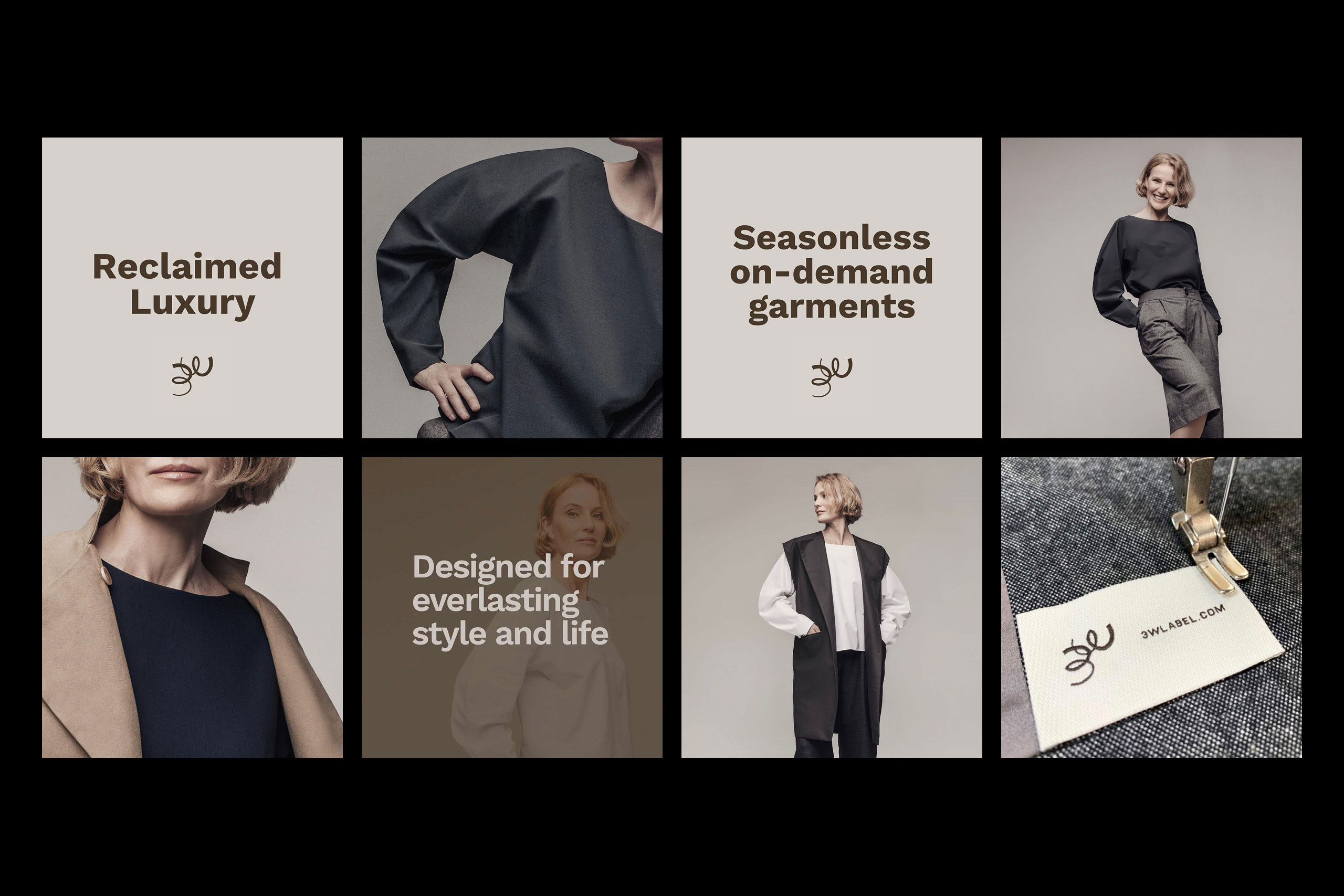
The identity elements are used across a wide range of applications, from packaging and garment labels to premiums, stationery and digital templates. A brand guidelines document explains how to use the elements consistently. It’s been a real pleasure seeing the 3W brand identity grow through its use on their website and social media.
Credits
Working together with Anathomia, and Irina Moreno and Zuzana Mandic, the founders of 3W Label. You can read more about their mission on the 3W Label website.
Photography by Oltin Dogaru (last image).