Roisin van Ravenhorst
Overview
Following an exciting career as a speech coach, Roisin van Ravenhorst has been establishing herself as an interesting thinker and adviser to people in the business world, who are hoping to enjoy their work more, to supercharge their careers, and perhaps to get to a more healthy place in their non-work life. My long time friend, Matt Rudd from Rudd Studio, asked me if I could help with Roisin’s new identity.
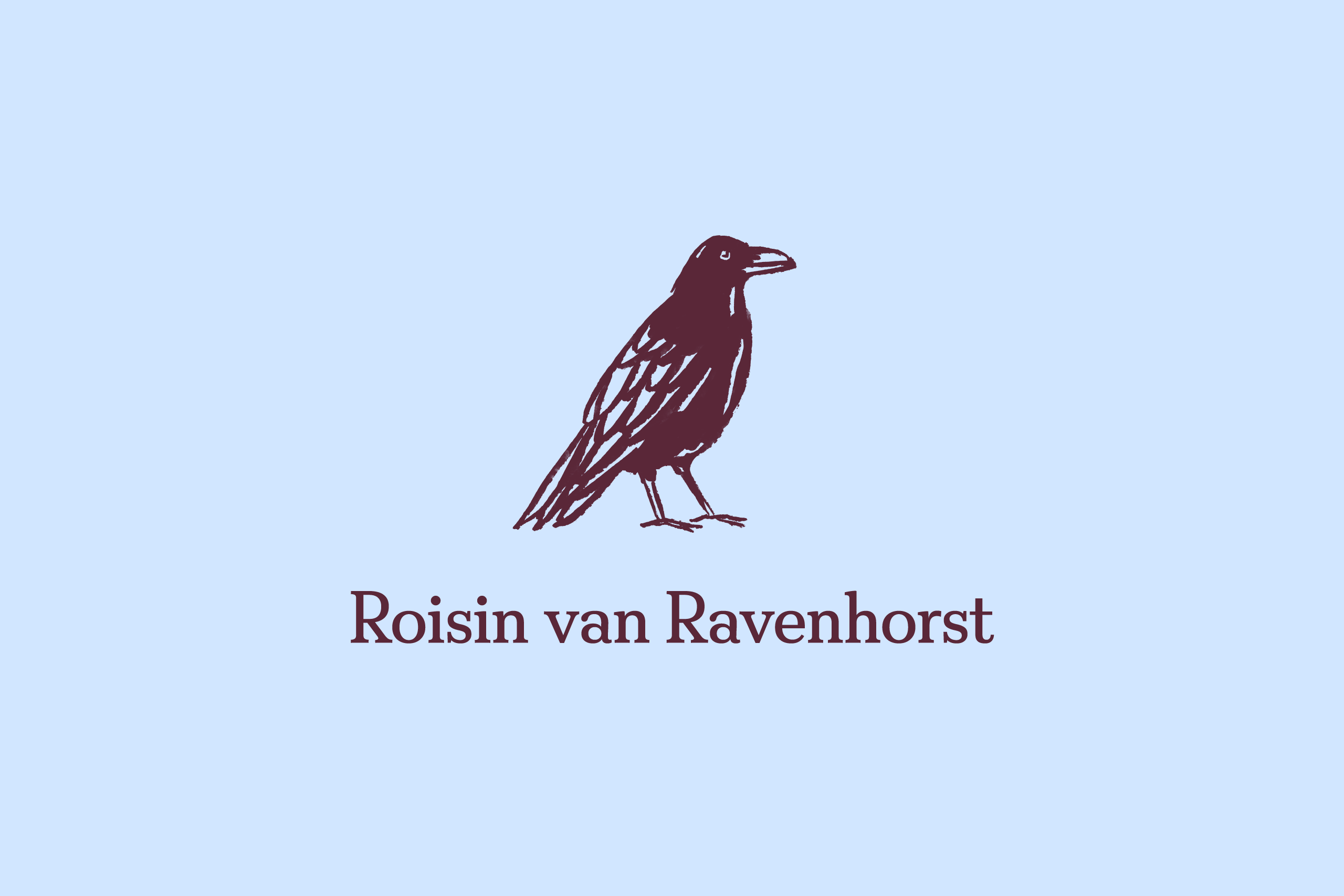
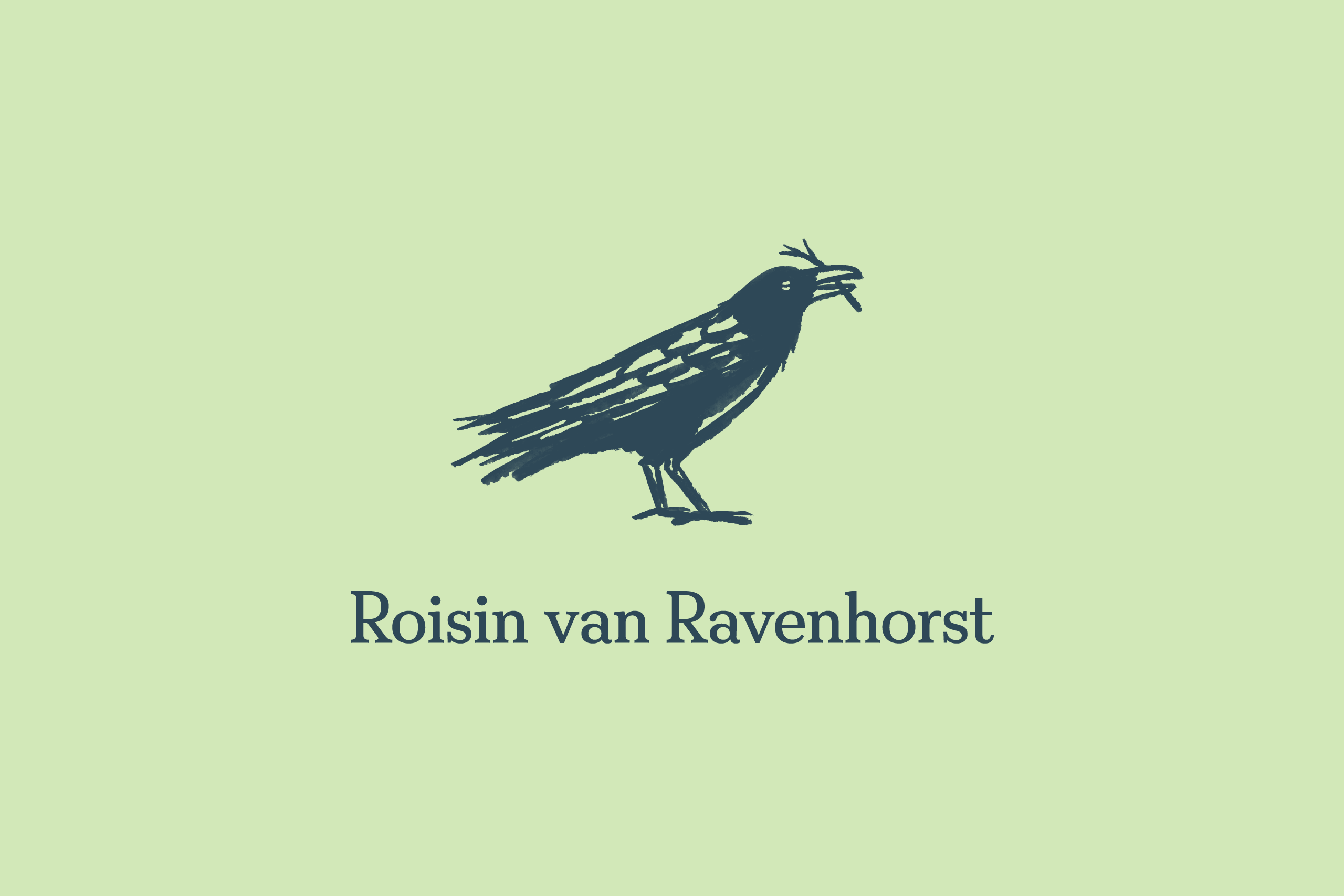
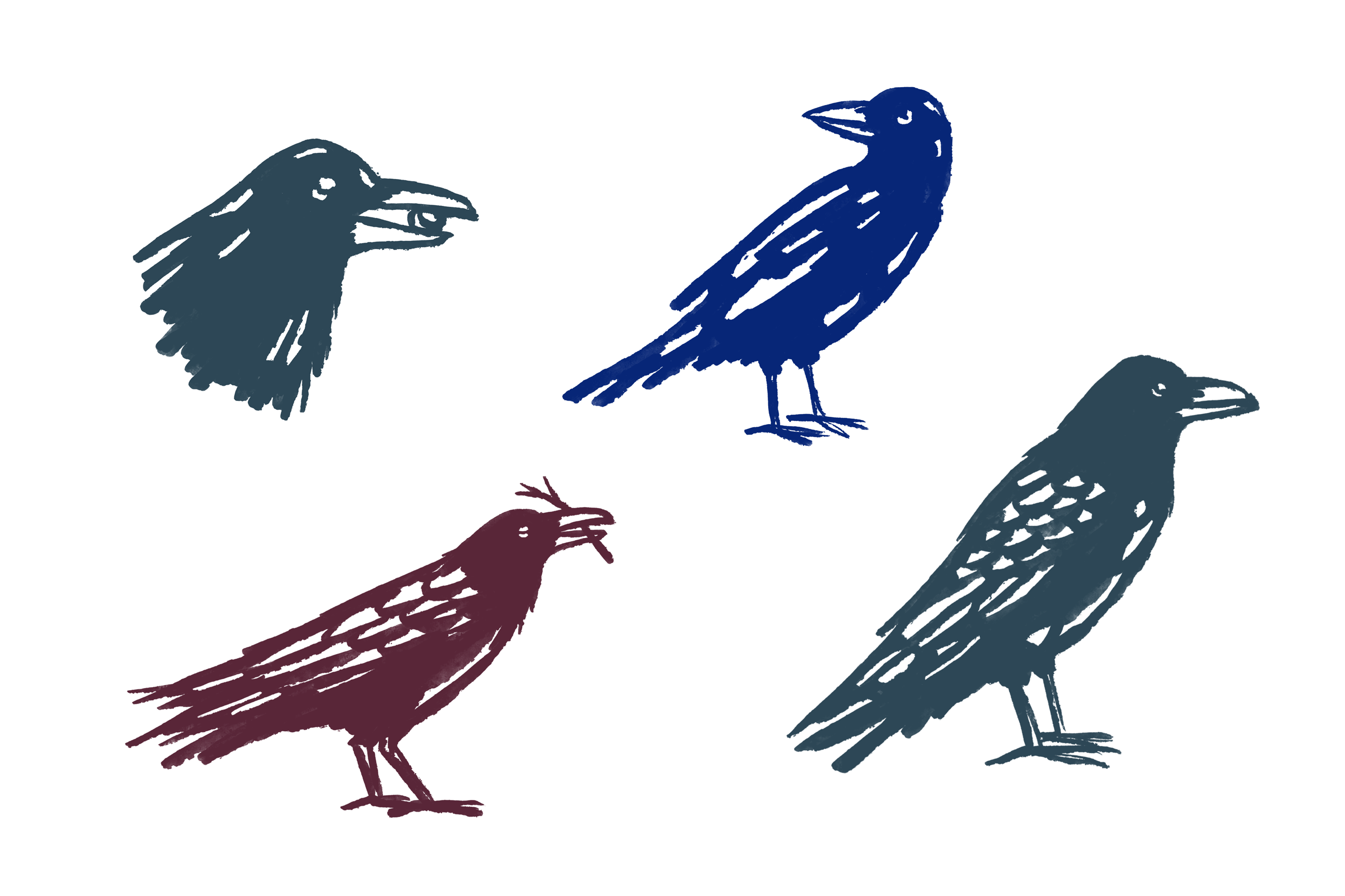
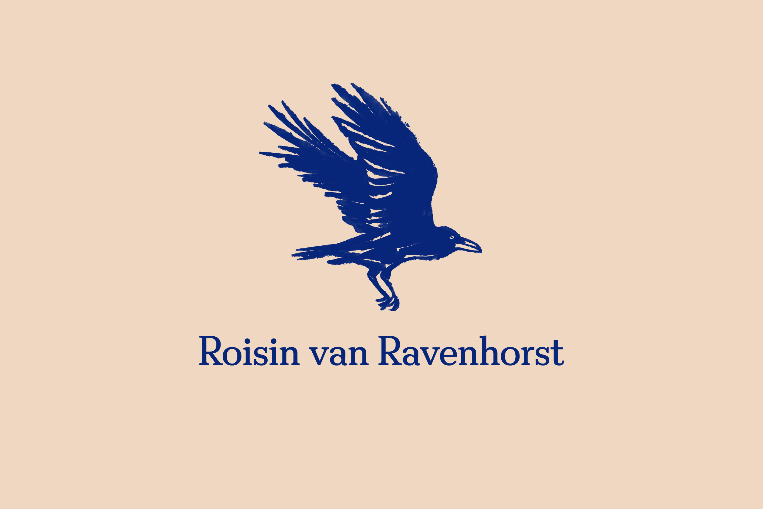
Van Ravenhorst means “of the raven’s nest” in old Dutch, so our goal was to create a logo and identity based on the raven – an exceptionally intelligent bird which is often associated with prophecy and insight.
Process
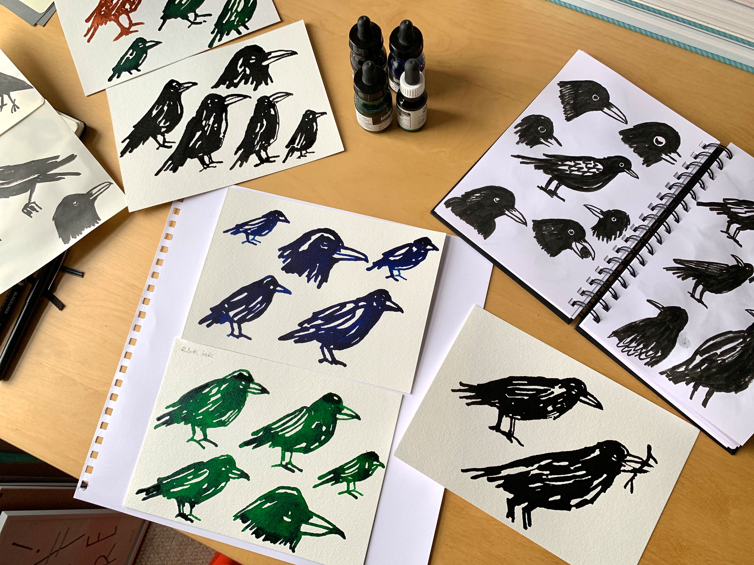
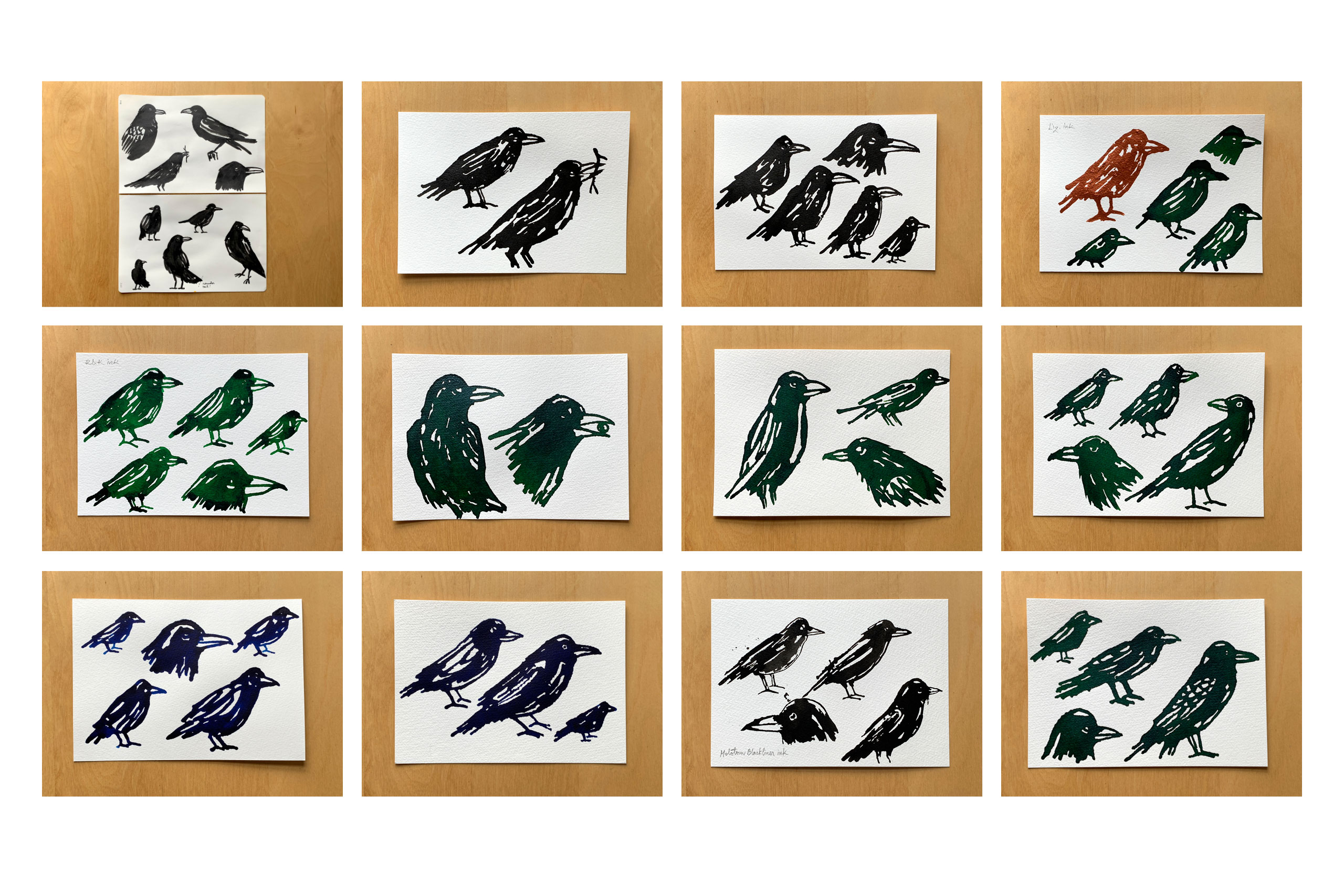
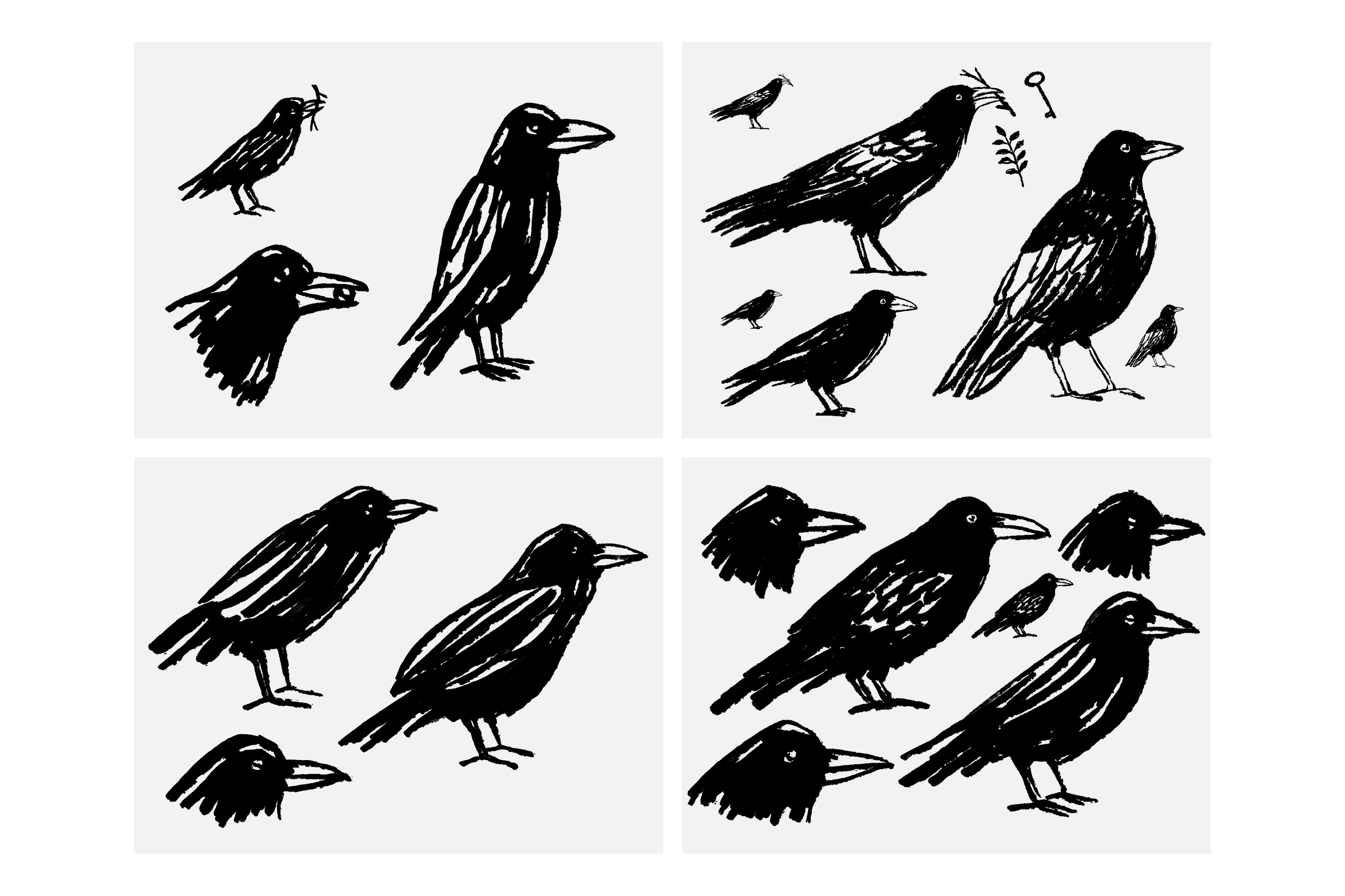
Drawing the ravens required a lot of testing of different tools, both analogue and digital. I started by using brush pens, then switched to pippettes. These were harder to control, but had a lot more energy in their lines. After scanning the better drawings, I redrew them entirely using a digital ink brush, making sure that the overall handmade quality remained present.
Identity elements
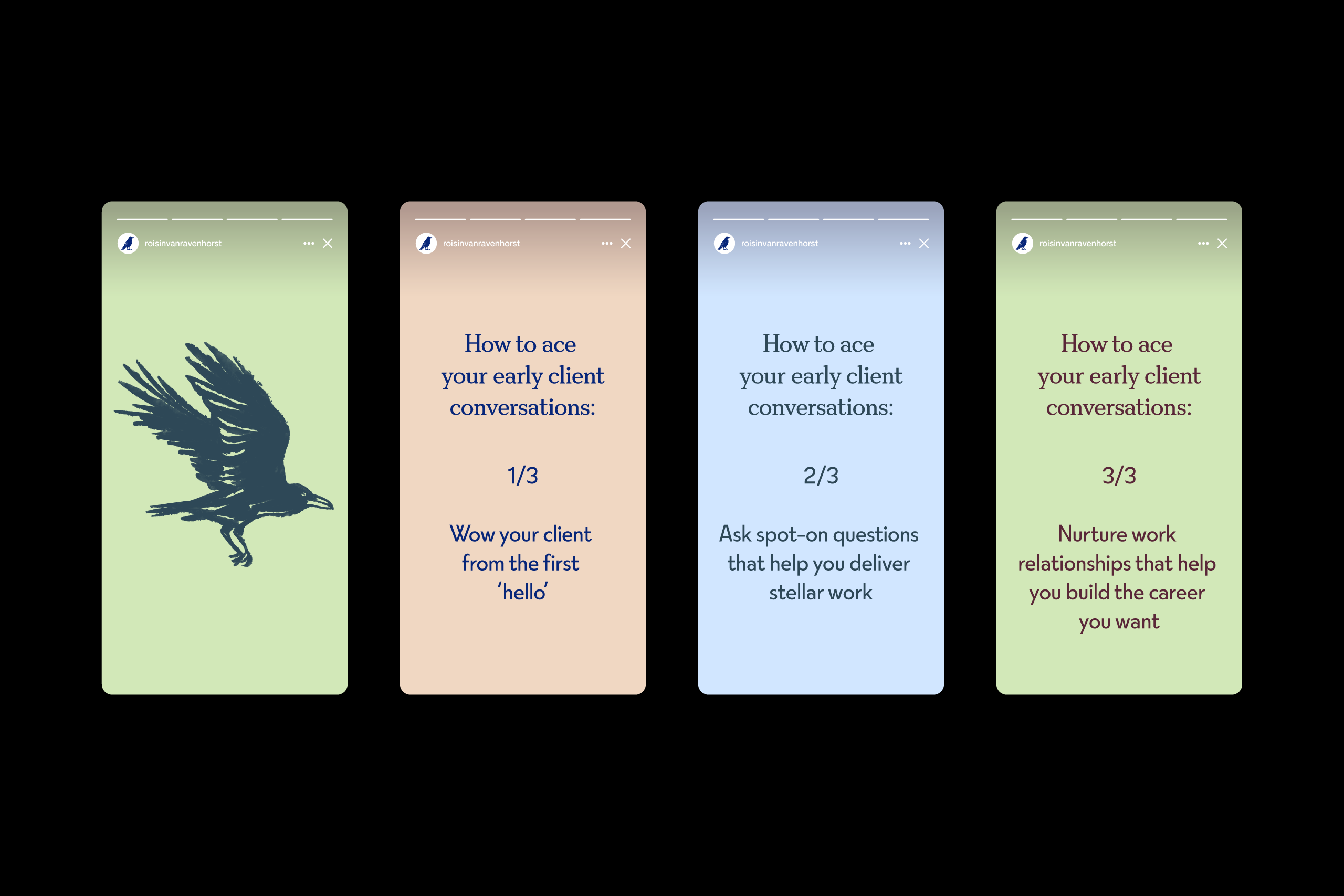
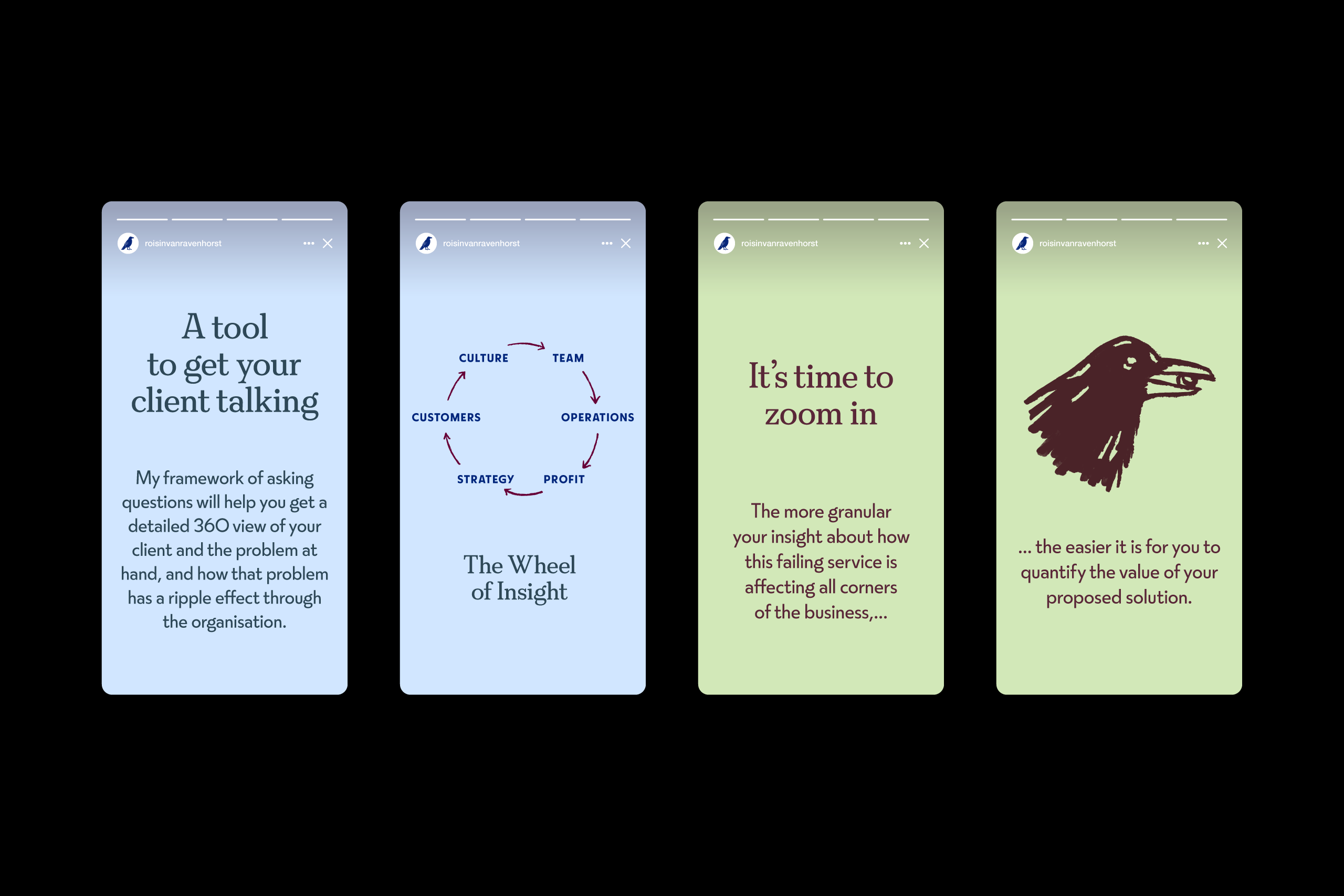
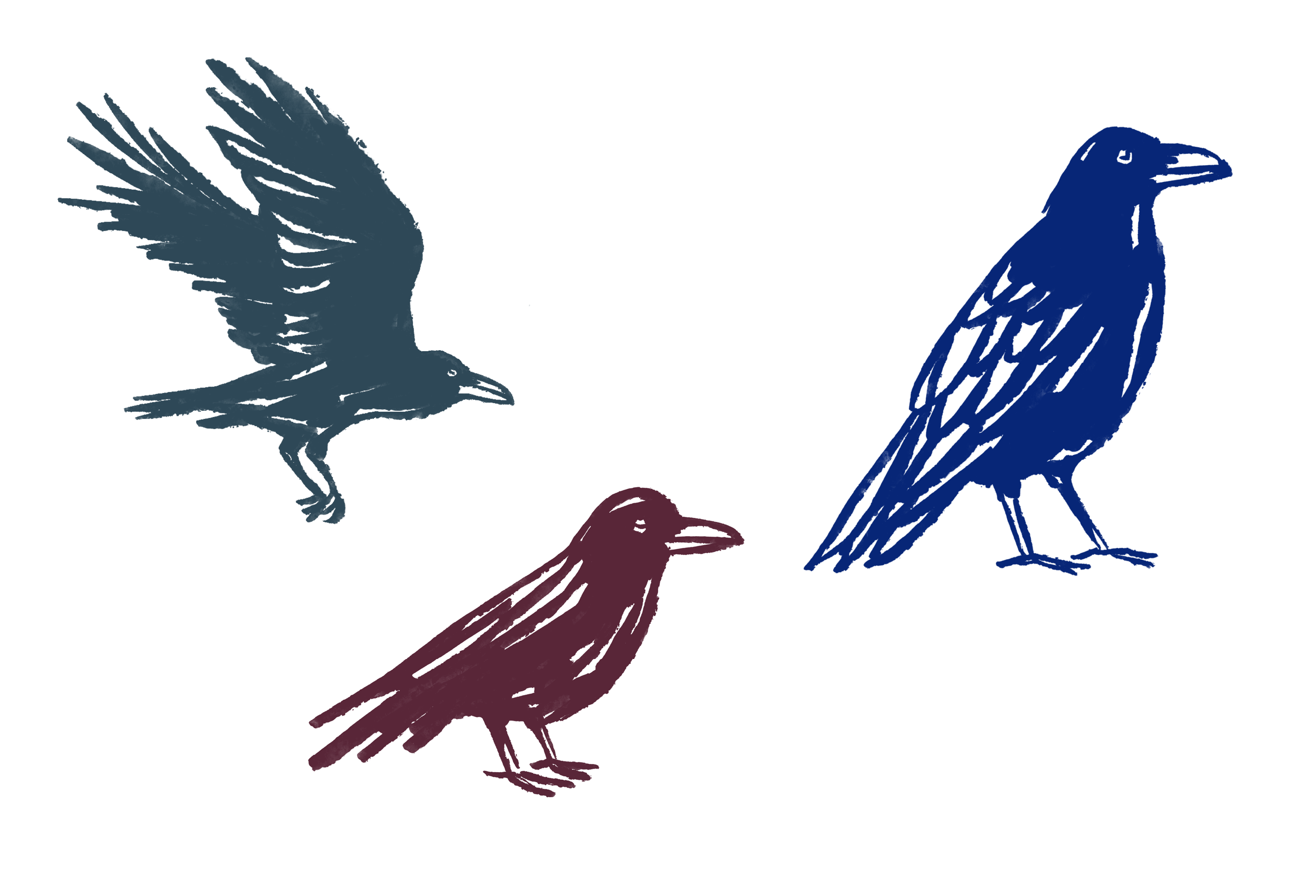
The ravens can work either as logos or as visuals, illustrating different concepts in Roisin’s work. The natural colours give the identity a relaxed and optimistic feel, and help avoid any negative associations for the ravens.
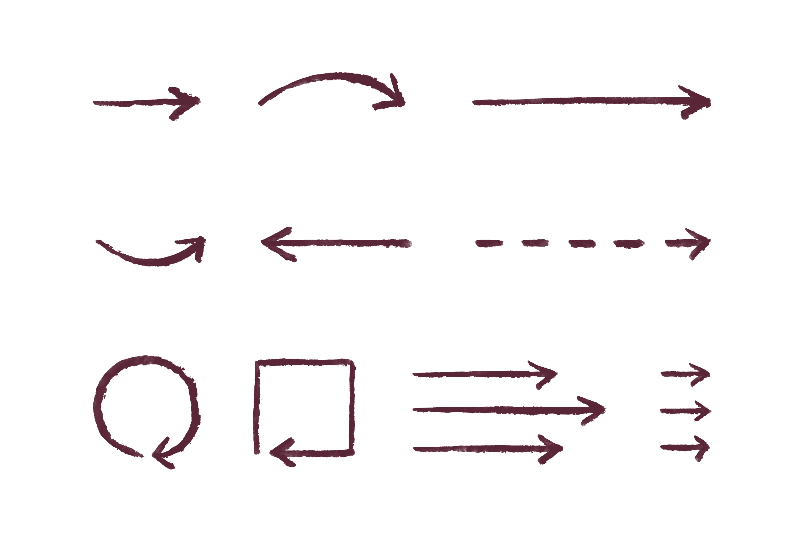
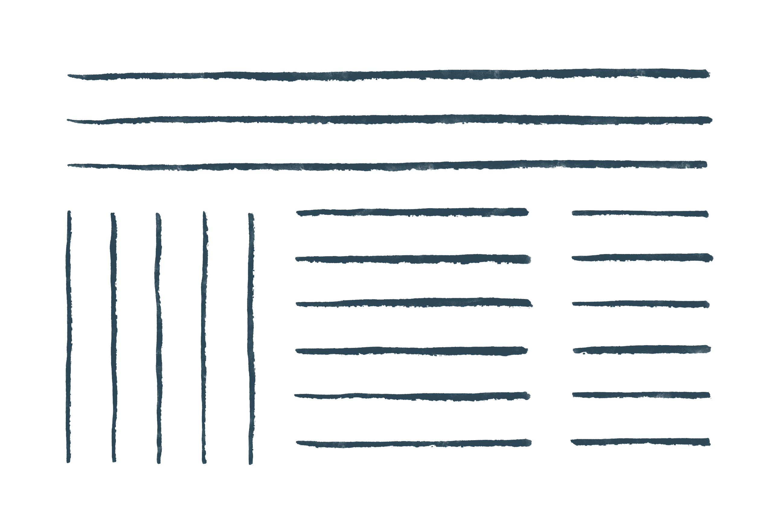
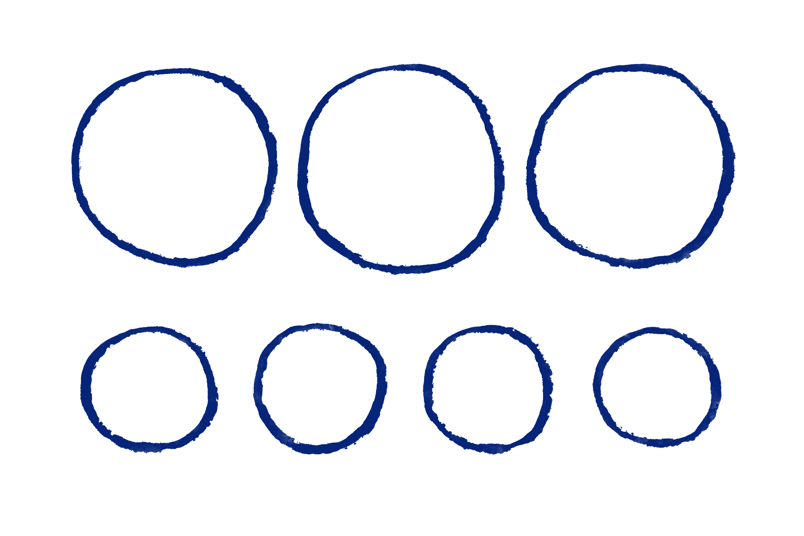
Using the same brush style, I also created a series of shapes, lines, arrows and other graphic elements which Roisin can use in her presentations or social media posts.
All the visuals and the colours can be used in a flexible way, creating a coherent identity across any type of materials.
Client feedback
Roisin’s feedback about her new identity couldn’t have been better: “Every time I see it, it makes me happy“.
Credits
Working together with Roisin van Ravenhorst (the client) and Matt Rudd (Creative Director).