Leeds Alumni Magazine
Overview
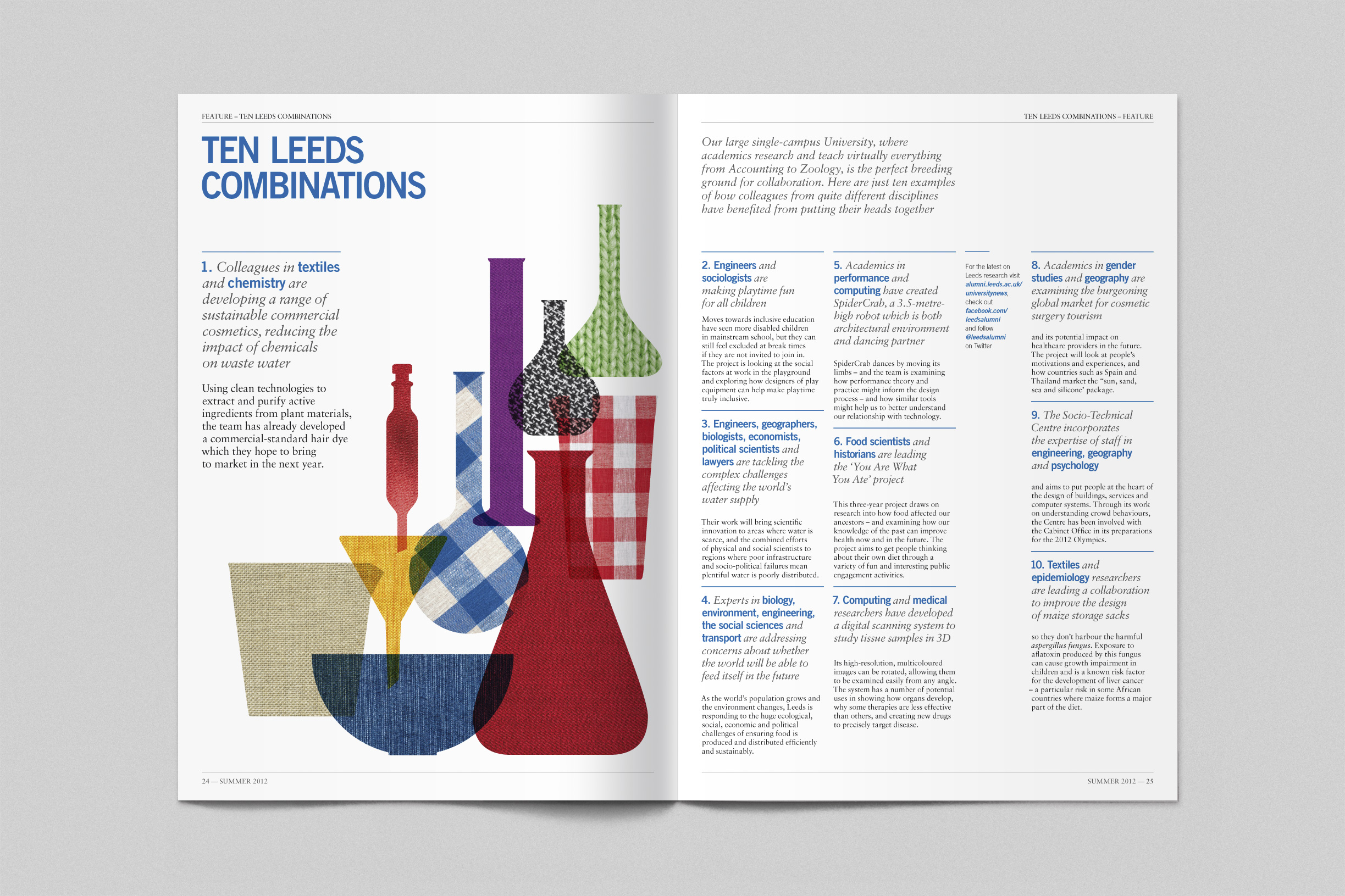
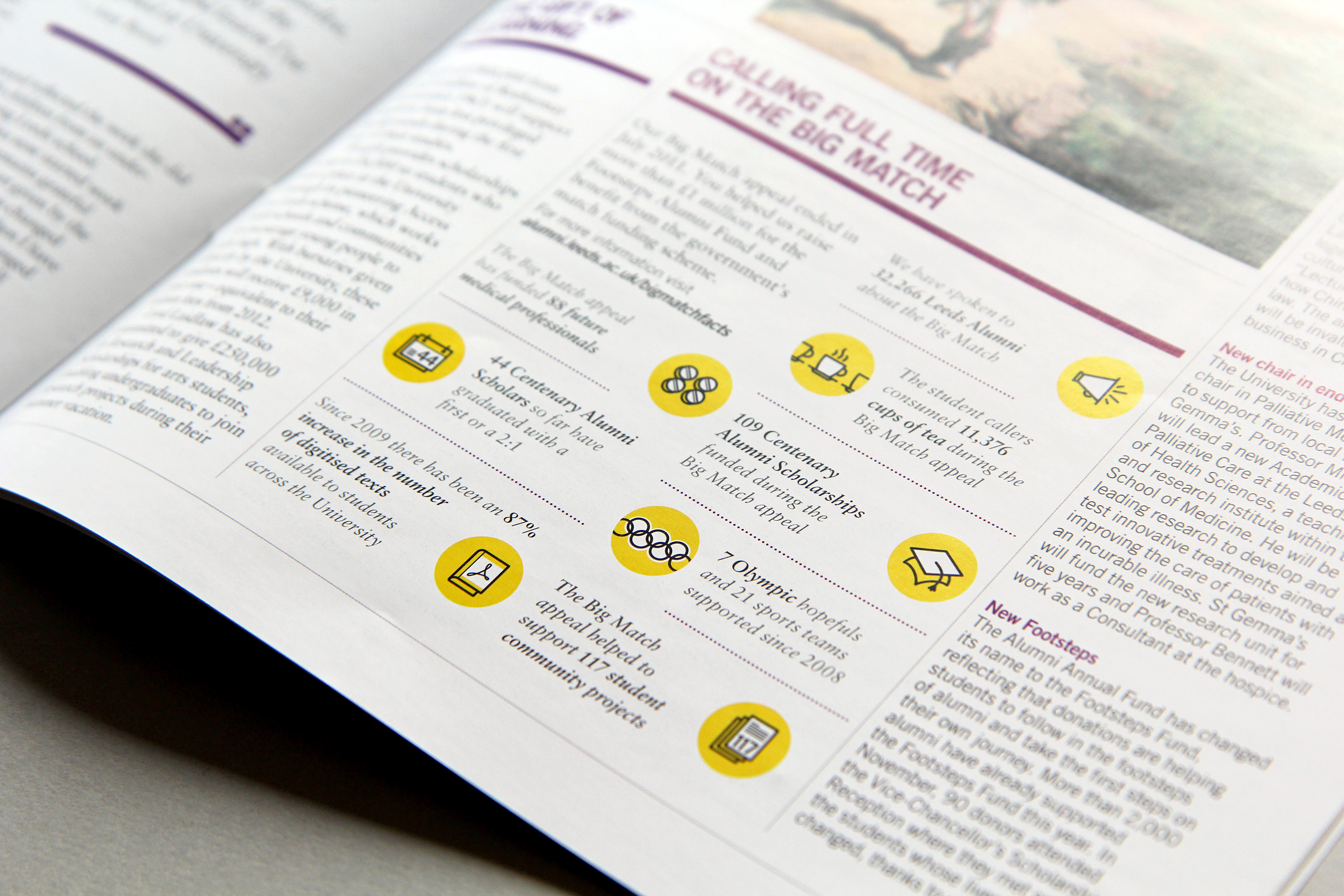
The University of Leeds has a strong alumni network, in more than 50 countries across the globe. The Alumni magazine keeps them updated with the school’s latest news and is published twice per year. For two issues, I was in charge of the magazine’s editorial design and art direction. While I didn’t design the magazine’s general identity, I’ve made many refinements on its design and especially on its typographic elements, improving its overall consistency.
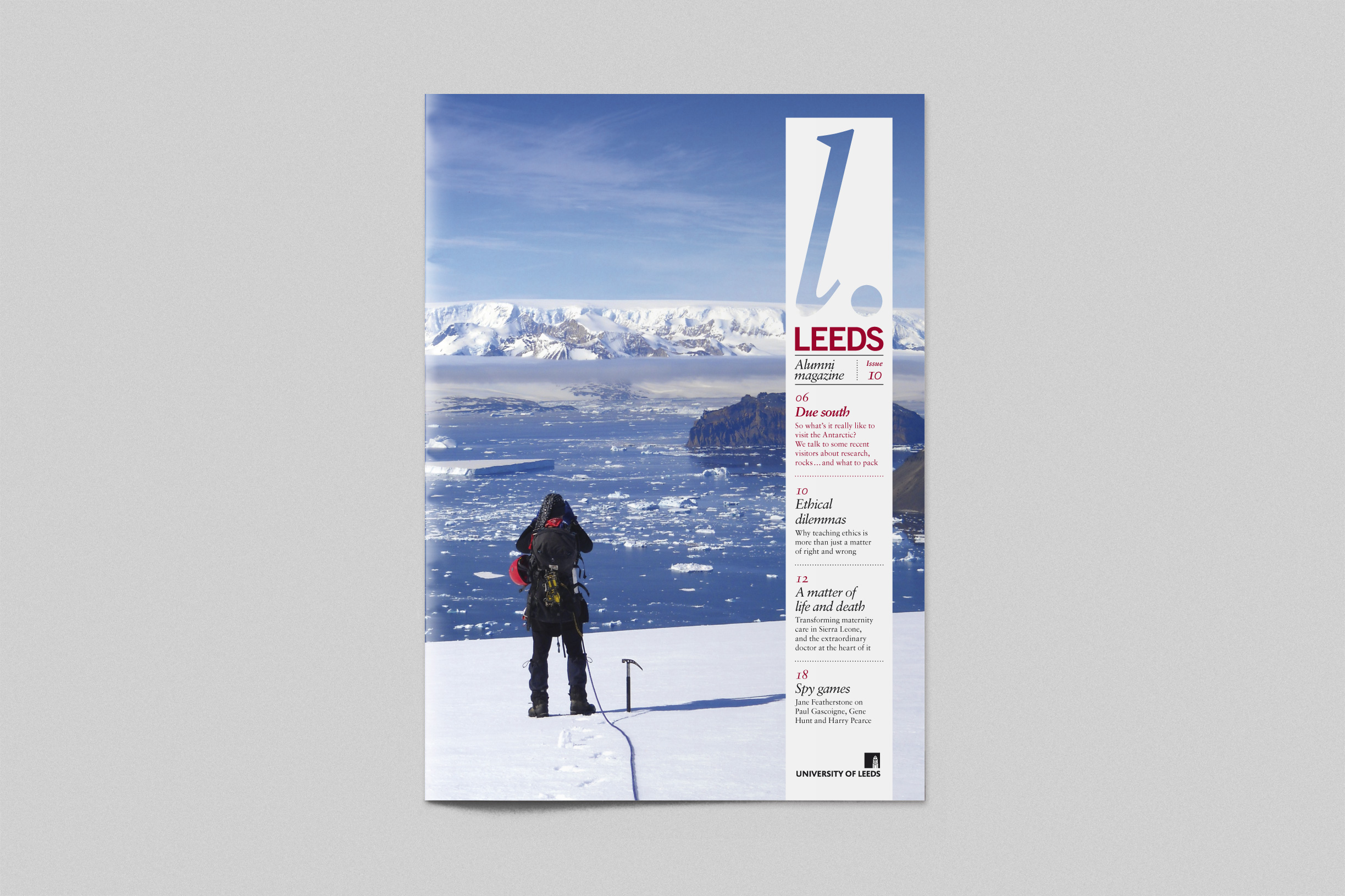
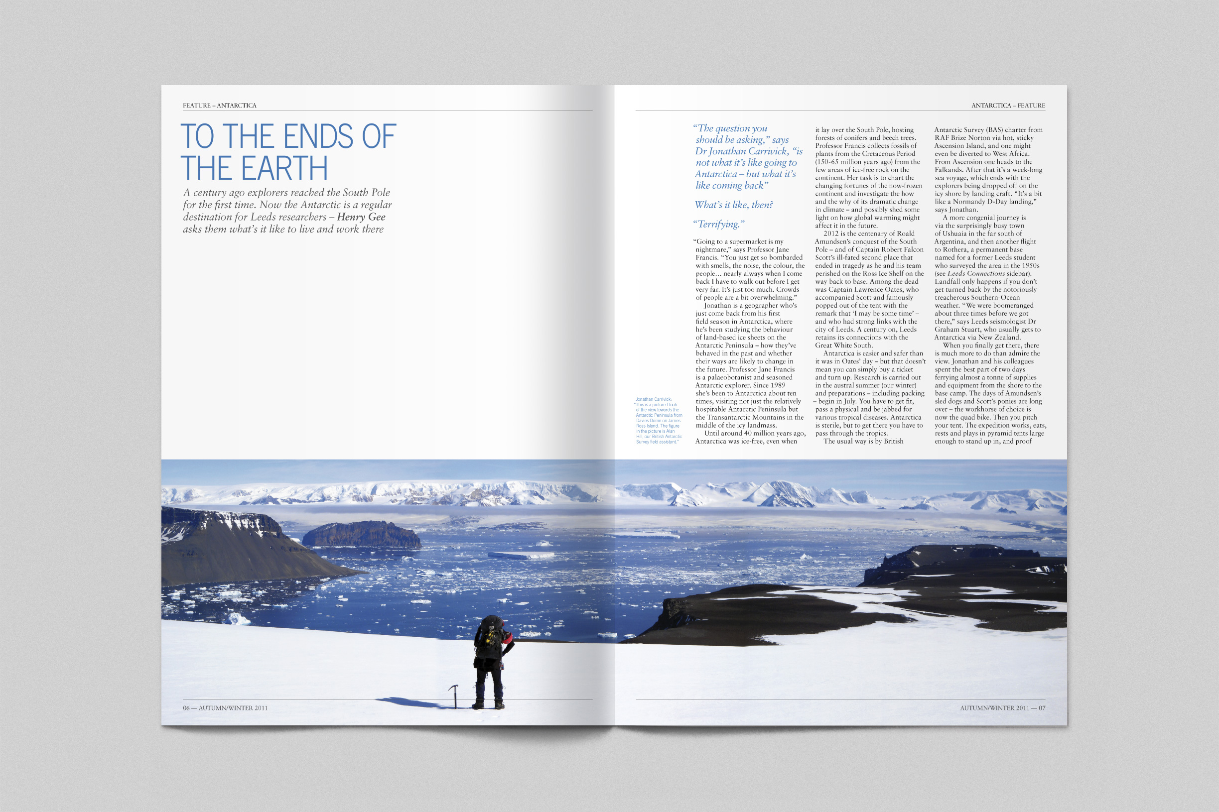
The winter 2011 issue main feature was a two spreads story about the Leeds’ alumni Antarctic expeditions, also depicted on the cover. A generous amount of whitespace on the opening spread was used to suggest the vastness of the ice lands and the overwhelming feeling of being insignificant.
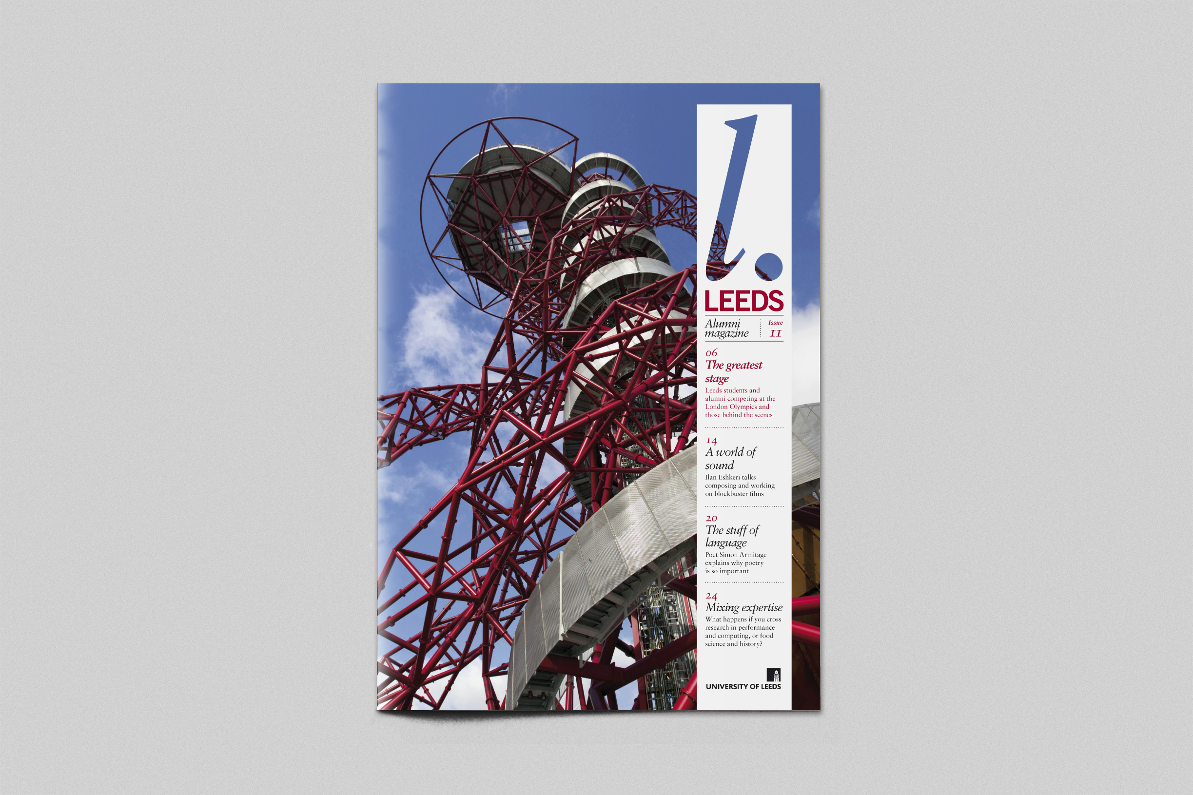
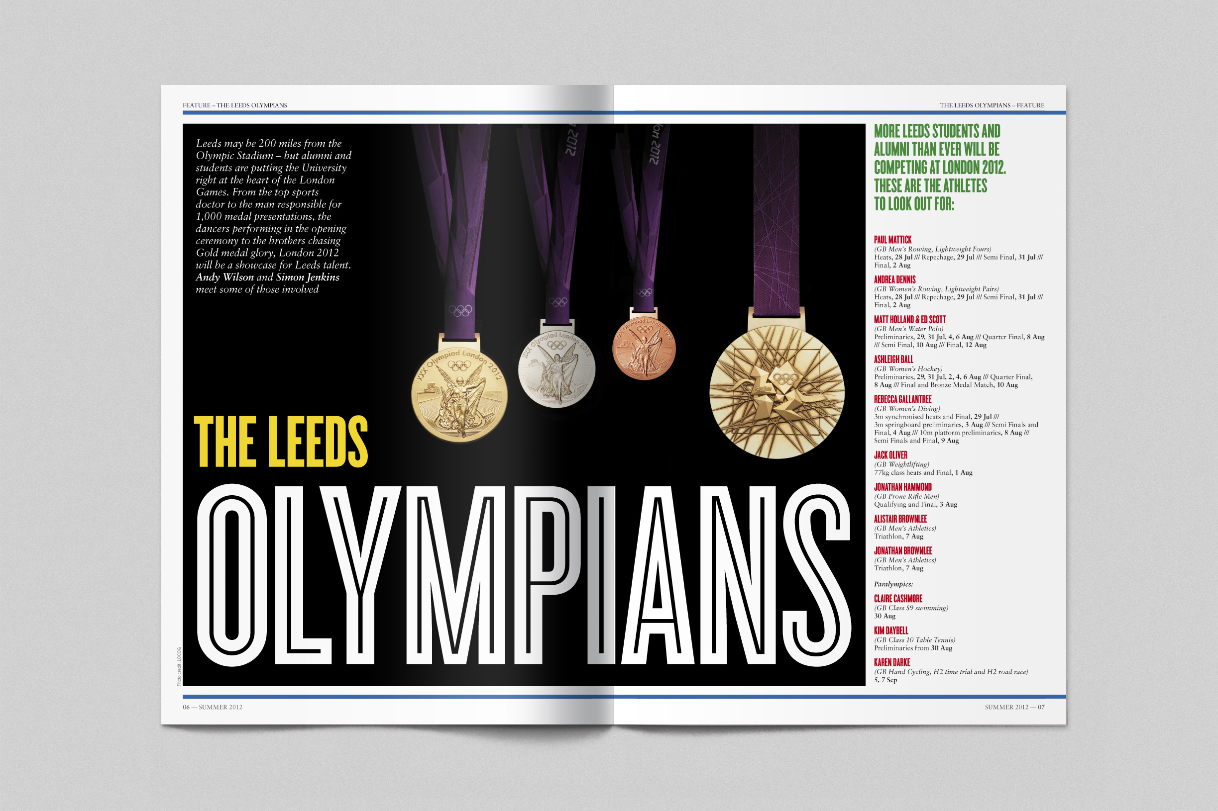
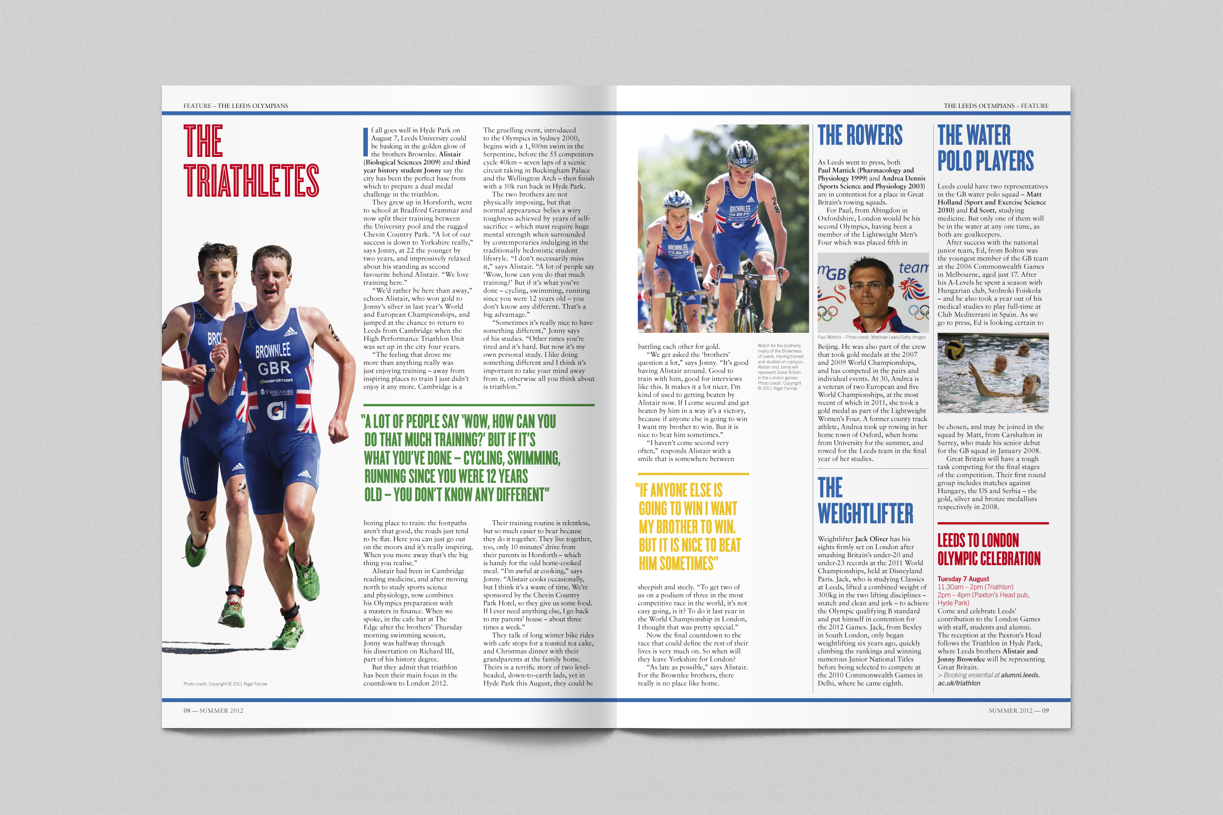
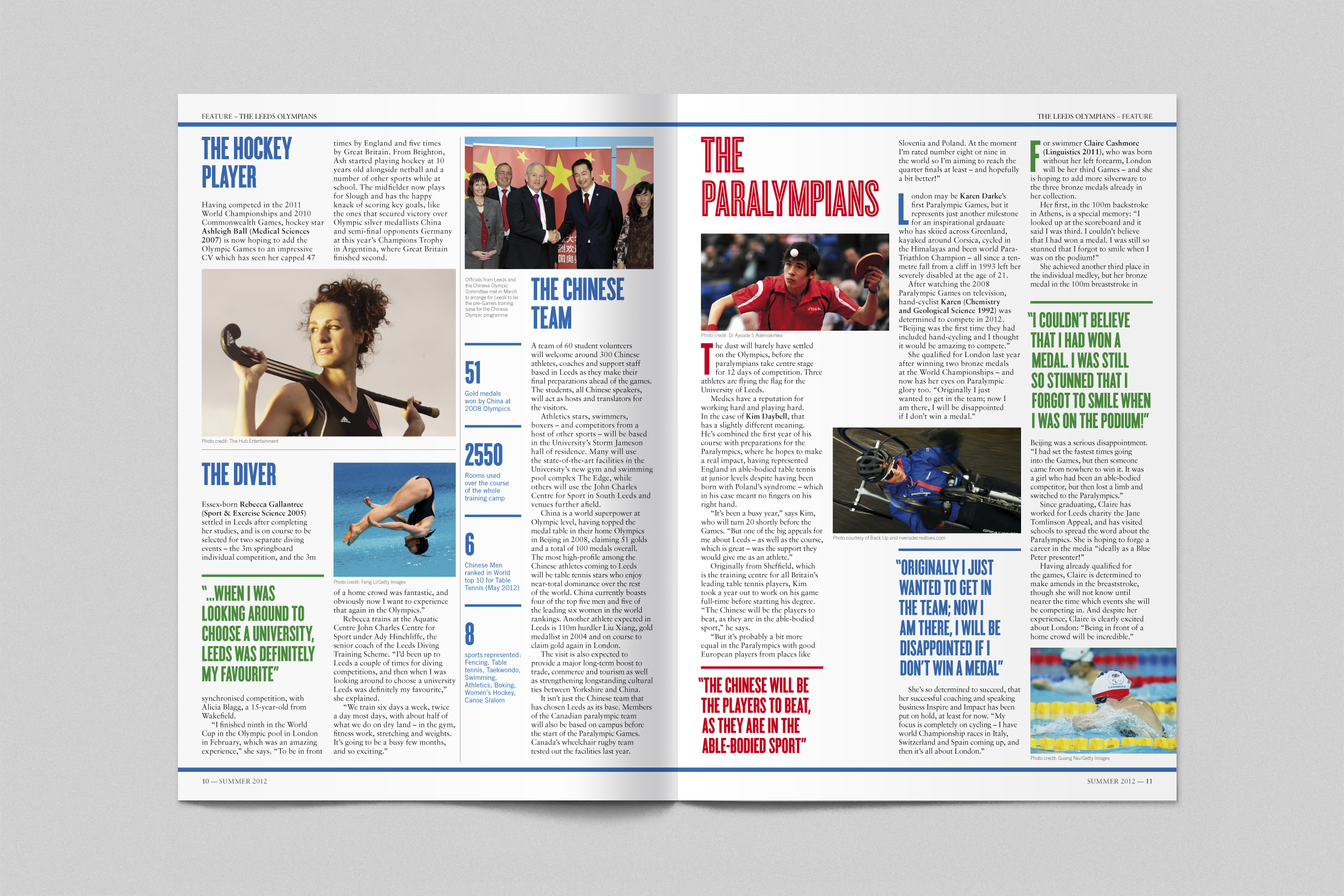
The 2012 summer issue proved to be a tough challenge, as the main feature article was about the Leeds Olympics participants, but the tough Olympics rules restricted the usage of most of the available content. Still, a strong visual theme was designed, relying on a ‘guest’ inline typeface used in all-caps, together with the five Olympic colours, all suggesting the Olympic theme. On the opening spread the proud “Leeds Olympians” title is accompanied by the names of the Leeds participants, together with the dates when they would compete, almost in a film poster manner. Stories are ‘running’ together on their own lane, continuing across the spreads.

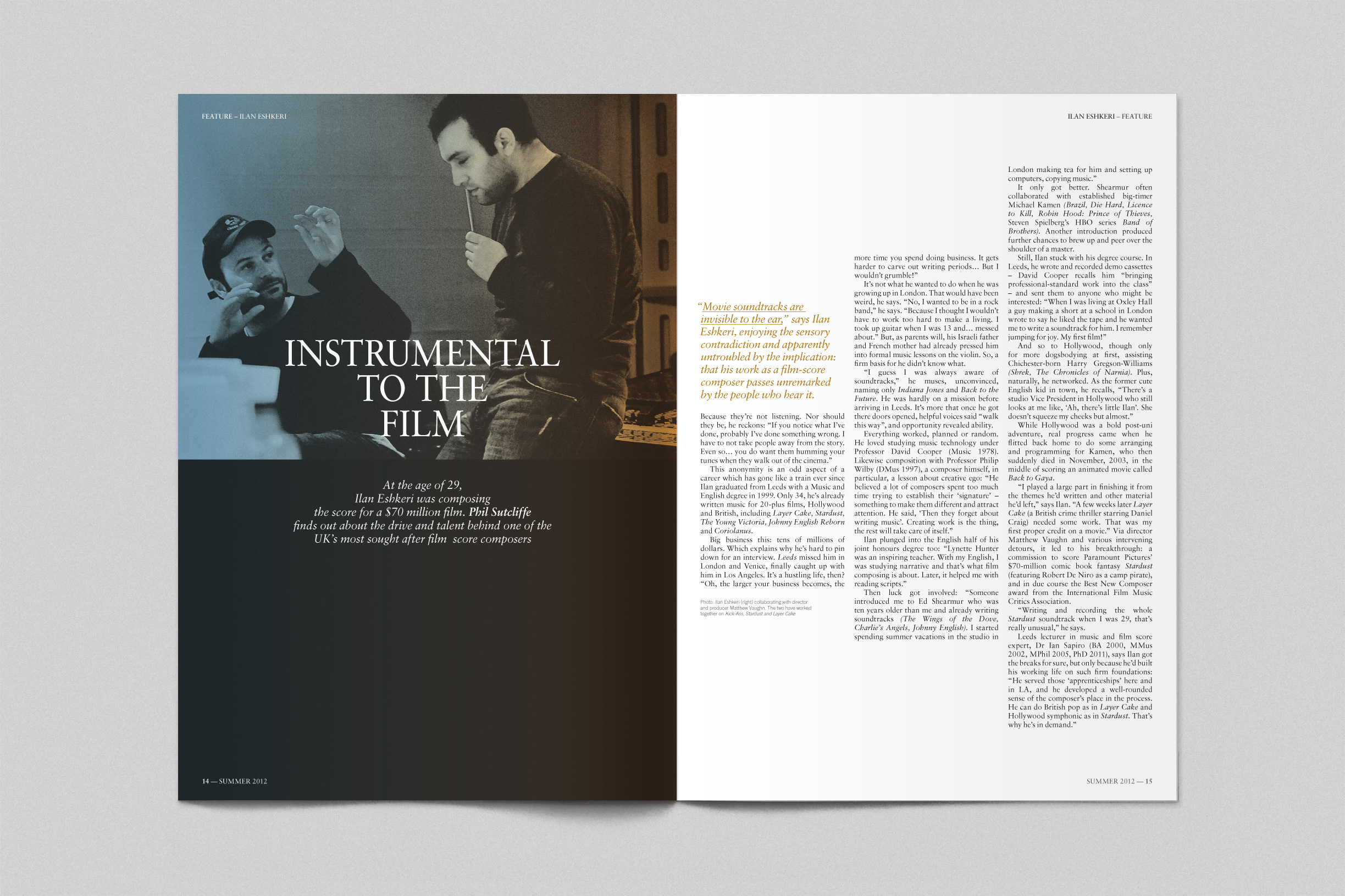
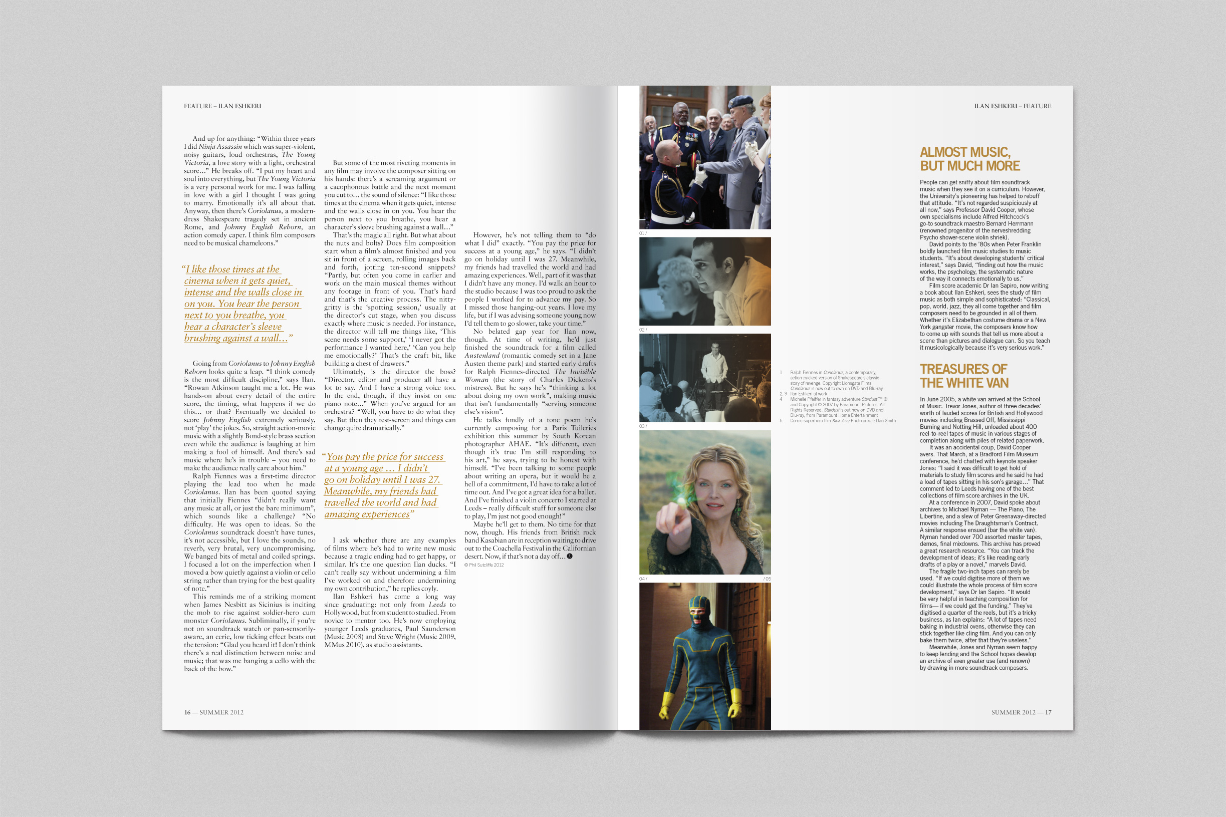
The second feature was about Ilan Eshkeri, a successful film score composer. The spreads mimic the main subject through the arrangement of columns and text lines that suggest sound waves or equalizers. The colour treatment of the black and white photography showing the composer goes from cold to warm, suggesting the emotion that a good score can add to a film.
Credits
Designed while I was working full-time at Appetite. Team: Daniel Vasconcelos – Design Director, Iancu Barbarasa – Senior Designer.
