Valence
Overview
Identity design for Valence, a company that helps people learn how to build stronger bonds with their colleagues, such that their teams are more than the sum of the parts.
Valence had been working for a few years under the name Shift. Parker Mitchell, the company’s founder, got in touch, asking me to help them update their identity. We discussed several concepts, with one of them being the clear favourite. However, during the process, it became clear that the Shift name no longer matched the company’s goals and services. After discussing a few name options, we agreed that Valence would be a good choice. Besides its use as a chemistry term, valence means “a relative capacity to unite, react, or interact”. This matched perfectly with our favourite identity concept.
The solution
A murmuration describes the flocking of starlings, often in large flight formations. It’s incredible to see (check out for example Søren Solkær’s “Black Sun” photography project), and a perfect metaphor for achieving amazing things through teamwork.
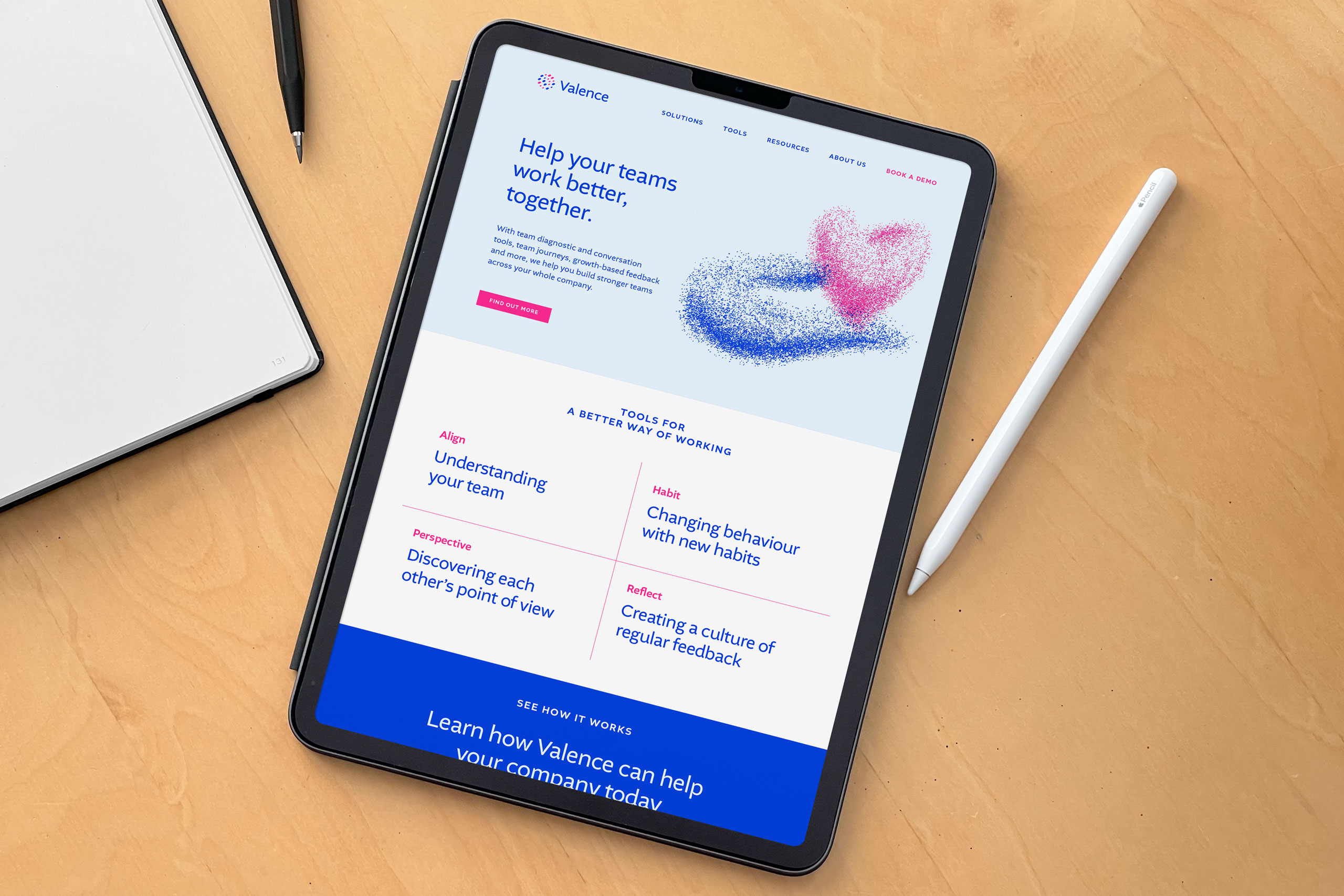
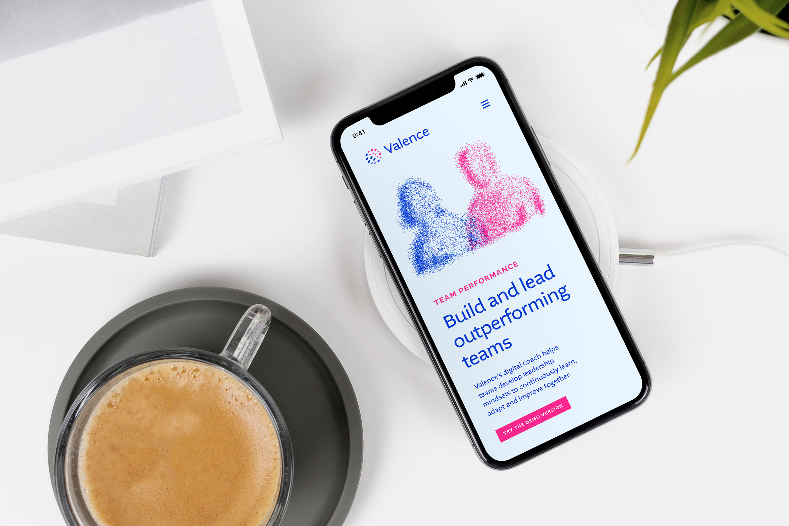
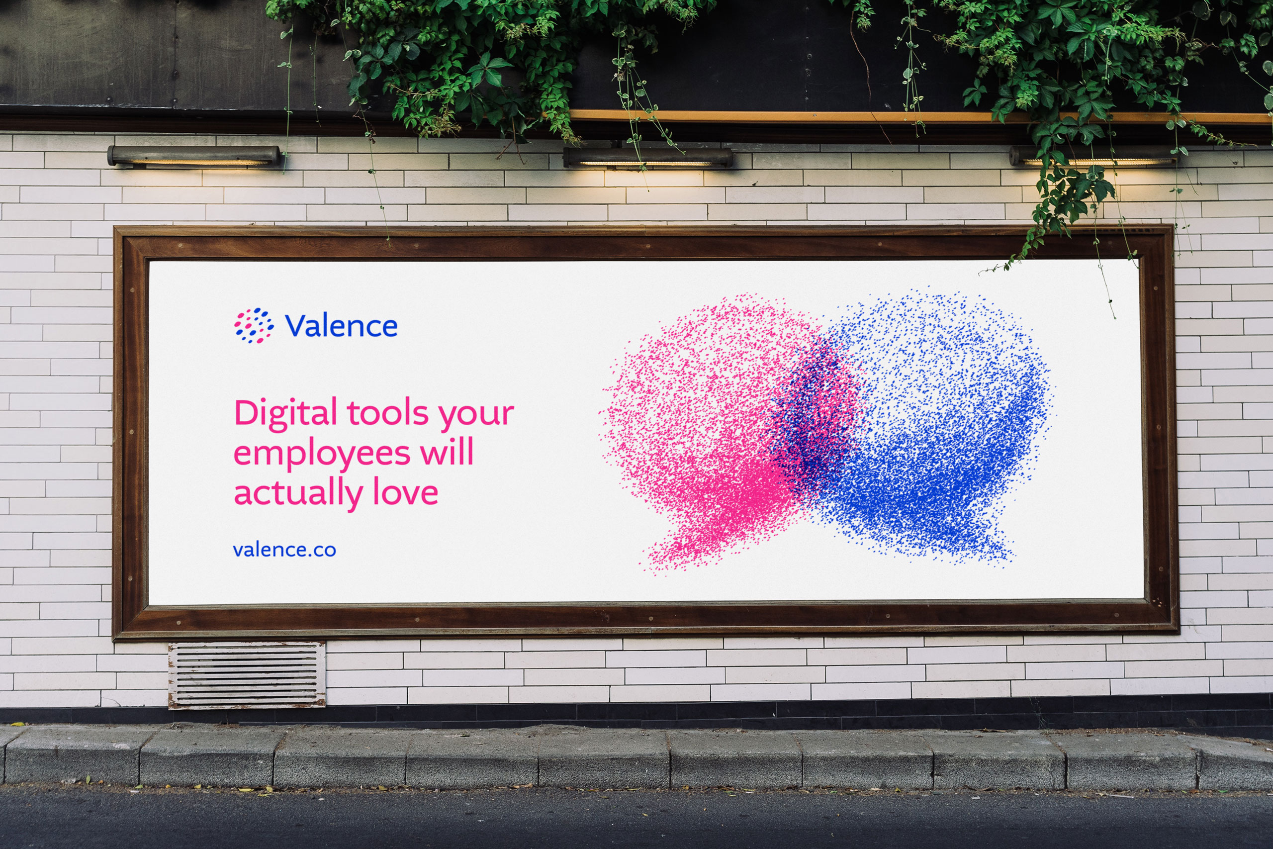
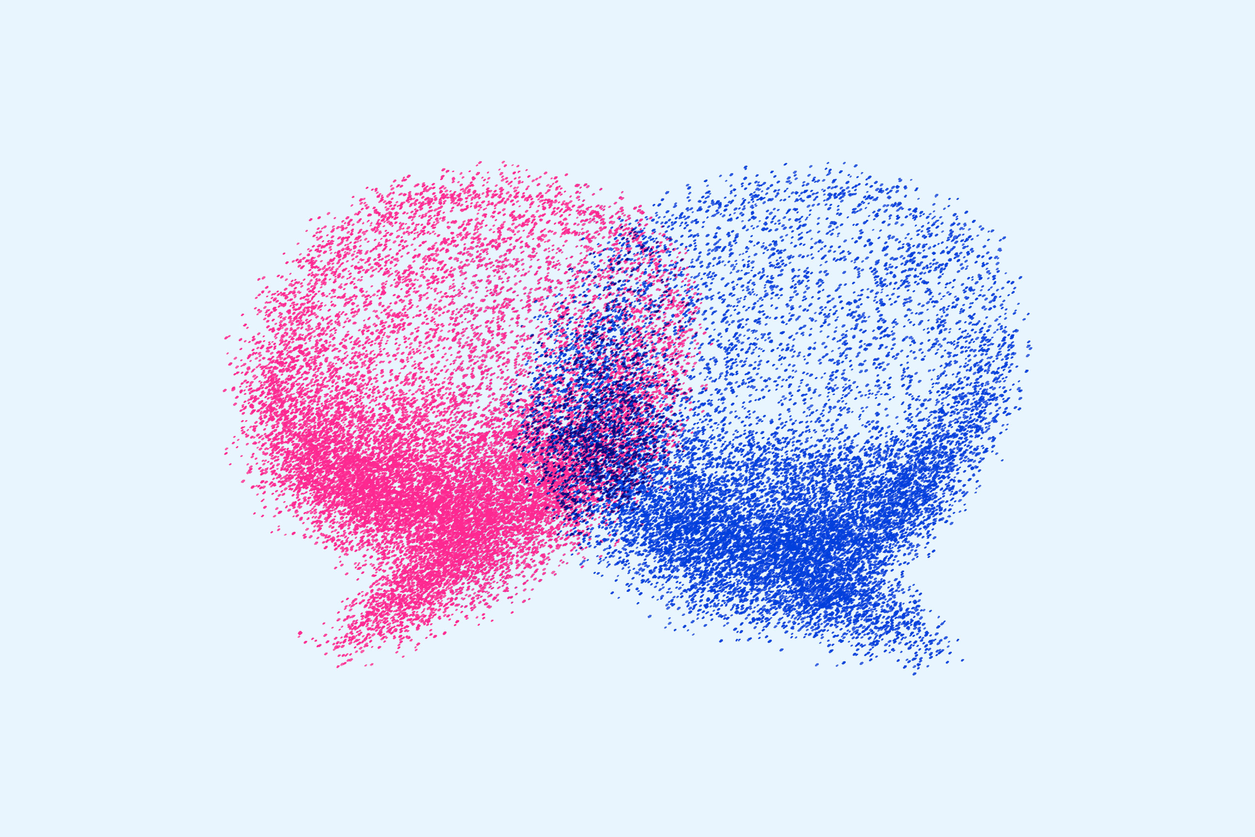
The Valence visuals reference the starling murmurations, suggesting people working together in a successful, flexible way. They also illustrate key aspects of Valence services, as the particles forming each murmuration take on familiar shapes. The dual colour palette suggests the complementary personalities often found in good teams.

Brand assets
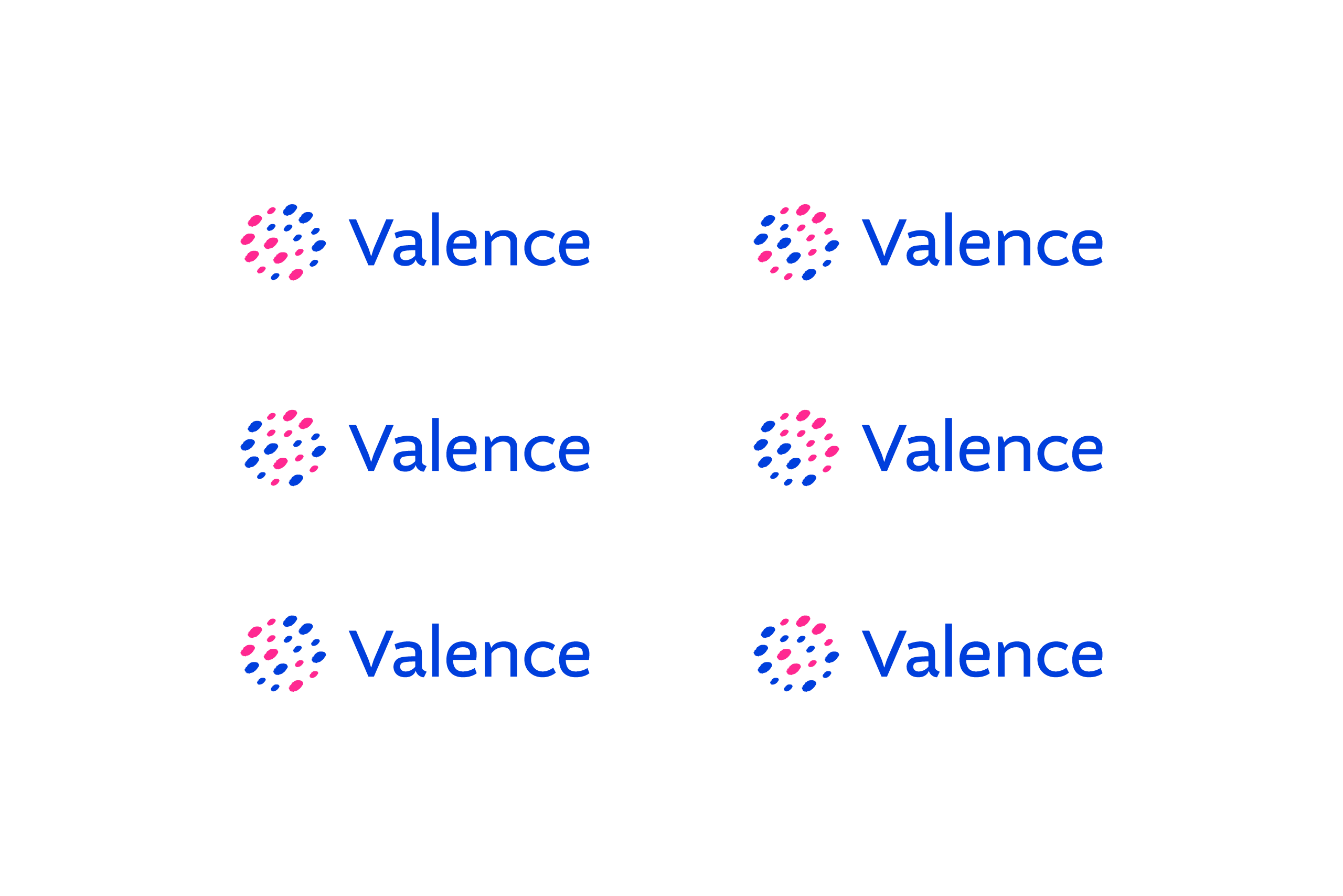
The Valence logo comes in different colour versions. The symbol is made up of 18 particles, reminding of the larger visuals. Each particle can be interpreted as a person’s touch or experience added to the team.
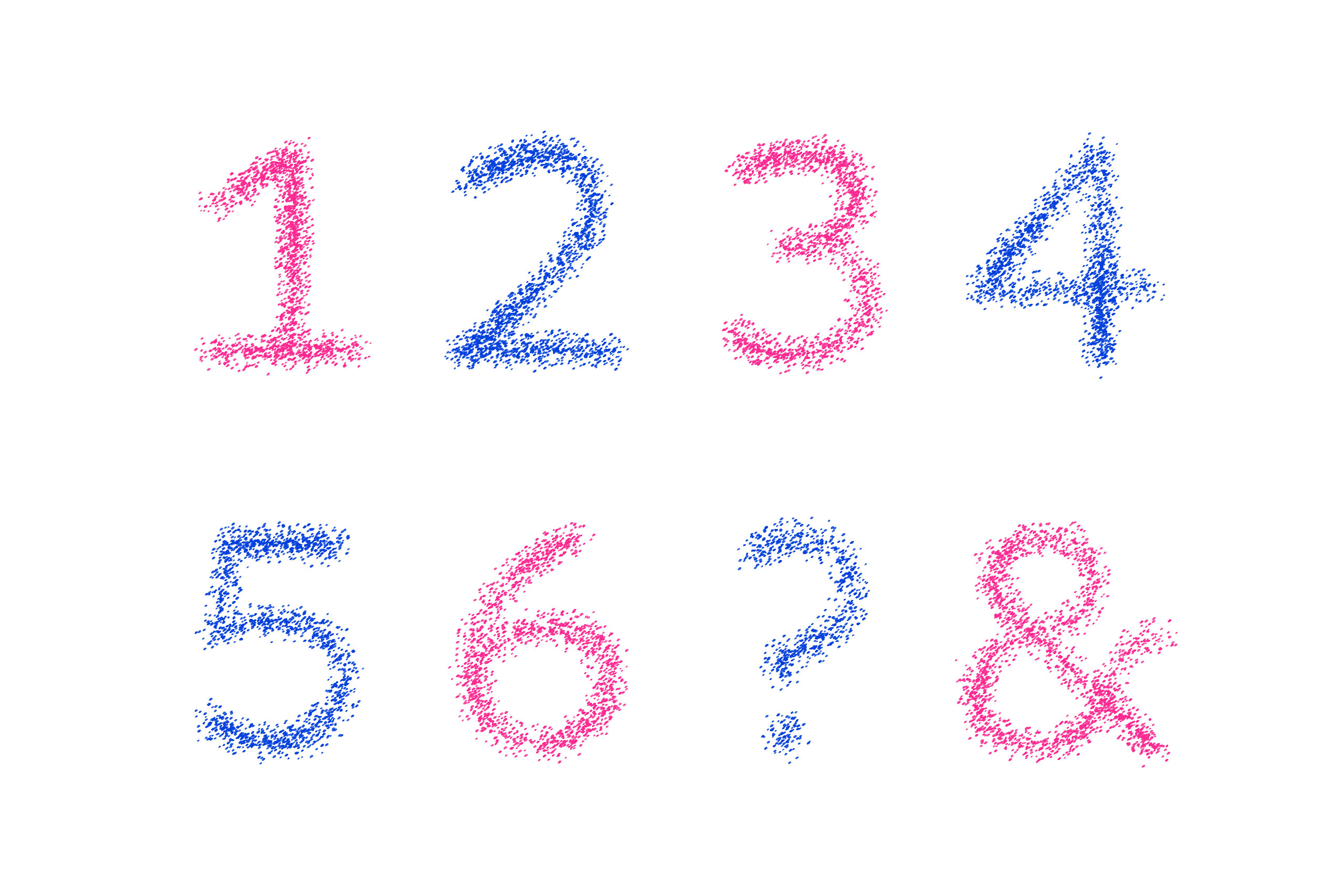
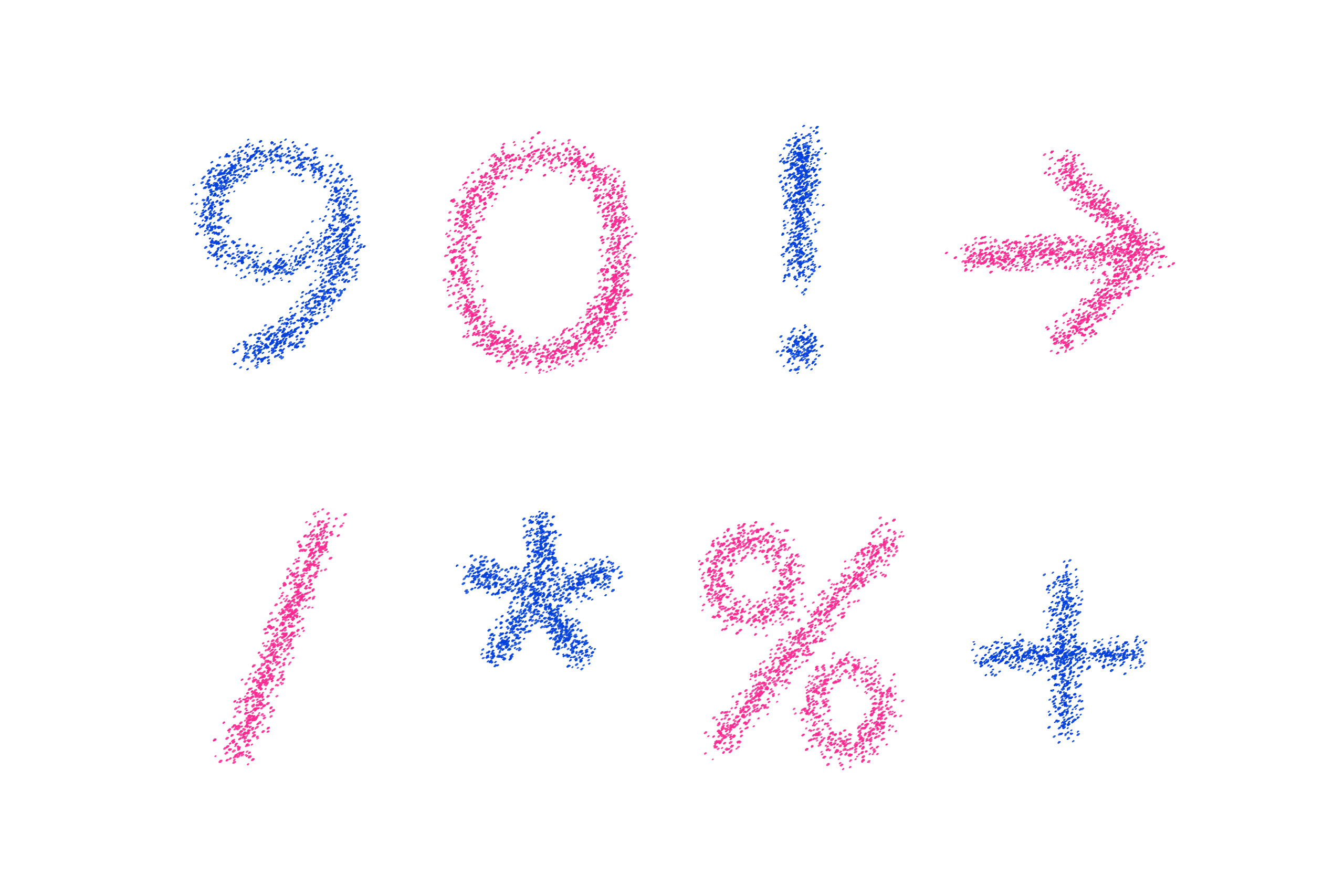
The illustrated visuals can be used to support key messages across multiple formats and media. A custom set of numbers and characters can be used to communicate key facts and similar messages.




Interactive visuals
Animated and interactive versions of each visual add an element of delight to the Valence website. The visuals are recreated entirely with code written by my friend and long-time collaborator Steve Jones. Each particle is constantly moving, and the visuals transform from one into another if you click or tap on them. See how this works in the video below.
Client feedback
It was really great to receive this feedback from Parker:
“Our partnership was really instrumental in me developing, or rediscovering, a sense of pride in how we showed up to the world. I found immediate connection with you on many dimensions, and you helped draw out and create a sense of who we were, who we are, and to show the best parts of that back to the world in a simple, elegant and beautiful way. When I see our logo, our murmuration, our palette, our typeface, I just feel pride, and that’s such an incredible gift to give to an entrepreneur, so thank you.”
Credits
Working directly with Parker Mitchell, the founder of Valence. You can find out more about their team and experience on the Valence website.
Code for the interactive visuals created by Steve Jones (Code with Feeling).
