Design Connect
The brief
Michael Thomson has been advising businesses and organisations for more than two decades. We’ve had the pleasure of working together before, so I was delighted when he asked if I could design a new logo and visual identity that would represent his expertise in a better way.
The solution
After several discussions with Michael about his approach, it was clear that in most projects, his role is that of a facilitator: someone who can look at what’s on the table, point out the essential and guide everyone towards better solutions.
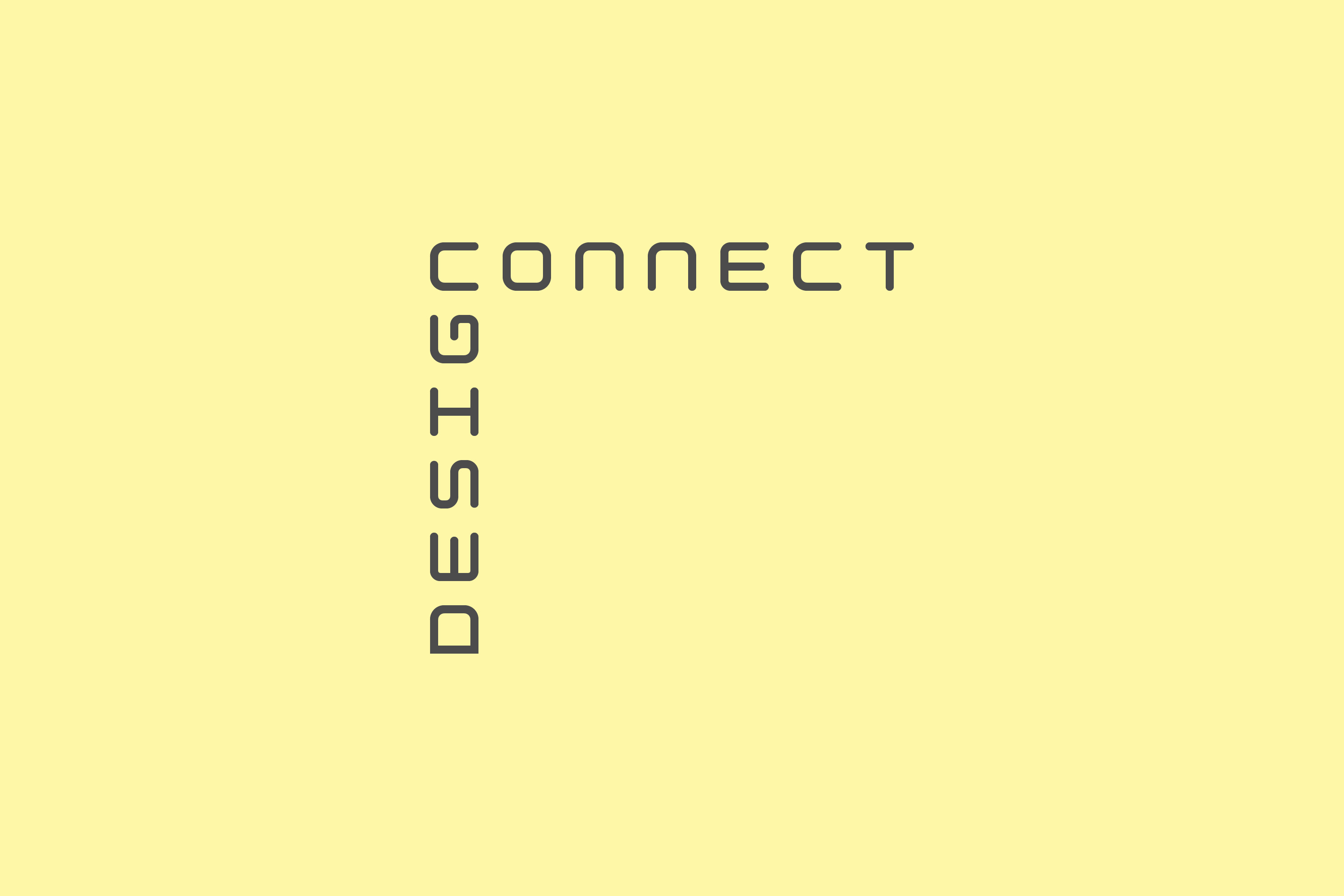
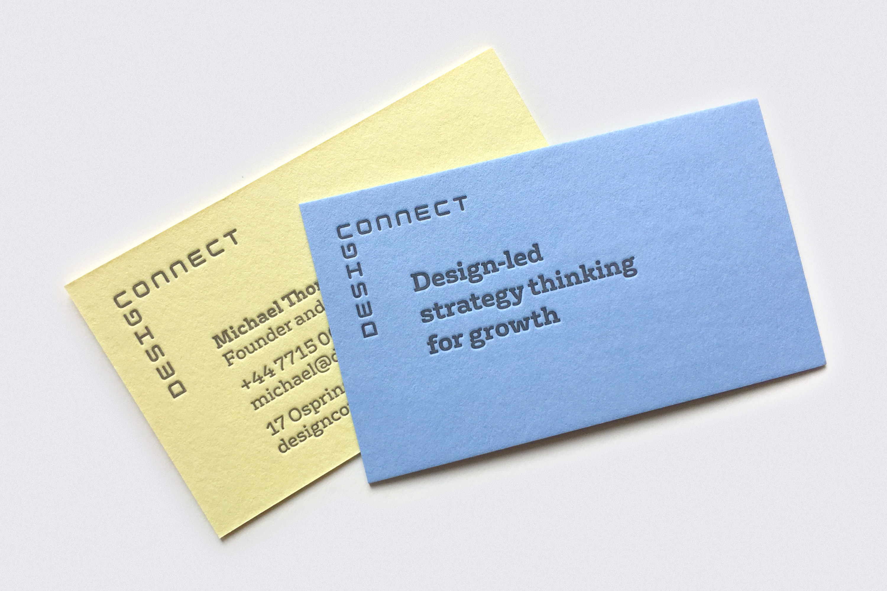
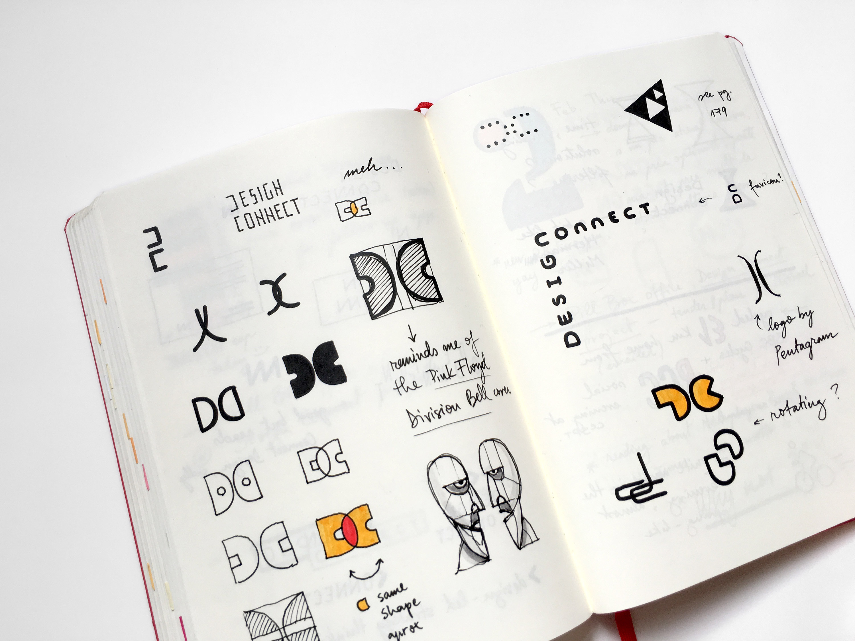
This idea led to a typographic illustration of the name: the two words, ‘design’ and ‘connect’, joined together through the surprising use of a simple shape that works both as an ‘n’ and a ‘c’. On top of that, the colour palette was inspired by the sticky note pads that Michael often uses during workshops with his clients.
The website
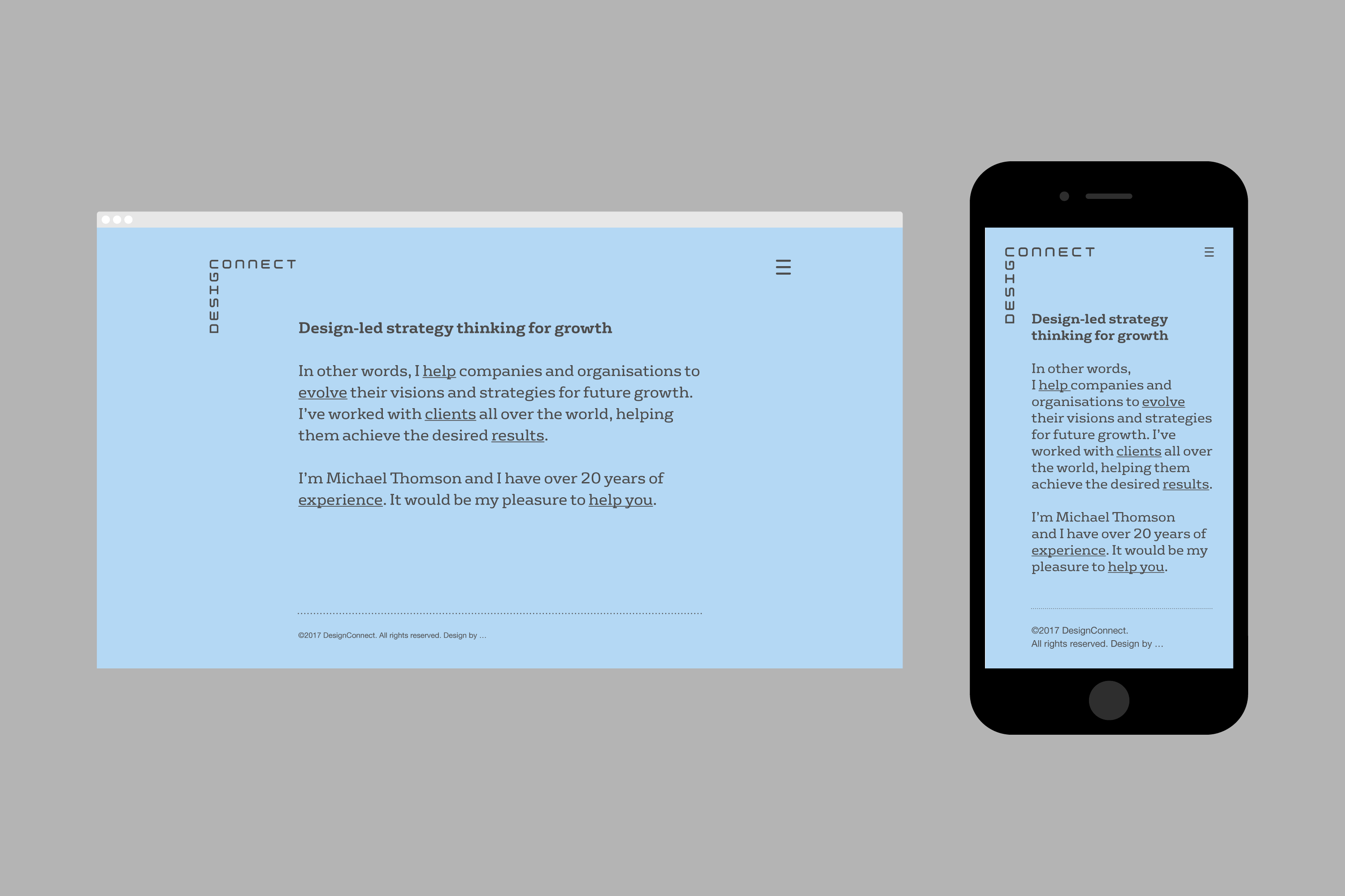
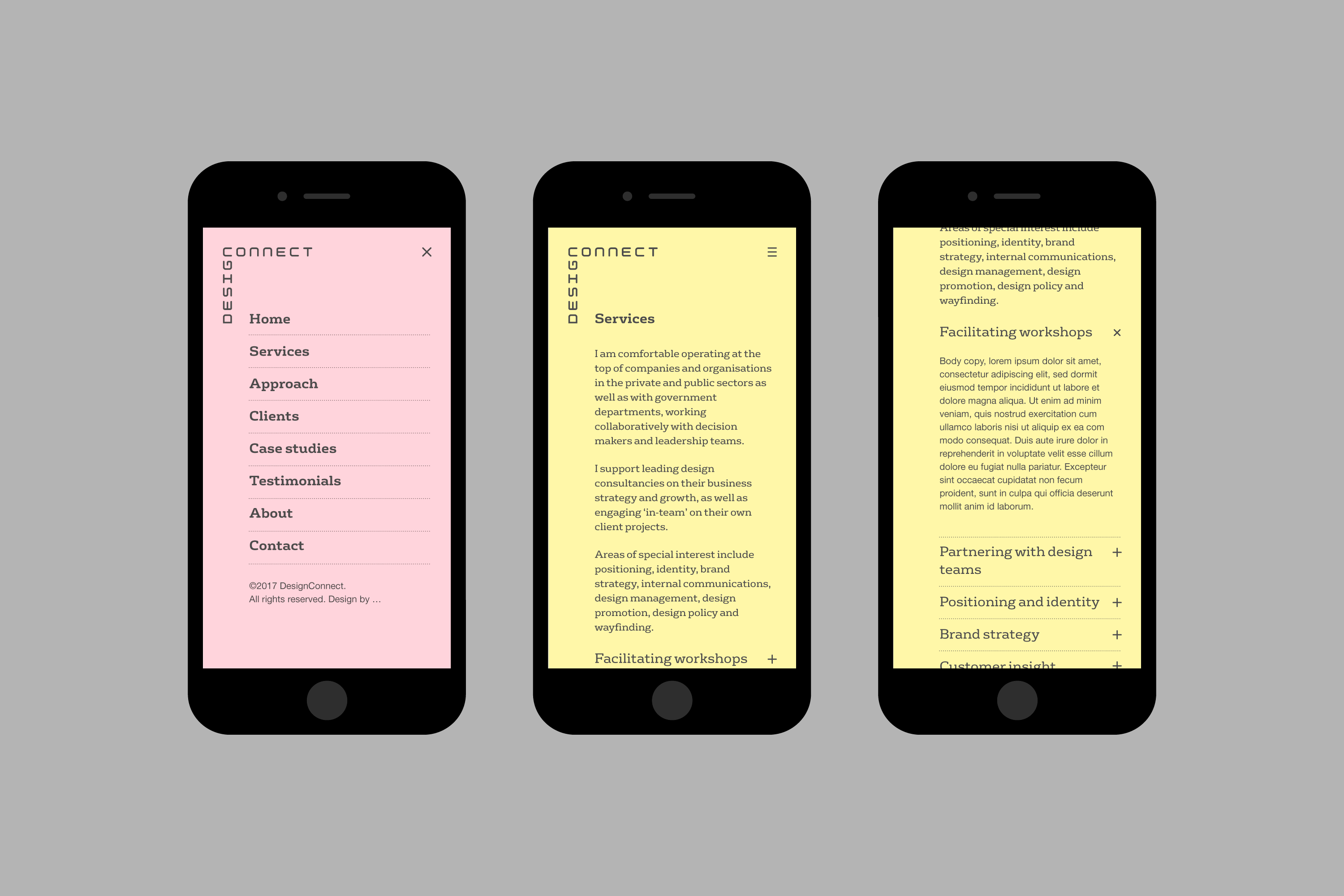
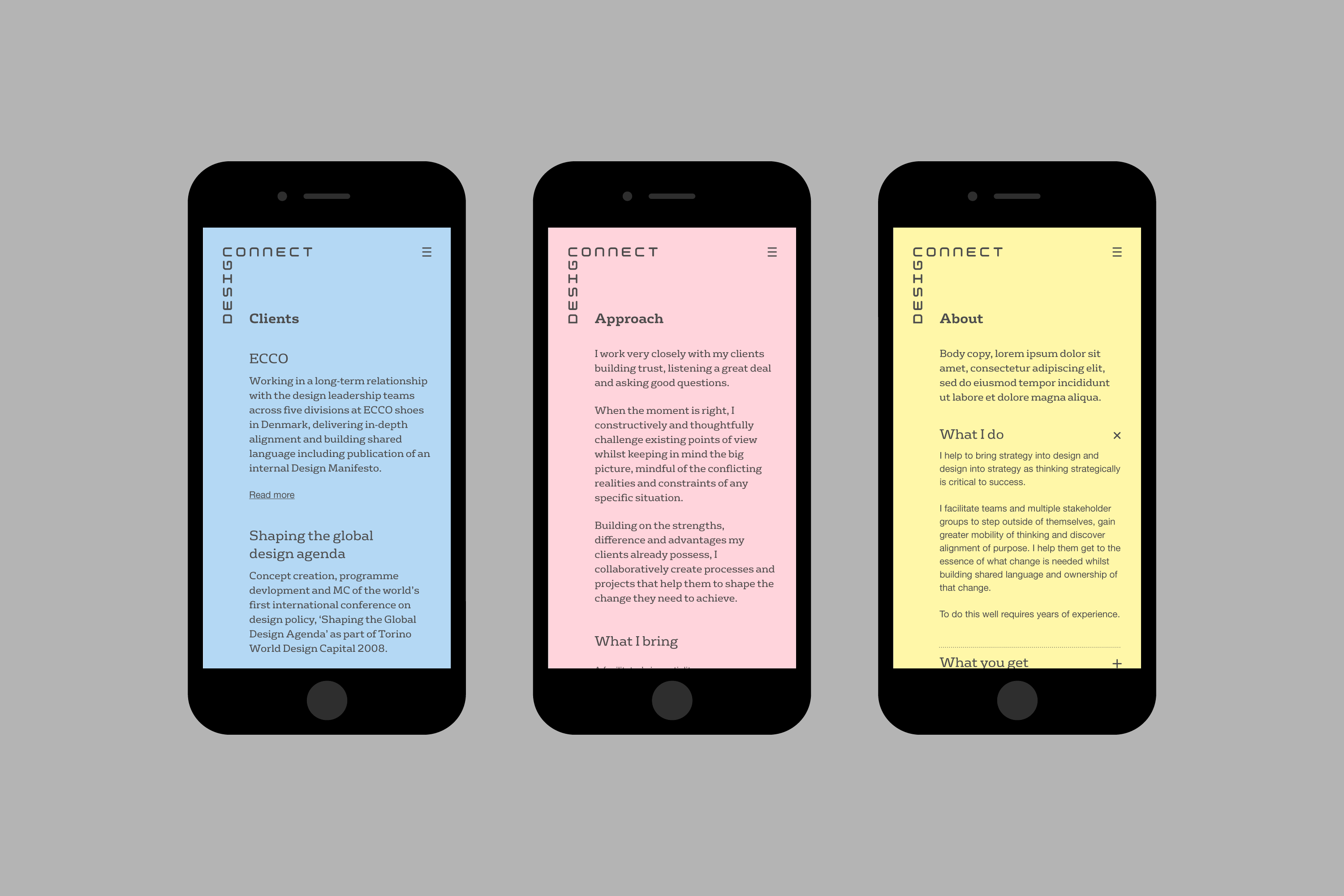
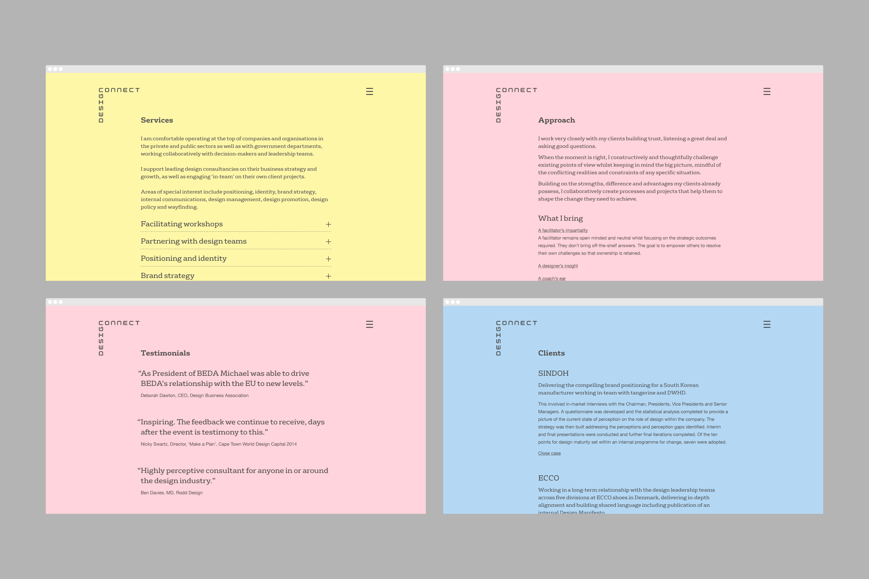
One thing that all of Michael’s clients have in common is the fact that they’re very short on time. This meant that the website needed to be clear, fast and easy to read regardless of whether that was done on a smartphone in an airport, a tablet in a taxi or a laptop in a board meeting. I helped Michael structure the content and designed the responsive website, together with Steve Jones who was responsible for the coding.
Part of the process
I went through several typographic solutions based on the fact that the ‘d’ and the ‘c’ could use the same shape, but the final solution presented itself when I tried to look at things “sideways”, as Alan Fletcher used to say.
Client quote
Thanks for this. I am so excited I woke at 5:30 this morning to look at it. Really. I am so pleased at what you are doing for me. It makes me feel very different about my business and what I have achieved over the years.”
Credits
Working directly with Michael Thomson, the Design Connect founder. Website built by Steve Jones (Code with Feeling). Letterpress business cards printed by Blush Publishing.
