Quotidien
The brief
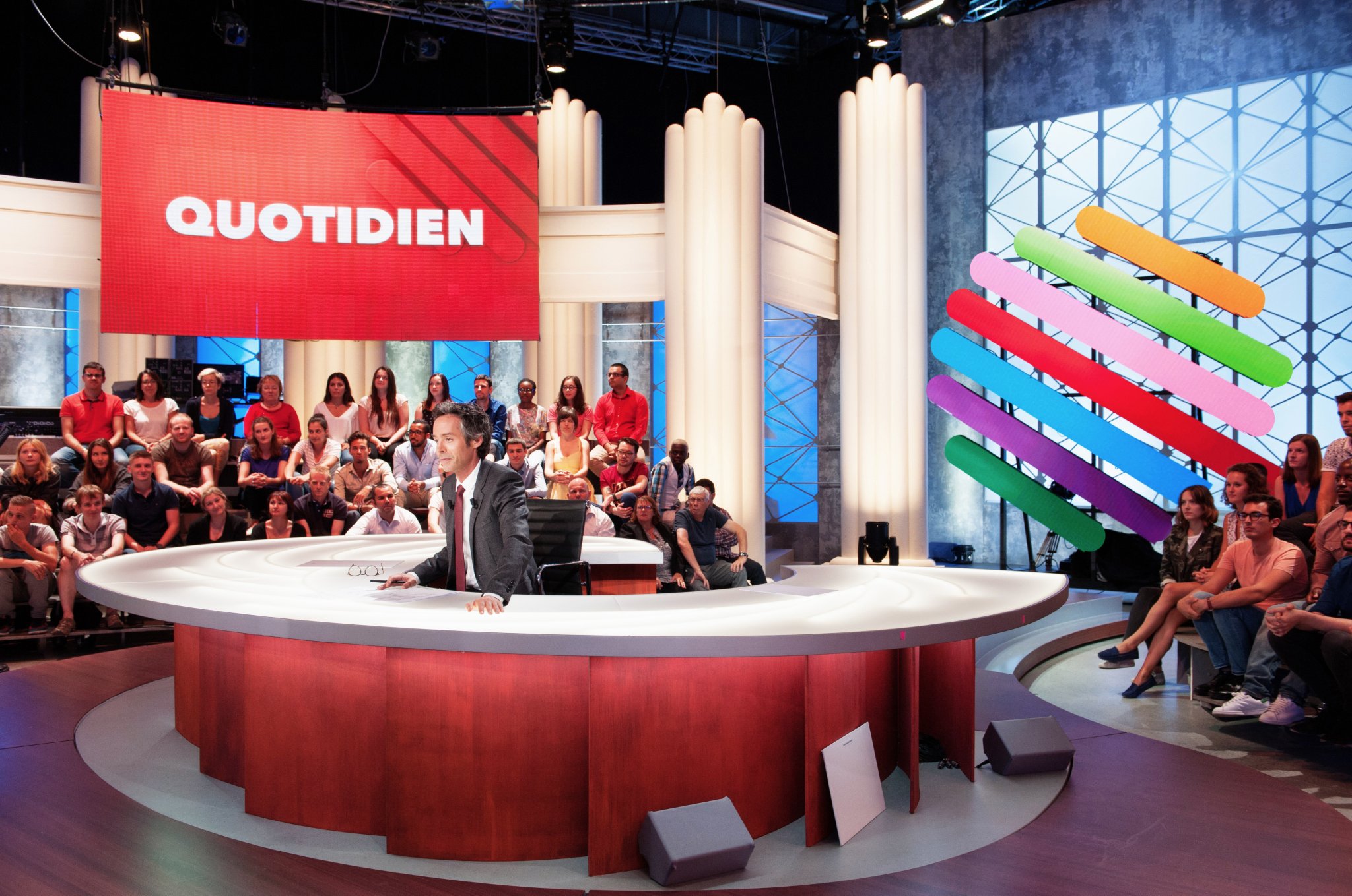
The French infotainment show ‘Le Petit Journal’ was being broadcast every evening on Canal+, attracting two million viewers. With the content ranging from serious news reports to mini comedy sketches, the show covered political, social and cultural news. But after five successful years, the show’s presenter, Yann Barthes, and his team decided to move to TF1, which meant they needed a new name and a new brand. Matt Rudd (Rudd Studio) asked me to help him solve the brief.
The solution
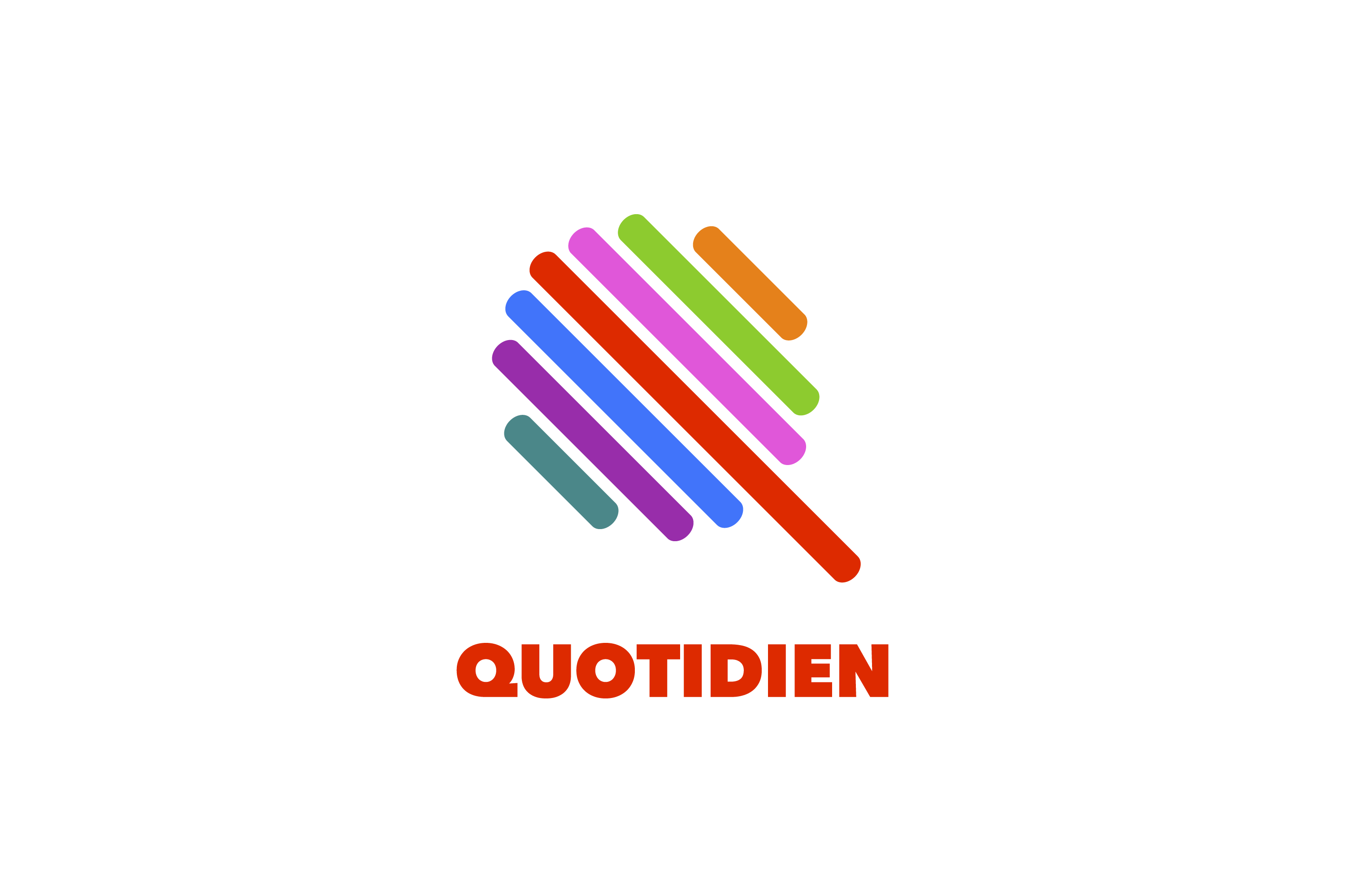
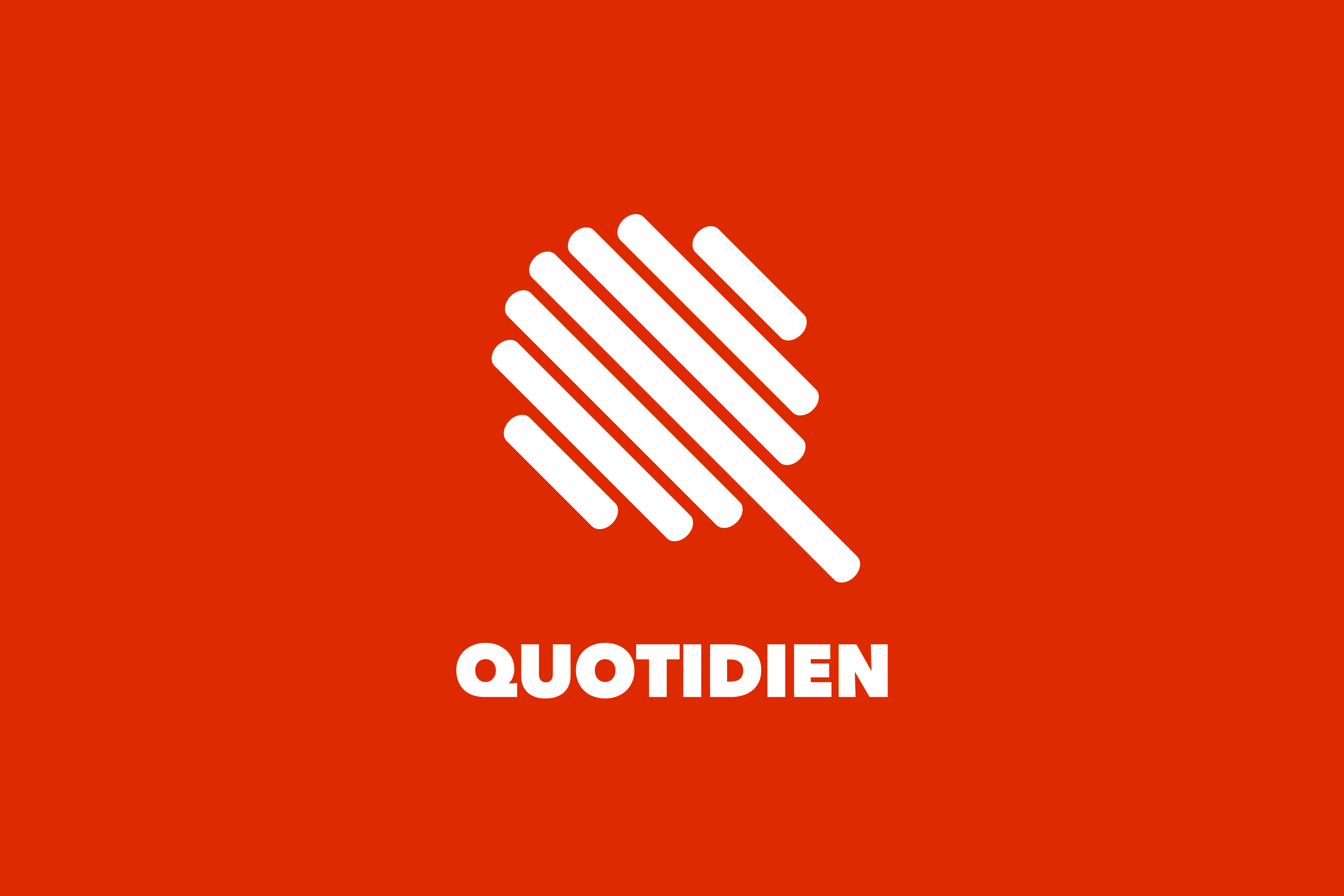
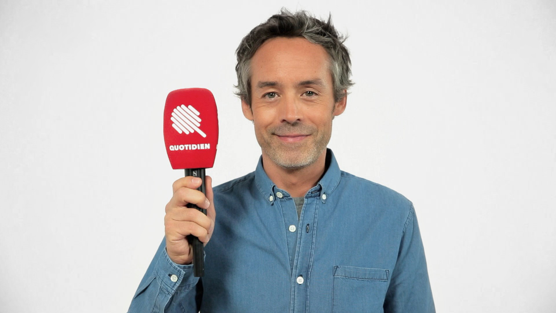
Since the new show was to be called Quotidien (Daily), the client felt that the new logo should be all about a Q – a strong graphic shape to sit behind the presenter, and also a distinctive, minimal mark to brand the reporters’ microphones. Matt and myself worked together on several options.
The winning logo, seven lines forming a Q, represents the seven days of the week, with today ‘highlighted’ in the middle. Red, used before by ‘Le Petit Journal’, was kept as the main colour, supported by six secondary colours representing the show’s diverse subjects. The all-caps, bold wordmark emphasises the show’s direct approach.
Credits
Project done together with Matt Rudd (Creative Director, Rudd Studio). You can read more about the process on Matt’s case study.