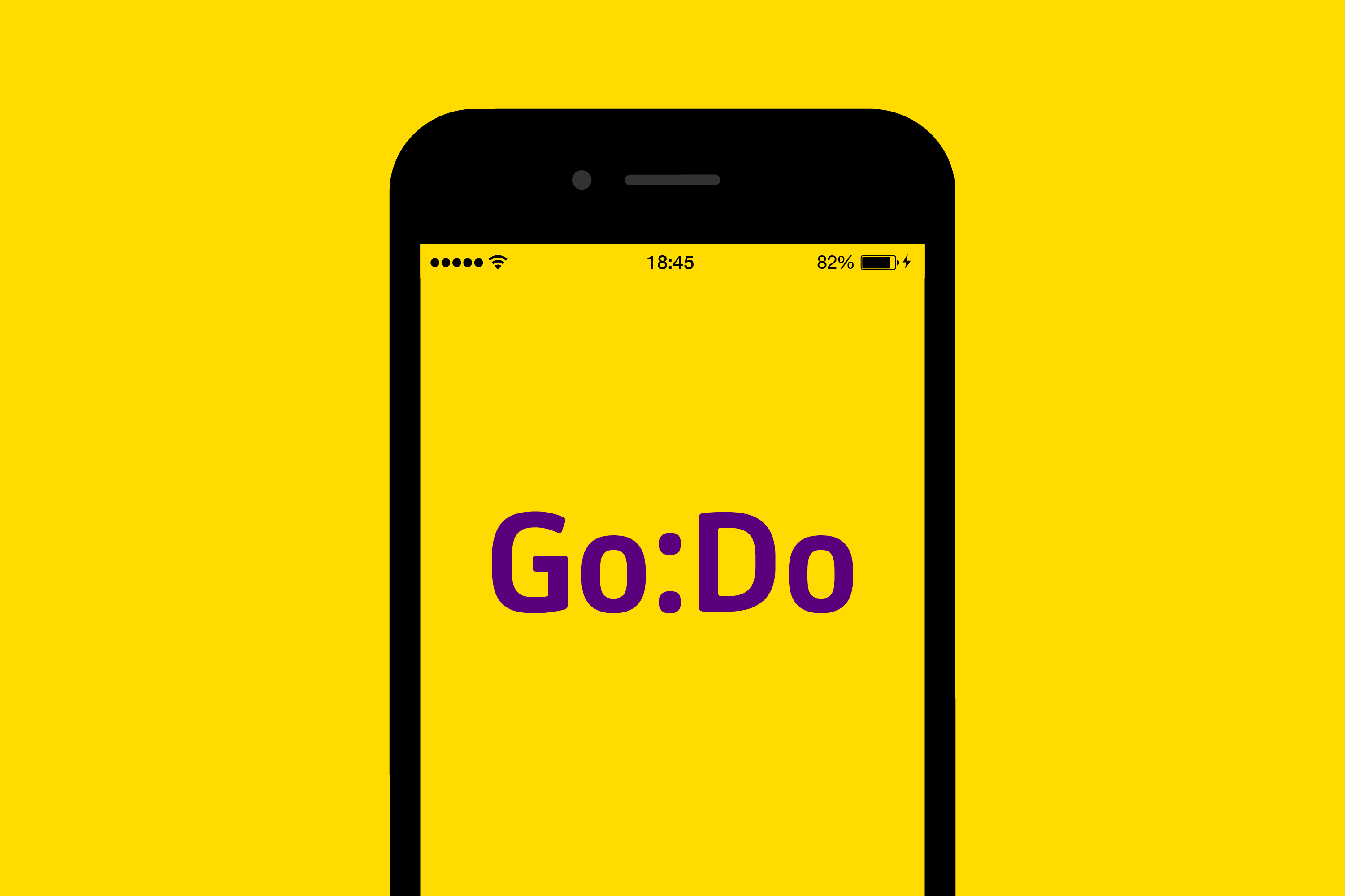
Go:Do
Overview
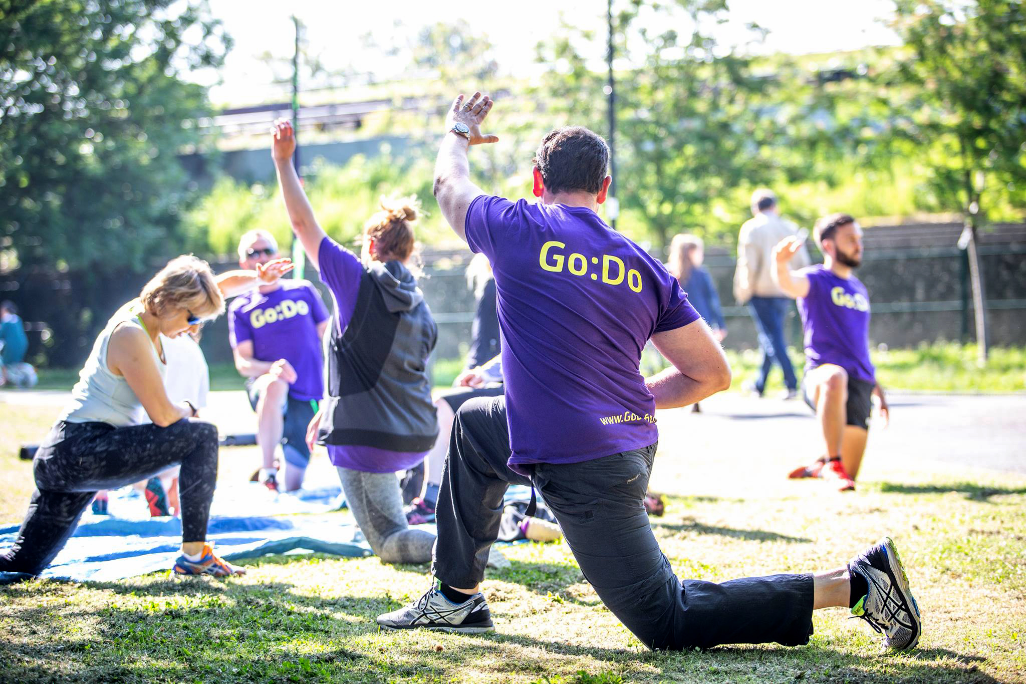
Go:Do is a digital marketplace that makes it easier for people to “find new ways to get fit”, and for trainers to find clients and manage their availability. I was responsible for the brand identity and design of two apps (how they work and how they look), and also involved in client workshops that helped shape out the business proposition.
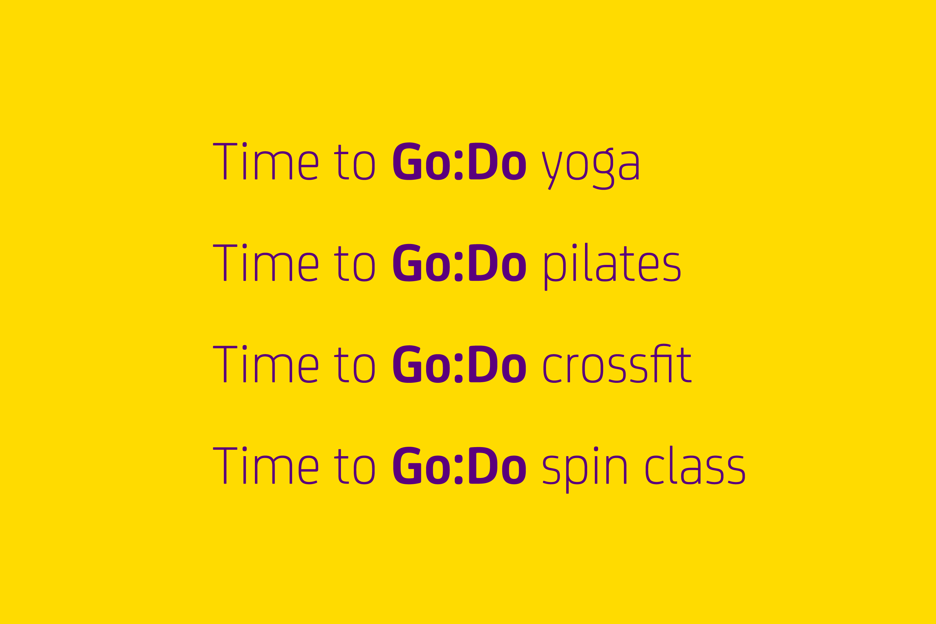
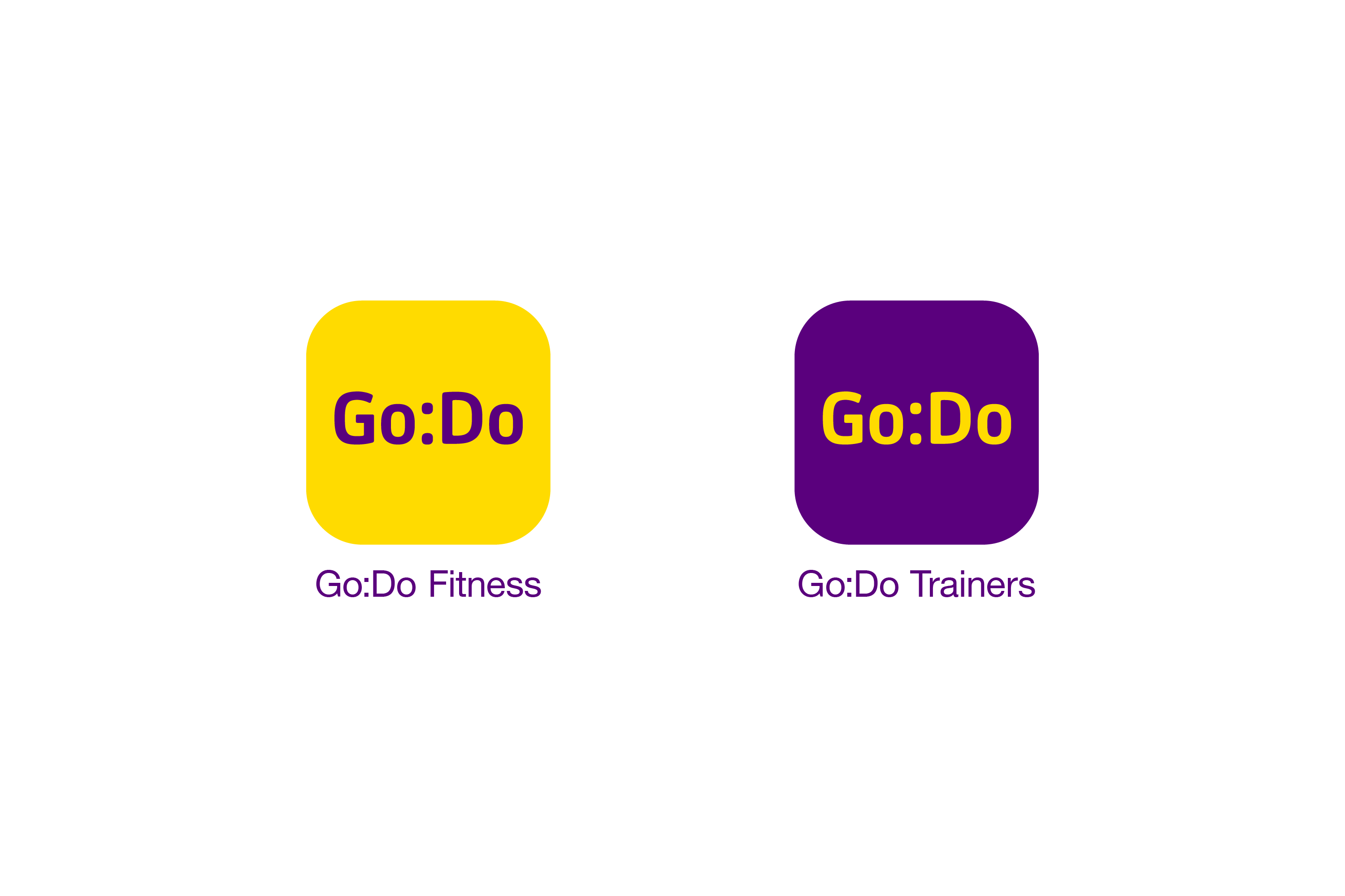
The identity is based on the idea that Go:Do saves you time by providing quick results based on your chosen location, and putting you in touch directly with trainers specialised in various fitness activities. The logo focuses on the short, encouraging name and suggests a digital clock through the use of the colon. The yellow and purple colour palette provides a dynamic, uplifting feeling and also helps with differentiating from competitors. Last but not least, the FS Joey typeface is used throughout, adding a digital character and a friendly, “easy to use” feeling to the whole app.
The users' app
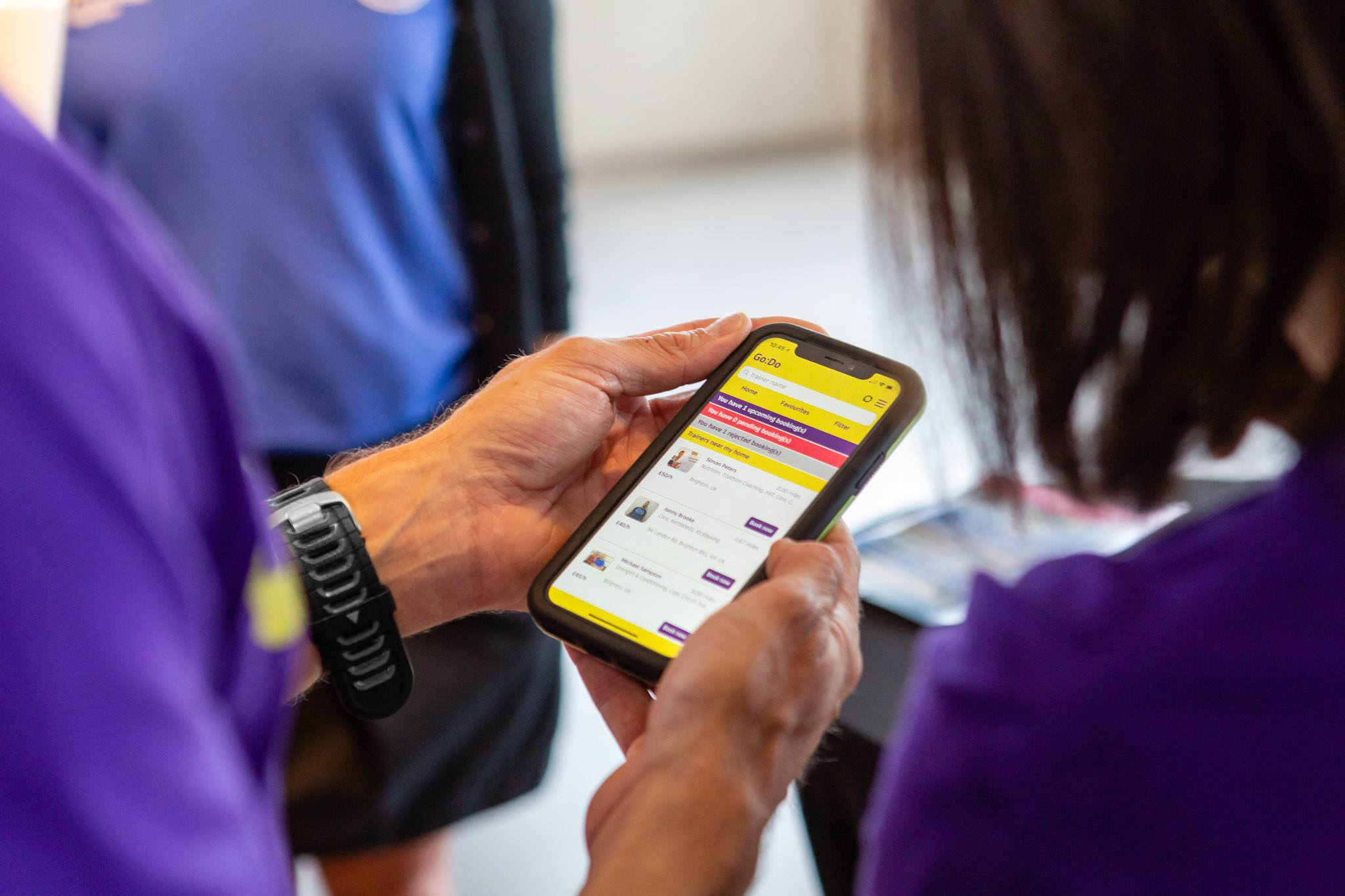
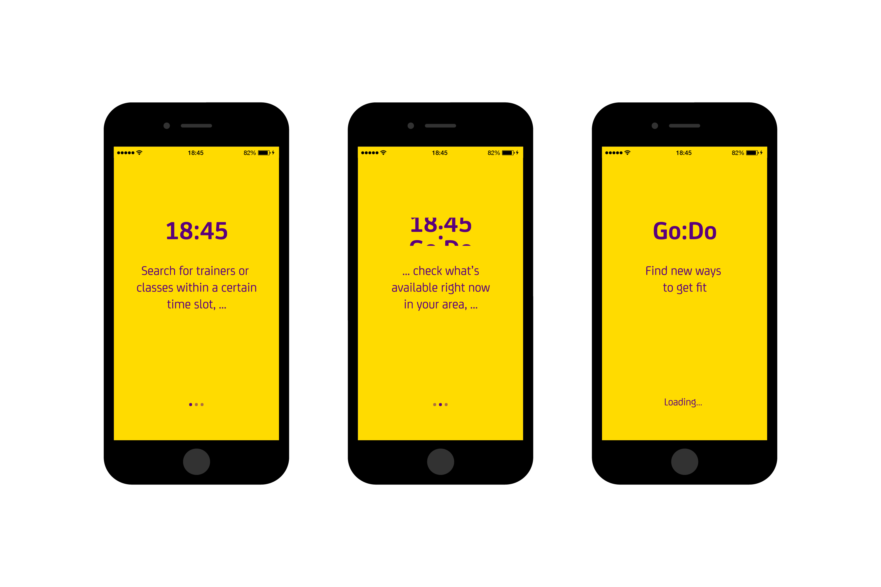
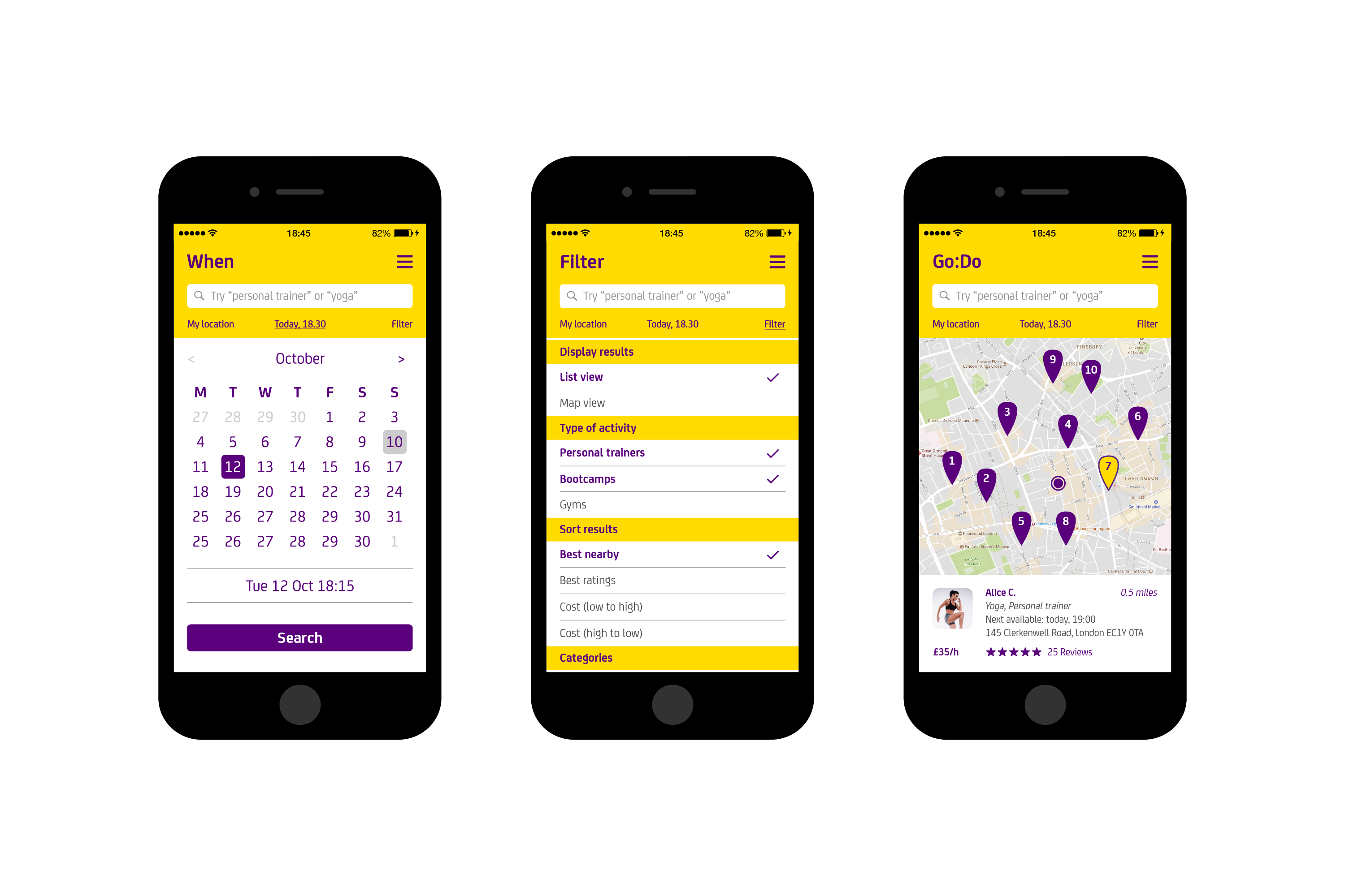
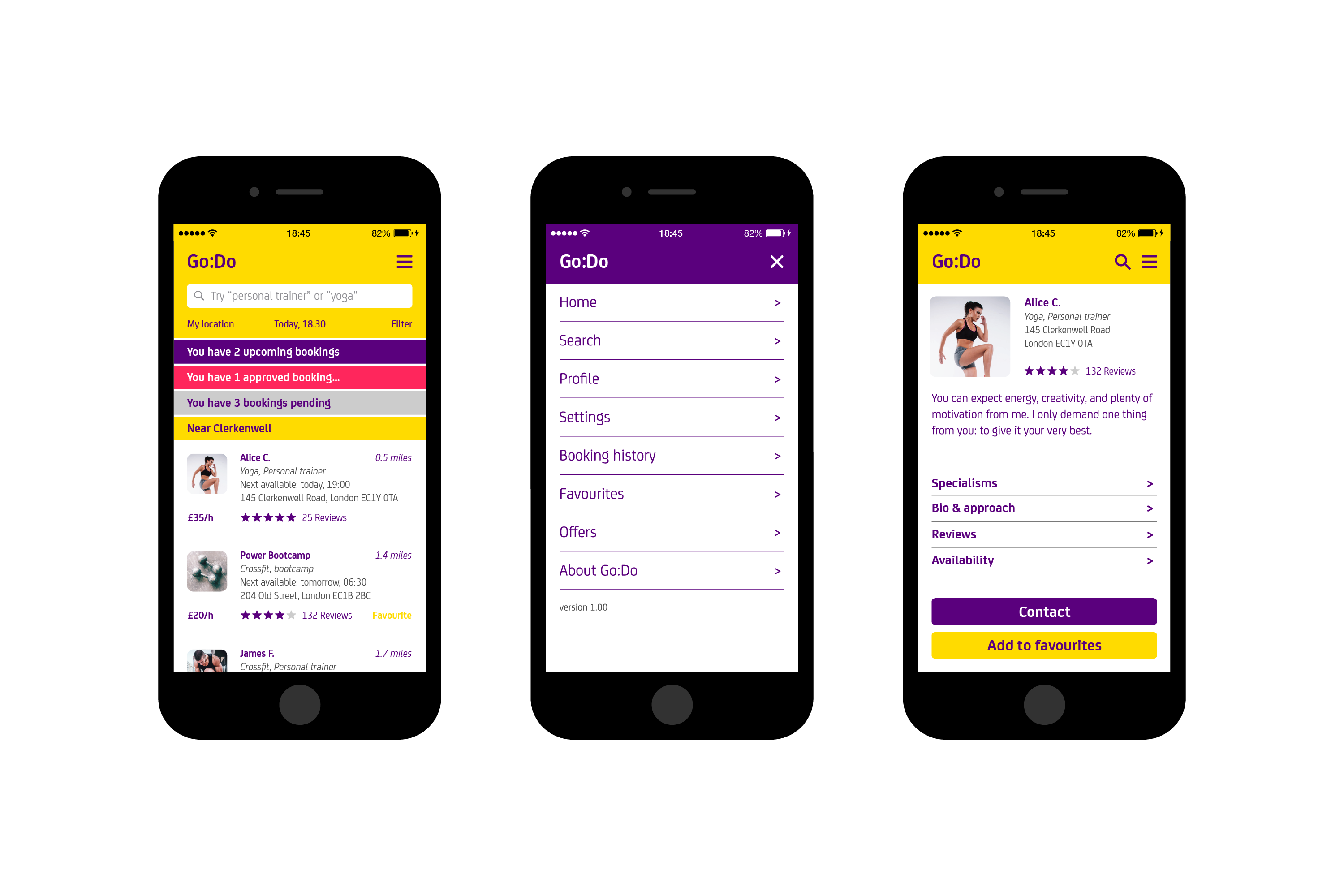
The goal was to give users the information they need in the fastest and clearest way possible. The search bar is always either at the top of the screen, or just one tap away, near the menu, no matter where you are within the app. Simple, clear typography structure and colour coding make all information easy to understand at a glance.

The trainers' app
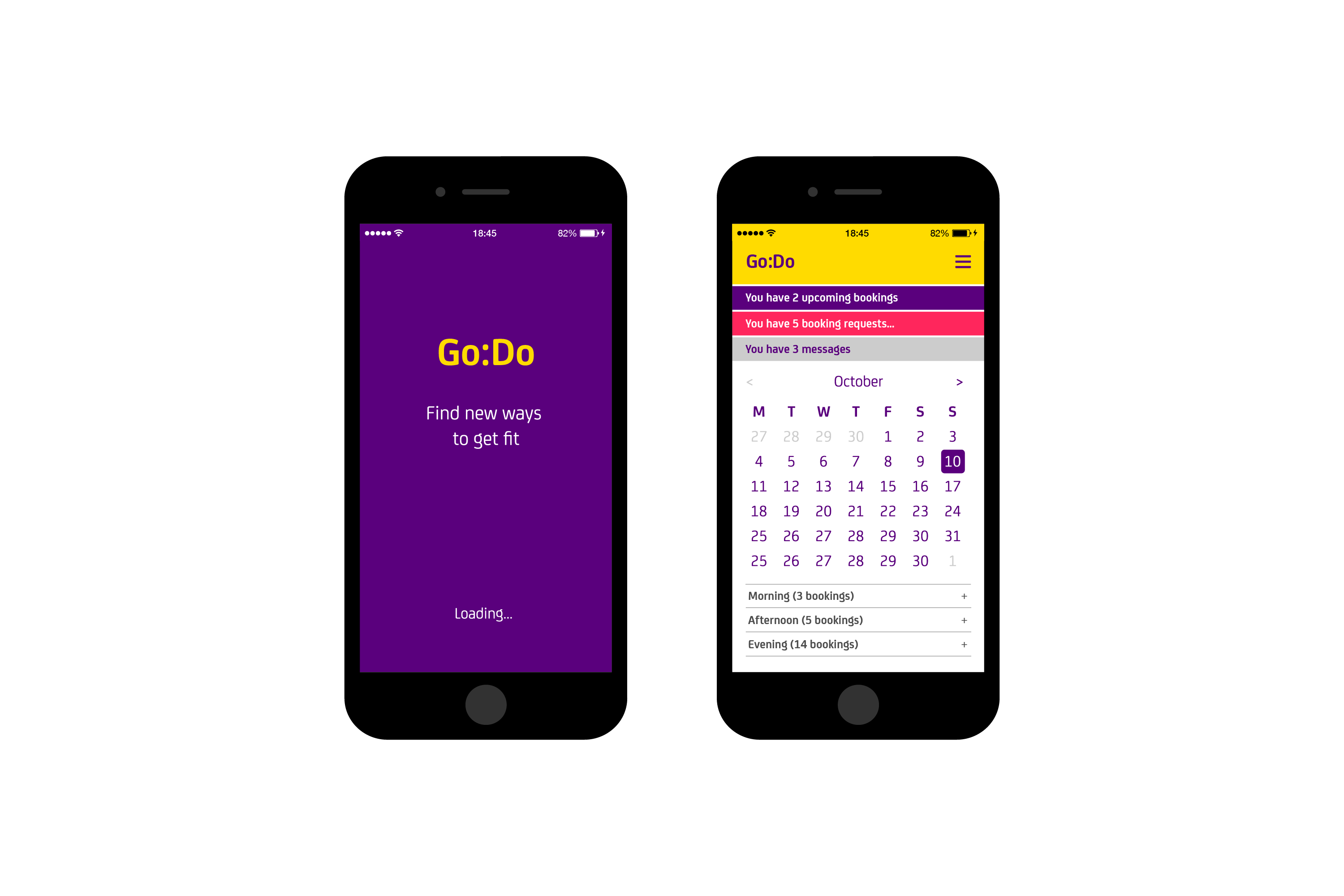
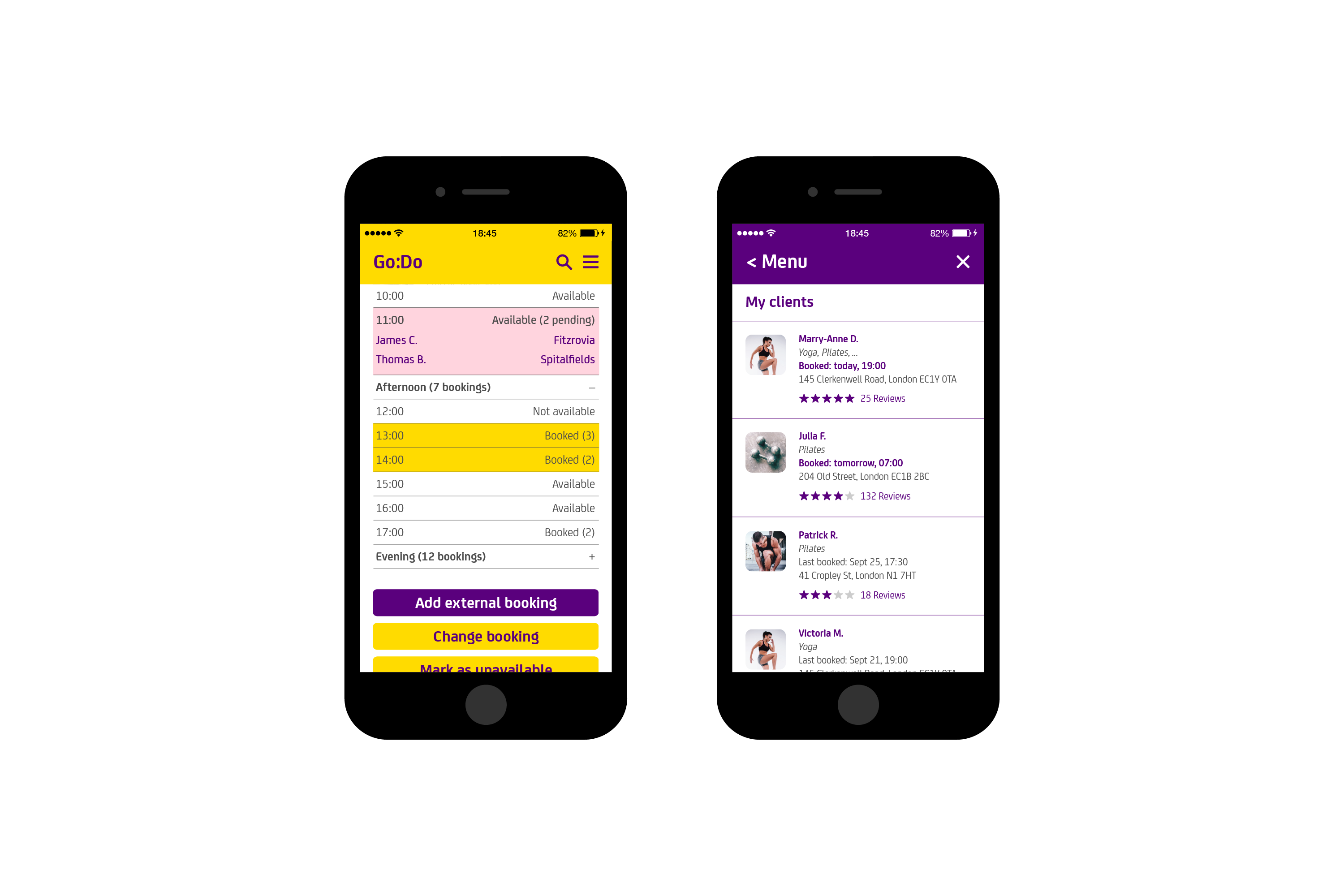
Developed as a separate app from the main one, the trainers’ app uses the same identity, but in a slightly different way. While for the main app the focus is on the search function, for the trainers’ app, the focus is on the calendar and its planning functions, allowing trainers to quickly manage their bookings and update their availability easily.
Credits
Project done with Amp London.