Maison Caramel
![]()
The brief
Maison Caramel is a boutique B&B and catered chalet in the French Alps, near Bourg-Saint-Maurice. Kerry & Serge, the owners, asked me to design an identity for their place that would appeal to skiers and snowboarders during the cold season, and to cyclists during the warm season.
The solution
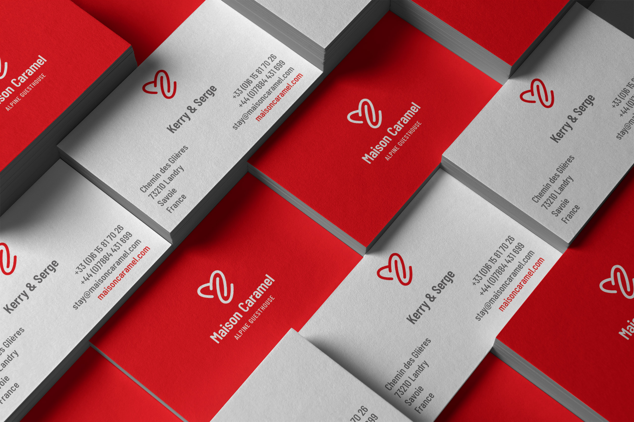
The accommodation had been working under the name Maison Caramel for a few years, but only during winter. The old logo featured a heart (a widely-used symbol in the Savoie area), but the overall look and feel was more connected to traditional arts and crafts, and didn’t have any of the exciting spirit one would associate with winter or summer sports.
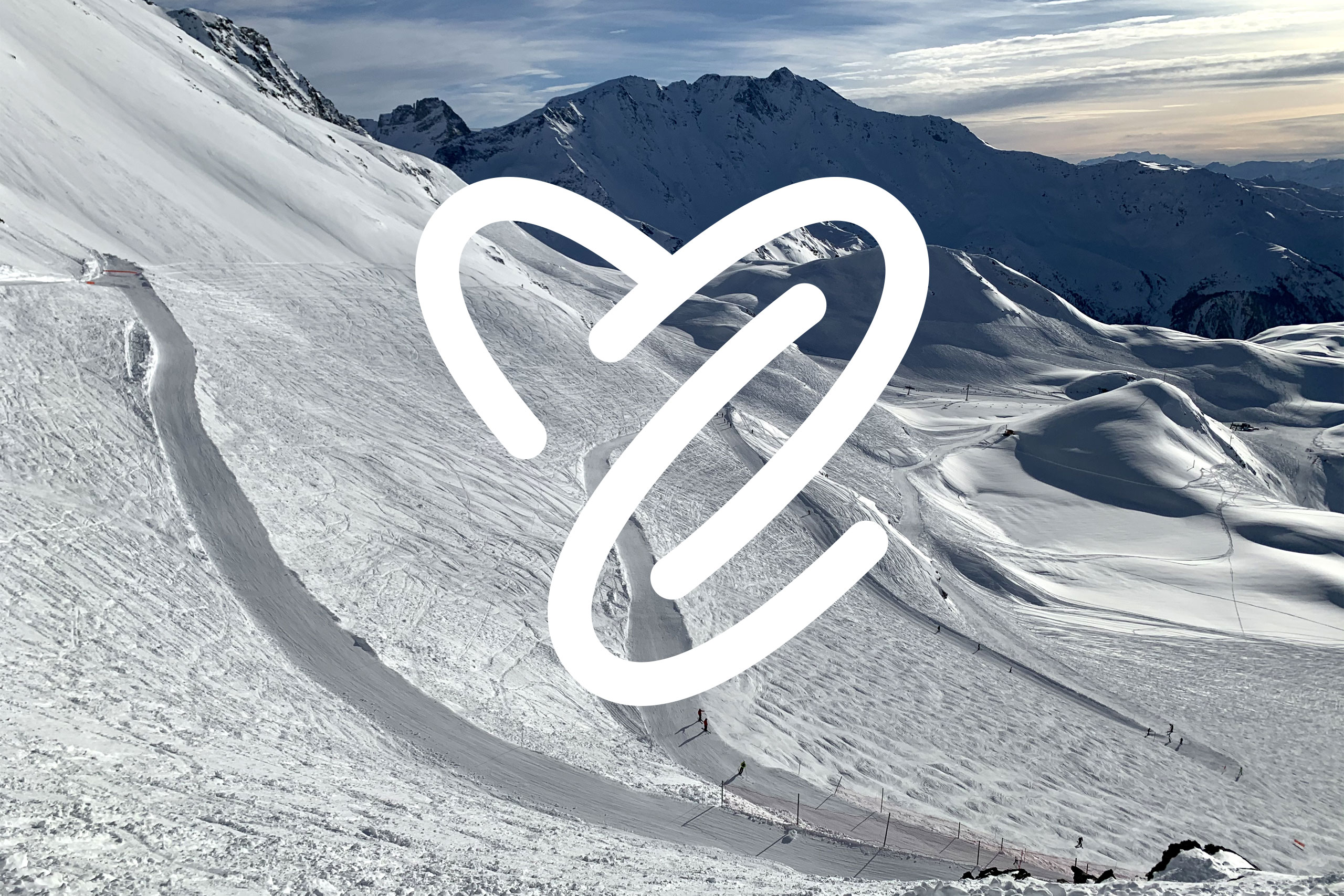
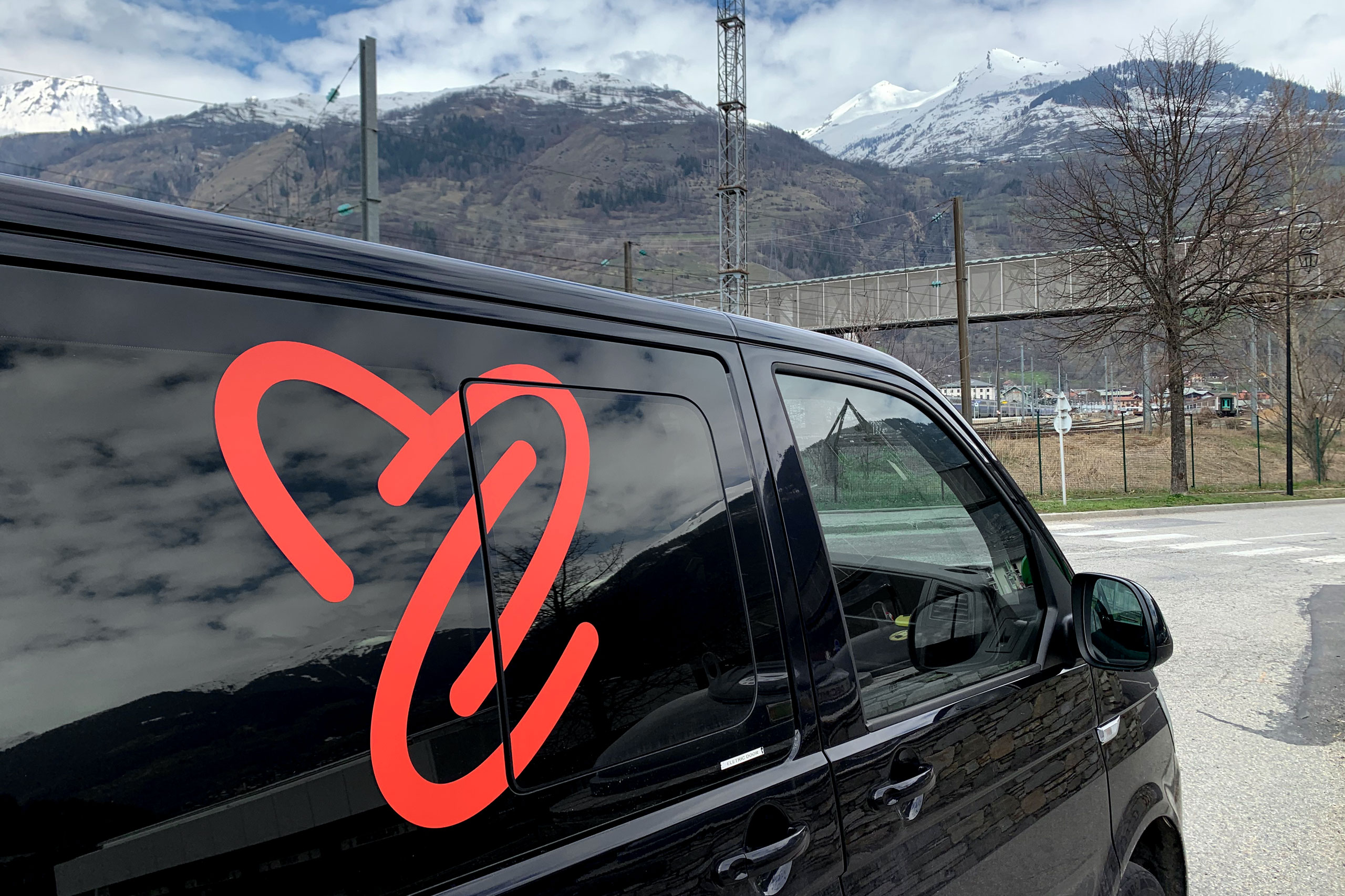
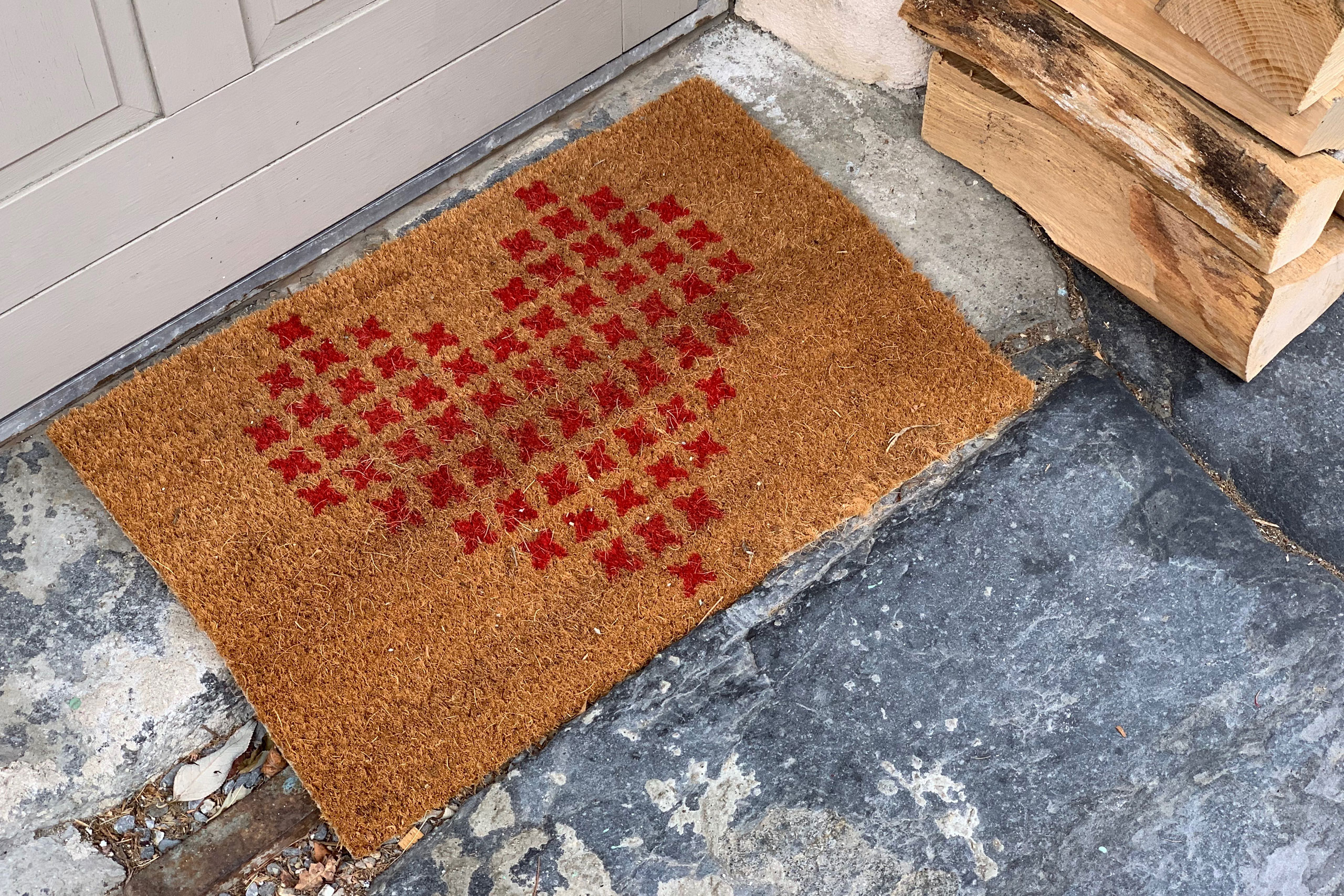
The new identity relies mainly on the MC symbol that references the traditional heart, mountains and valleys, ski tracks or road switchbacks. The colour palette uses red as the main colour (similar to the Savoie flag and coat of arms), making the identity feel exciting and the Maison Caramel ski jackets and cycling kit easily visible and recognisable.
![]()
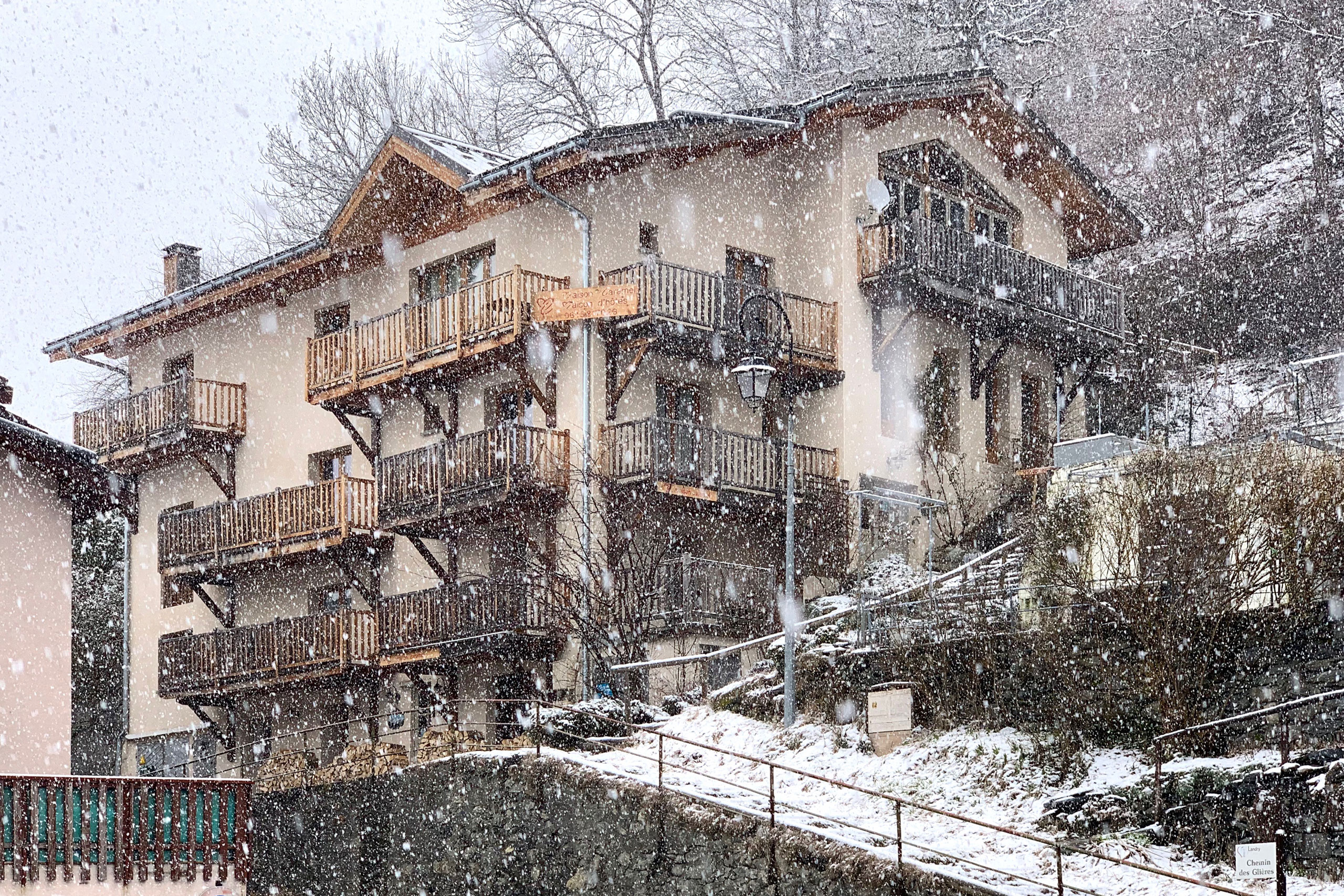
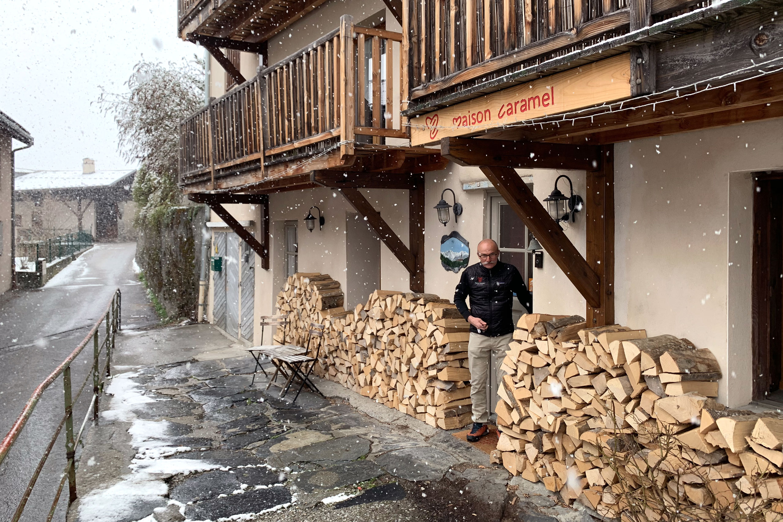
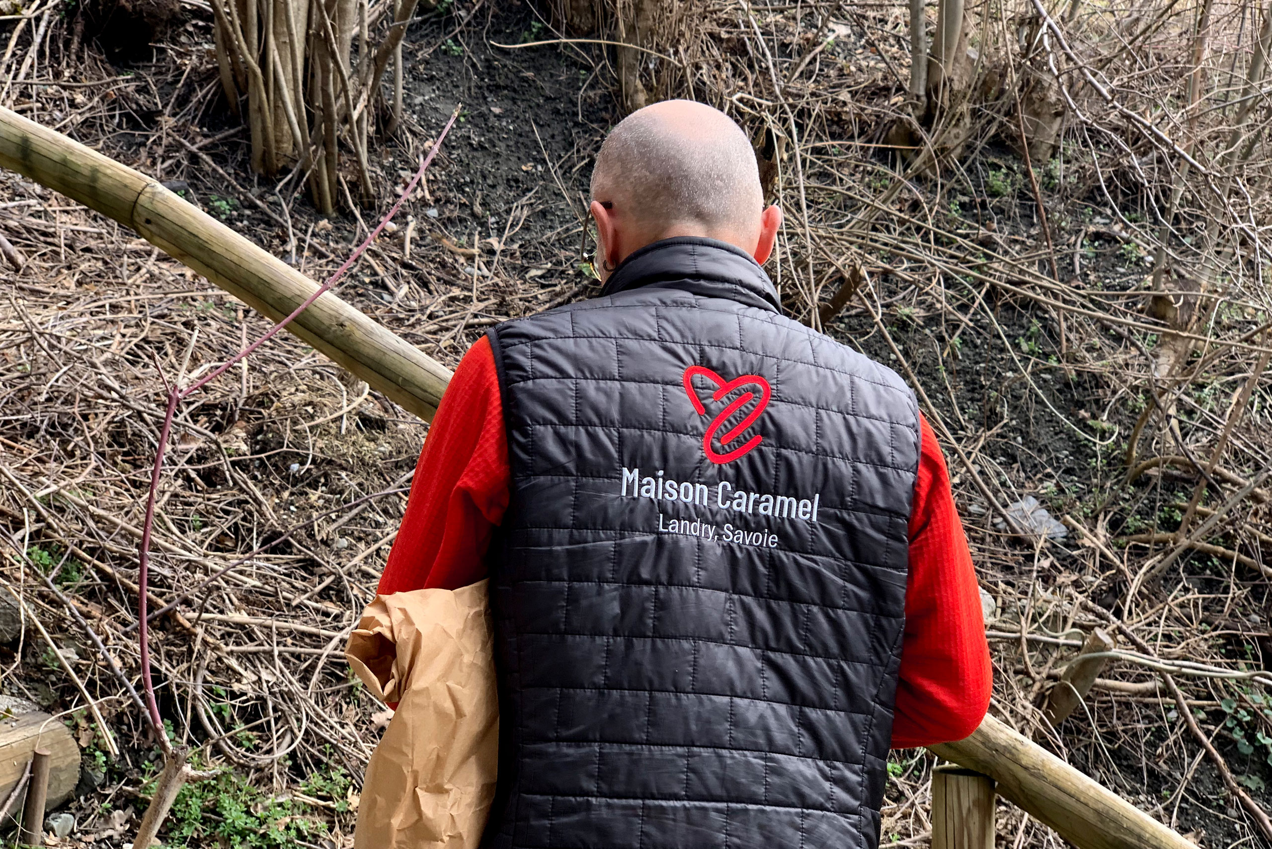
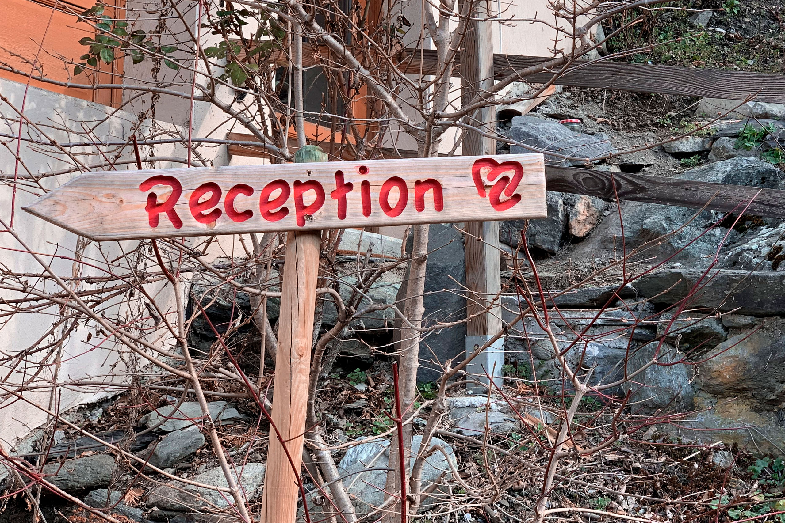
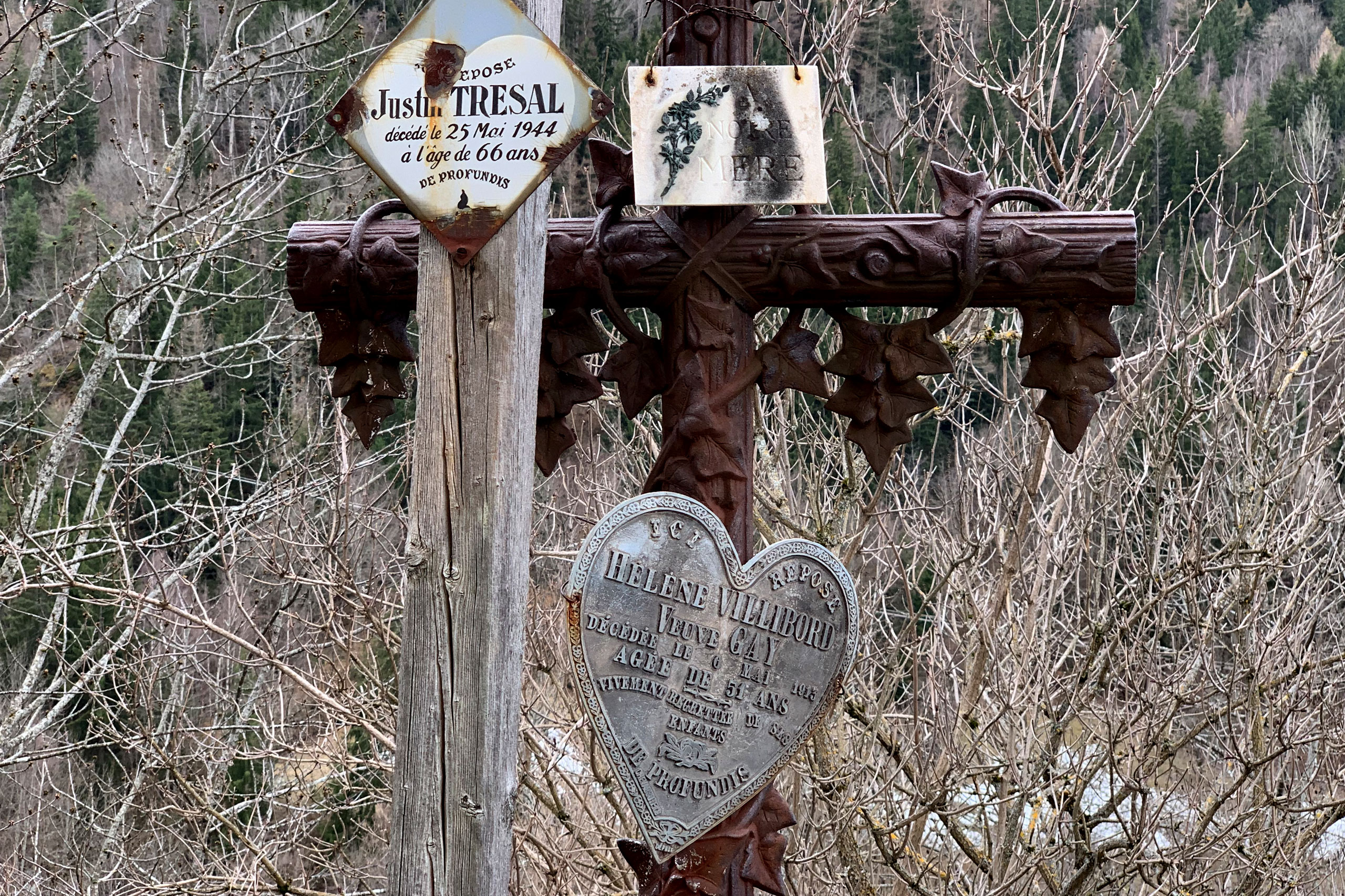
On site
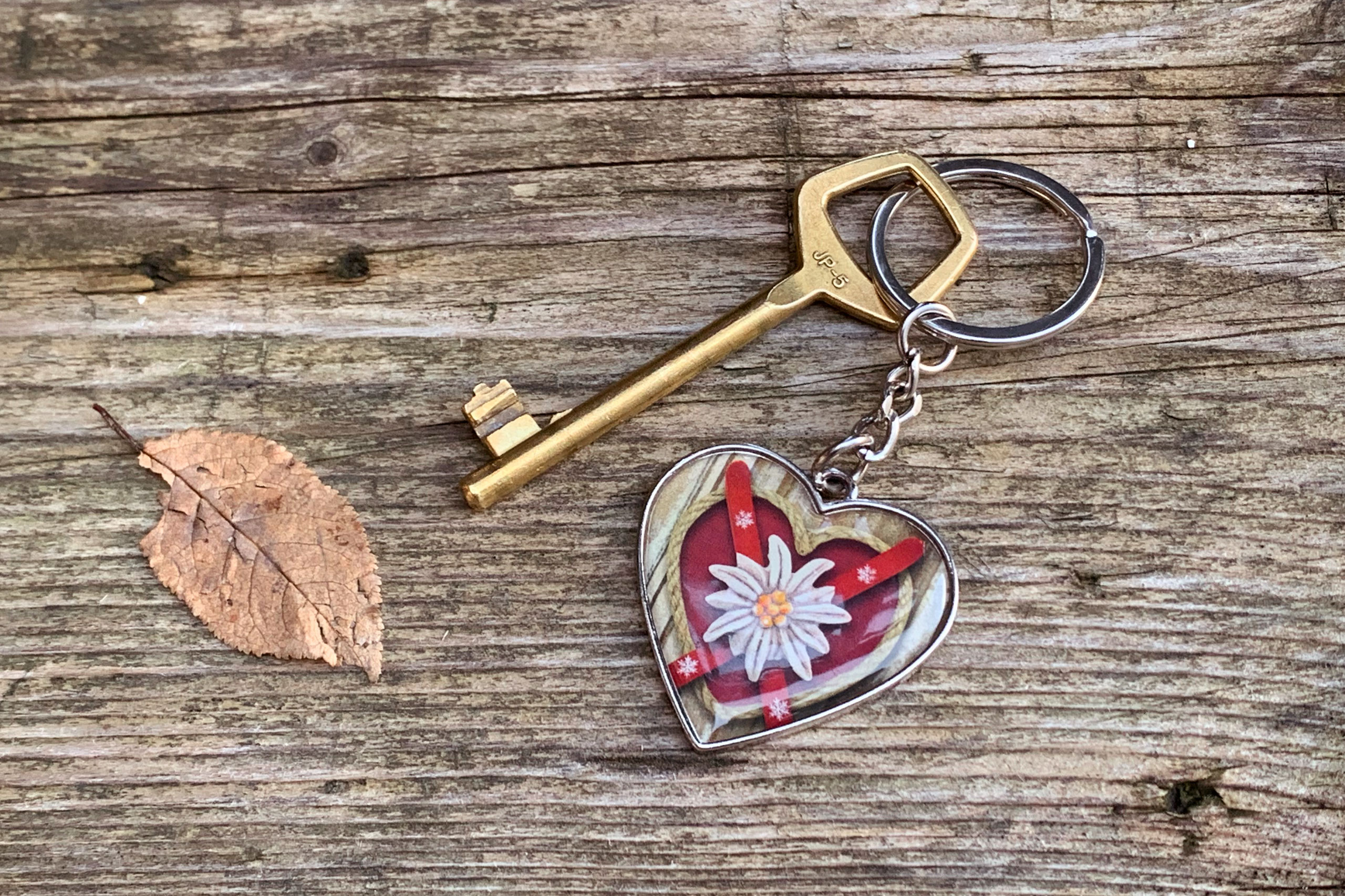
It was a great pleasure to visit Kerry and Serge during the ski season, and see the new identity in real life. The locally-carved wooden signs were especially a delight.
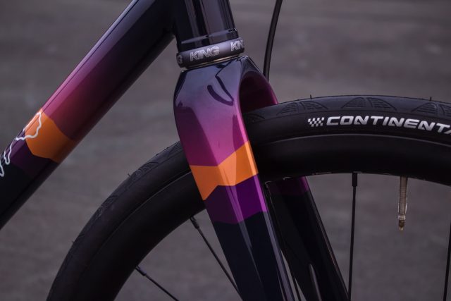
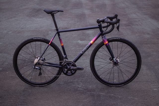
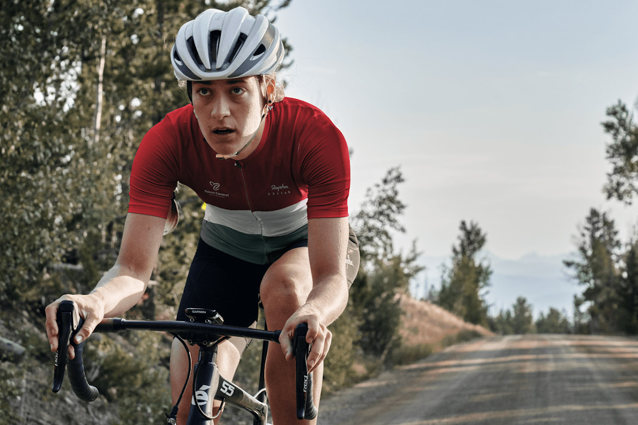
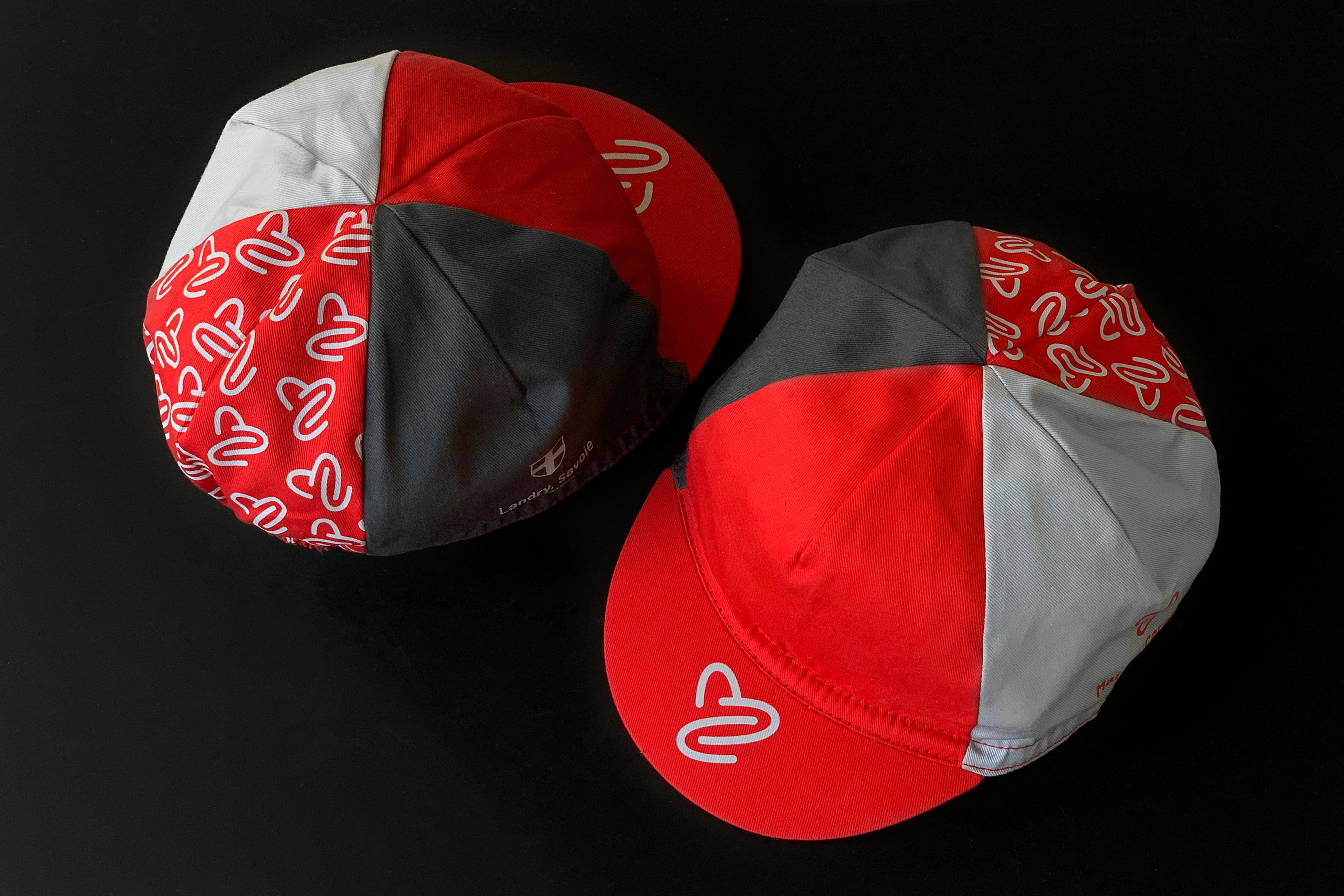
Cycling kit
The Maison Caramel cycling kit uses a tricolour design, reminding of golden era cycling kits like Bianchi’s (one of Serge’s favourite brands). First photo below courtesy of the Rapha Custom web platform.
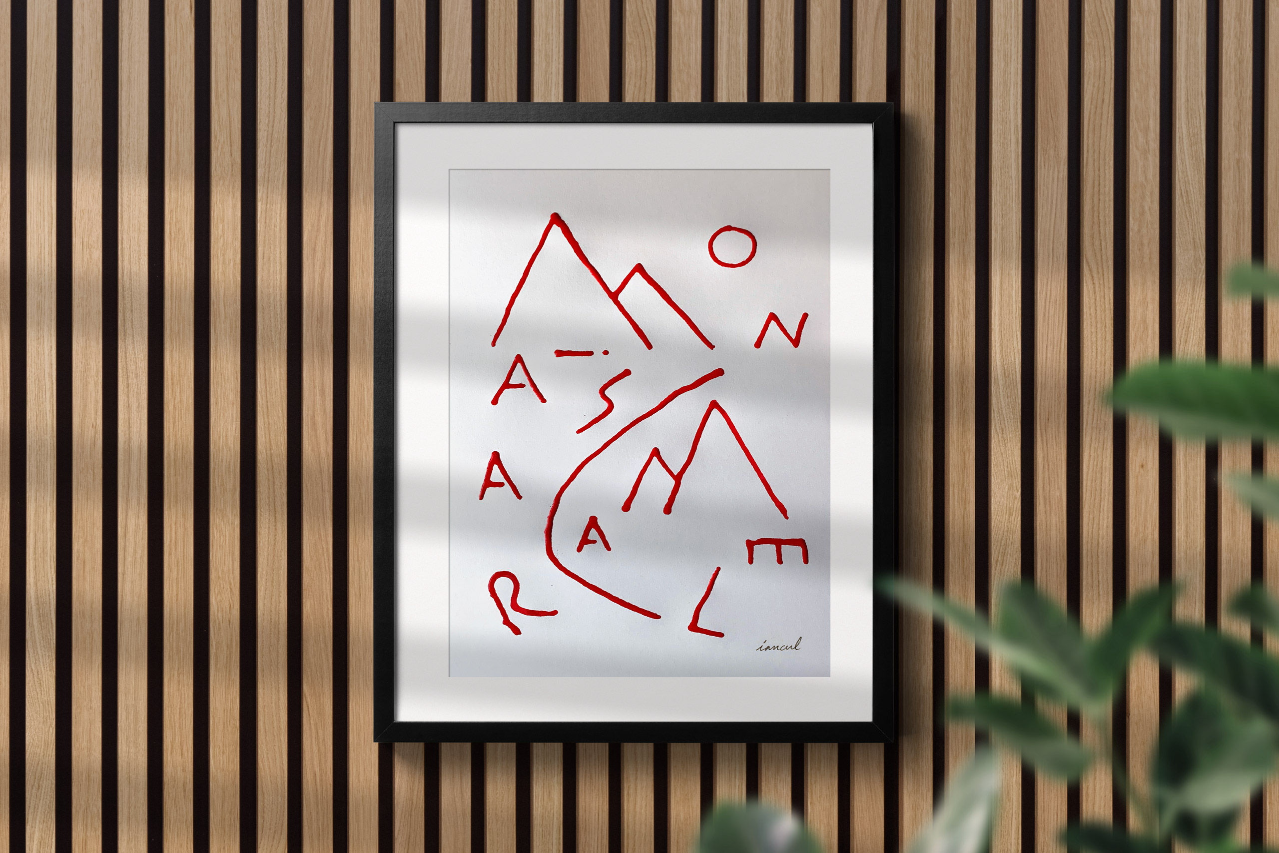
Poster
Lettering in red acrylic ink for a poster to hang in the chalet, using the letters in the Maison Caramel name.
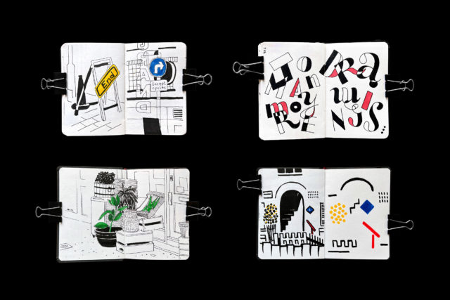
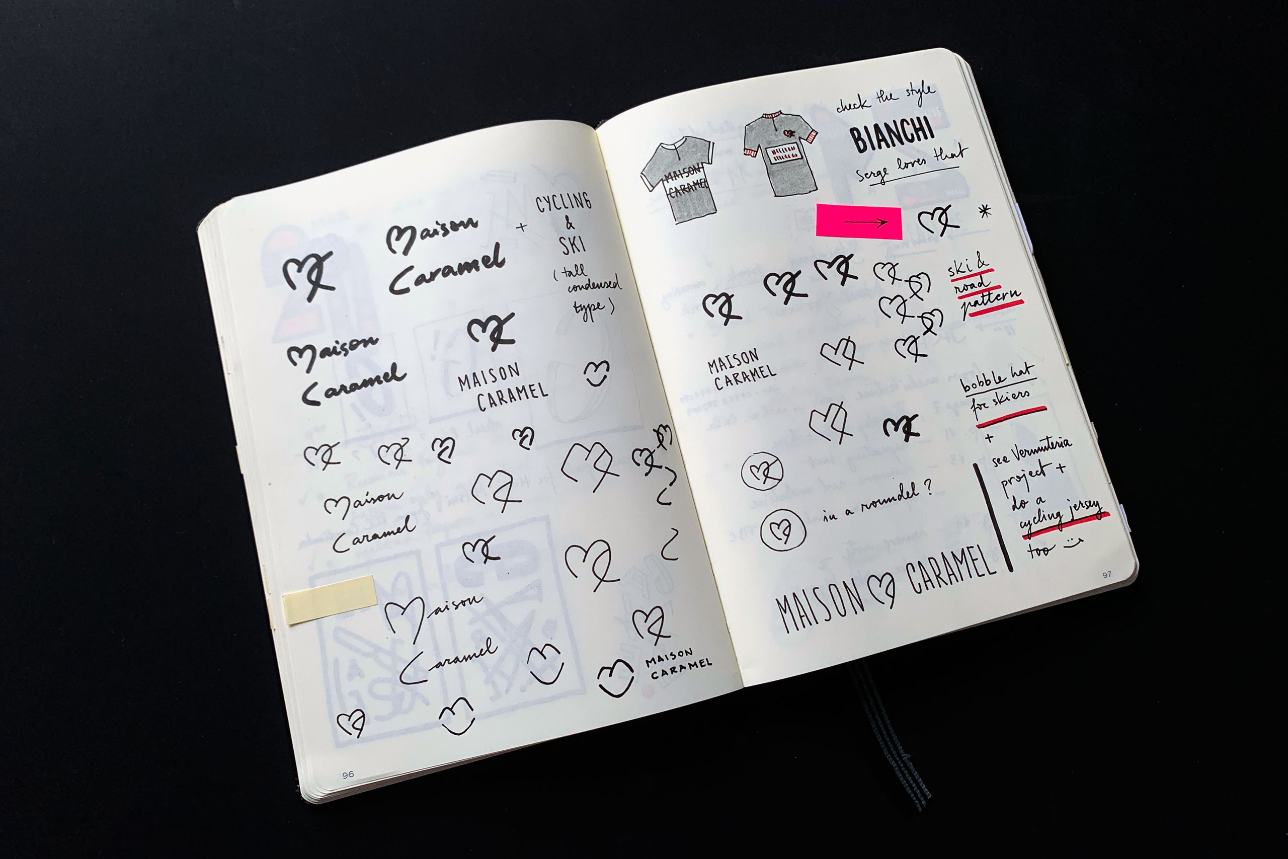
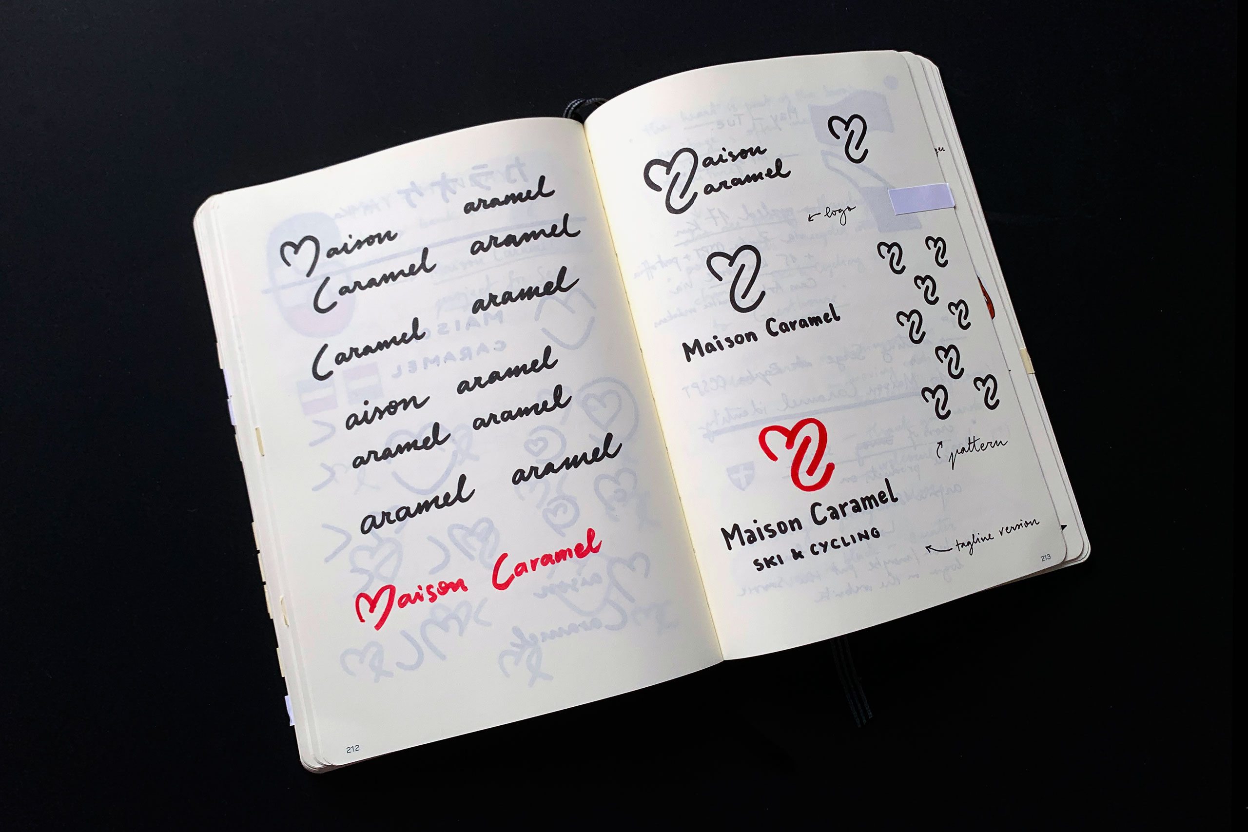
Part of the process
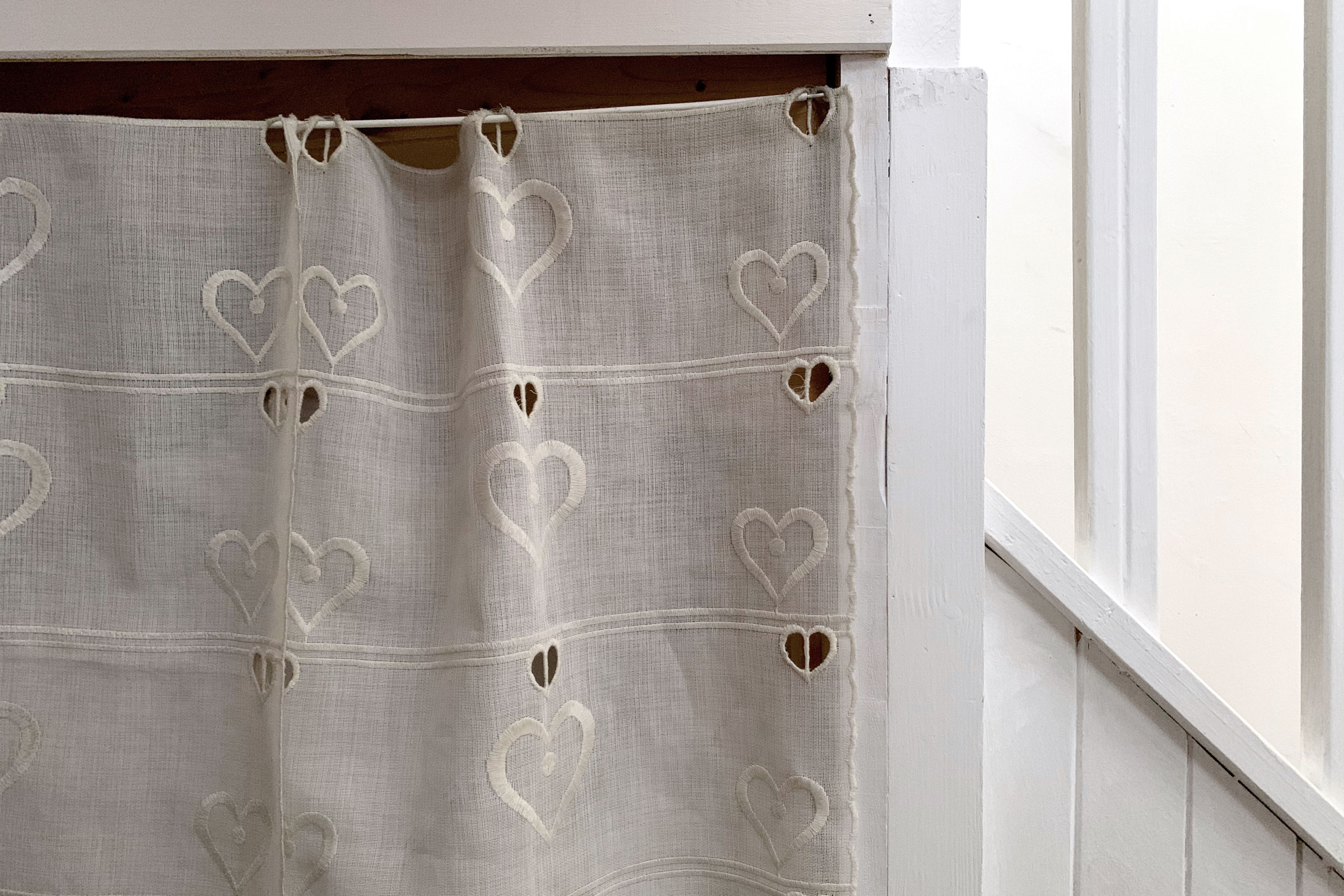
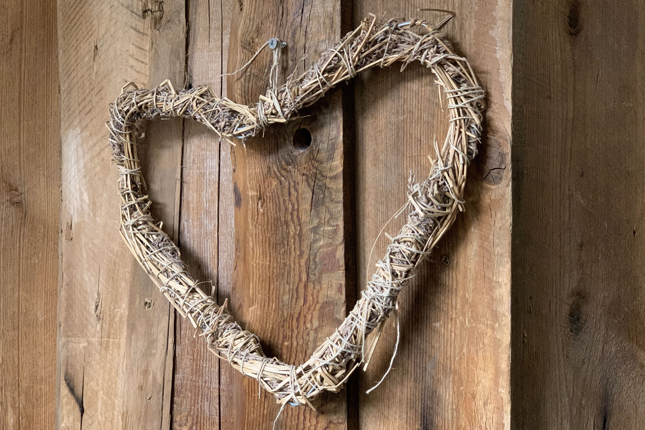
Hearts can be seen everywhere in the Savoie area. Based on the Catholic Sacred Heart, they were initially used on memorial crosses. Local artisans also started using the symbol when making furniture, ceramics, sewing, cow bells and many more. These days you can buy pretty much anything heart-shaped or with hearts in the local shops.
So it made perfect sense to have a heart-shaped logo. My initial sketches were based on a heart-shaped M that would also suggest a mountain’s silhouette, and a C that would suggest ski tracks or a road coming down the mountain. It worked, but I wasn’t very happy with the overall shape. The right solution came a few days later when I realised that the C would fit much better within the M if I imagined the road switchbacks as seen from above.
Links
If you’re thinking of doing a skiing or cycling holiday in Europe, I can’t recommend Maison Caramel enough. Have a look at their Instagram feed if you need an extra nudge.
Cycling kit and cap produced with the help of Rapha Custom.
Thanks to Toma Barbarasa for the photo at the very top.